Codecademy Projects
Redesigning an online coding platform's projects page


Context
- This unsolicited redesign project was completed over 5 days, without access to business information and customer data. Part of KPCB's Design Fellowship application process.
Role
- UX Design
- User Research
Tools
- Figma
- Google Sheets
Team
- Solo
Foreword
This case study has been conducted without any access to company data including development bandwidth, business requirements, and real usage information. To minimize the impact of these key constraints, I have conducted trivial research that will attempt to measure success within my small dataset.
Context
While browsing the list of KPCB’s portfolio companies, Codecademy piqued my interest. I had used their in-browser tutorials to learn HTML and CSS almost half a decade ago and decided to check out what they had to offer. I learned that some of their newest offerings included workspaces and project forums.
Currently, the Codecademy platform offers the following key products:
- Content: Videos, tutorials, and articles on learning different tools and languages
- Workspaces: Online editor where you can create and work on projects
- Forums: A discussion board for community members to share their work and discuss
While browsing through their products, I also spent some time learning about the company’s values of collaborative learning encouraging curiosity. These values will serve as key pillars of my case study, guiding product decisions.
Discovery
I spoke to four undergraduate students at Simon Fraser University about their recent experiences with Codecademy and the beginning of their coding journeys. These were 15-minute-long verbal interviews where I took notes. The consolidated insights from the interviews are as follows:
Beginner-friendly platform
All participants noted that Codecademy was useful in helping them learn the basics of coding.
Github is intimidating
New coders find Github intimidating and do not know how to get traction on their projects or contribute.
Low engagement on Forums
Sharing projects in the Codecademy Forums does not bring engagement, with very few comments or feedback.
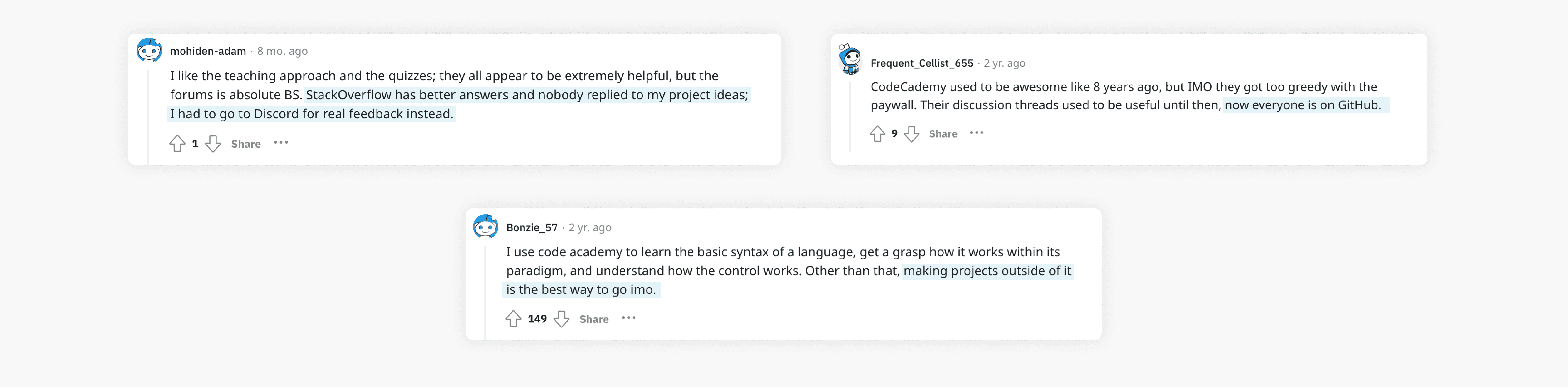
After talking to the students, I spent some time browsing through Codecademy’s website and discovered that Codecademy Forums indeed suffer from very low engagement from creators and contributors.
To further investigate this issue, I conducted quick secondary research about Codecademy Forums via Reddit and Discord.
My primary and secondary research helped me drill down and define the problem that I will be trying to solve.
What is the problem?
The current Codecademy Forums does not support discovery and engagement for learners building projects.
Why is this problem important?
When learners are unable to get feedback on their projects or contribute to others’ projects meaningfully, the learning cycle is roadblocked and can result in churn.
Why is this problem occurring?
There were many different reasons put forth when conducting primary and secondary research, summarized below:
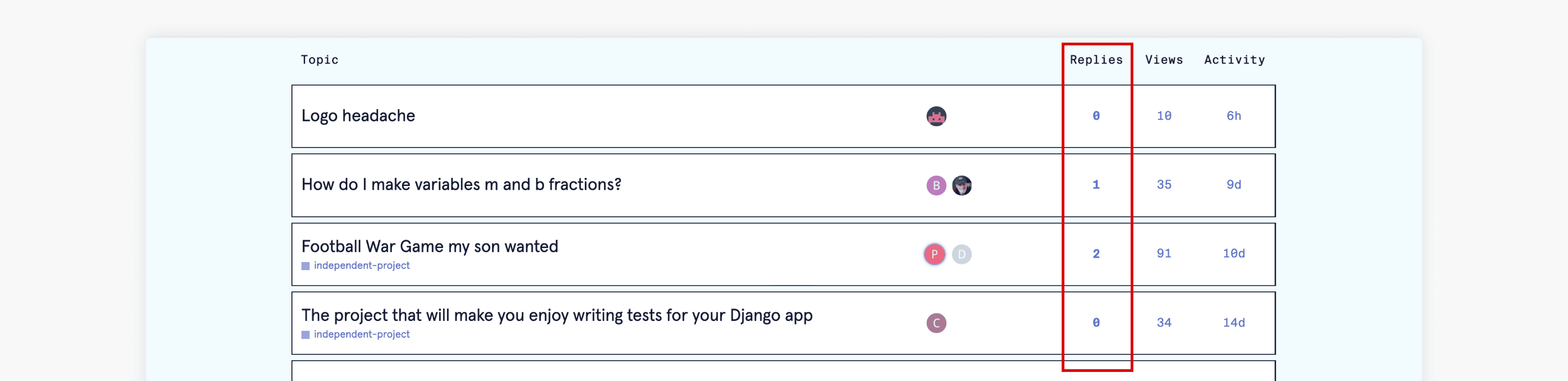
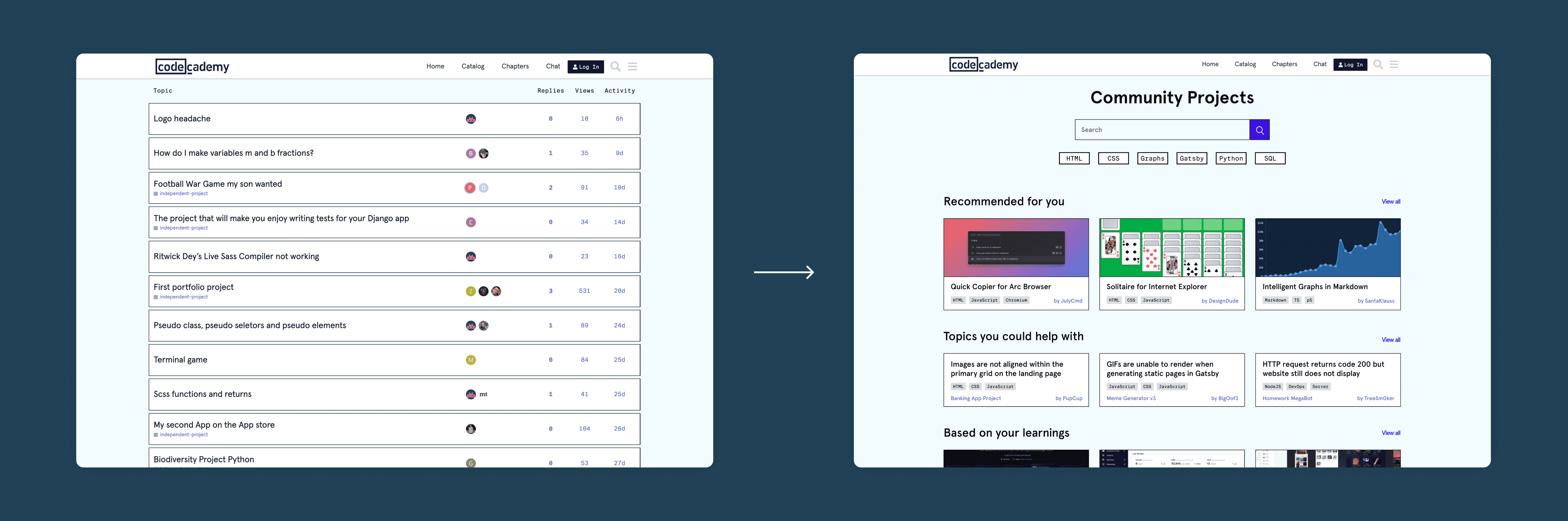
Poor discovery features
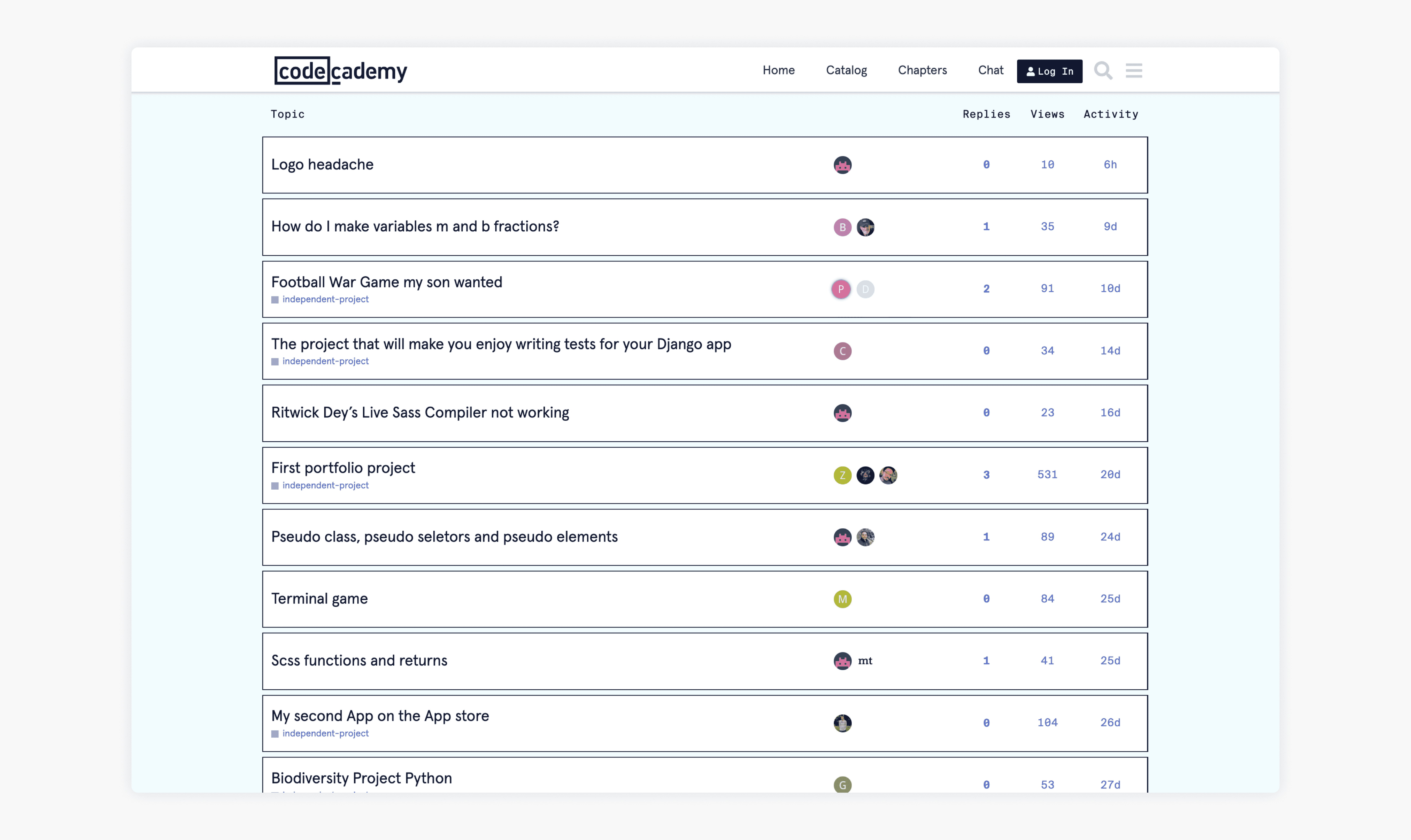
Projects are hidden 3 layers deep within forums, and all posts are displayed in reverse chronological order with no discernable visual differences.
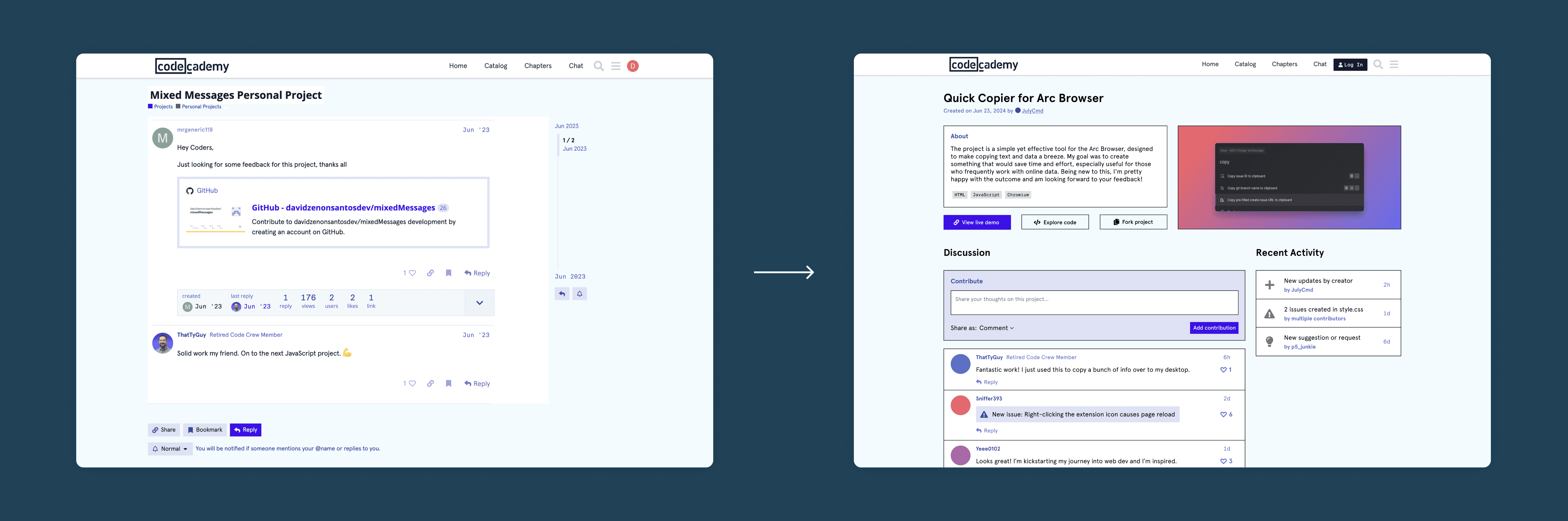
Off-platform links
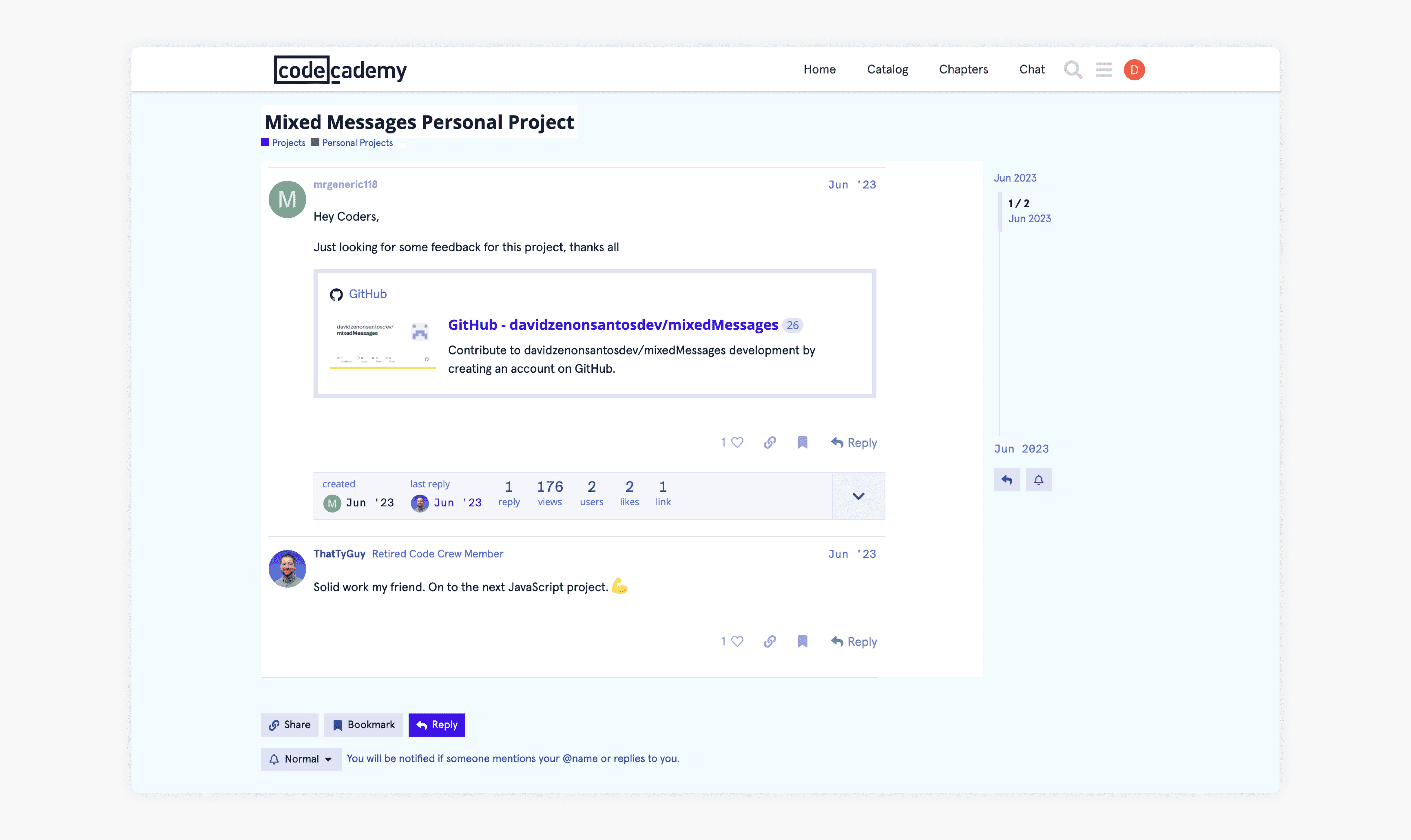
Most project discussions simply have a link to GitHub, where other users are encouraged to create issues and contributions, which may lead to drop-off.
Lack of meaningful ways to engage
The general interface of the forums is tailored towards bug-solving QnA and does not encourage discussion and contribution.
Codecademy’s mission statement is to create a safe space for beginners to learn, collaborate, and ask questions. The current state of the forums does not support the company’s goals. Based on this, I formulated a statement to guide the redesign project.
HMW redesign Codecademy Forums to assist learners in discovering and engaging with projects?
Ideation
I tasked myself to come up with a few different ideas within a 30-minute timeframe. This helped me be creative within constraints and focus on the most impactful ideas.
Integrate with GitHub
Encourage users to work with GitHub and add the ability to display GitHub projects in Codecademy’s forums natively.
- Pros: Real-world coding experience, richer integration in website.
- Cons: Fragmented UX, high risk of drop-off moving between platforms.
Gamify Existing Forums
Add a gamification aspect to the current forums by rewarding engaging behaviour, similar to Reddit and StackOverflow.
- Pros: Higher engagement numbers, quicker responses to queries.
- Cons: Risk of superficial engagement, distraction from goal of learning.
Community Projects Platform
Standalone experience where students can discover and share their work, get feedback, and collaborate.
- Pros: Enhances project visibility, richer feedback and collaboration.
- Cons: Relies on community contributions for support.
The most convincing idea of the three appeared to be the Community Projects, a standalone page focused on discovery, outside of the forums. This would go hand-in-hand with a redesign of the individual project page and offer richer ways for learners to interact with projects by offering discussion and code-specific discourse.
Out of the three, this was the only solution that truly addressed the problems of discovery and engagement by ‘pulling’ the user instead of ‘pushing’ them to exhibit certain behaviour. While gamification and third-party integration are not entirely bad ideas, those could be strategies to enhance the Community Projects page instead of being comprehensive solutions.
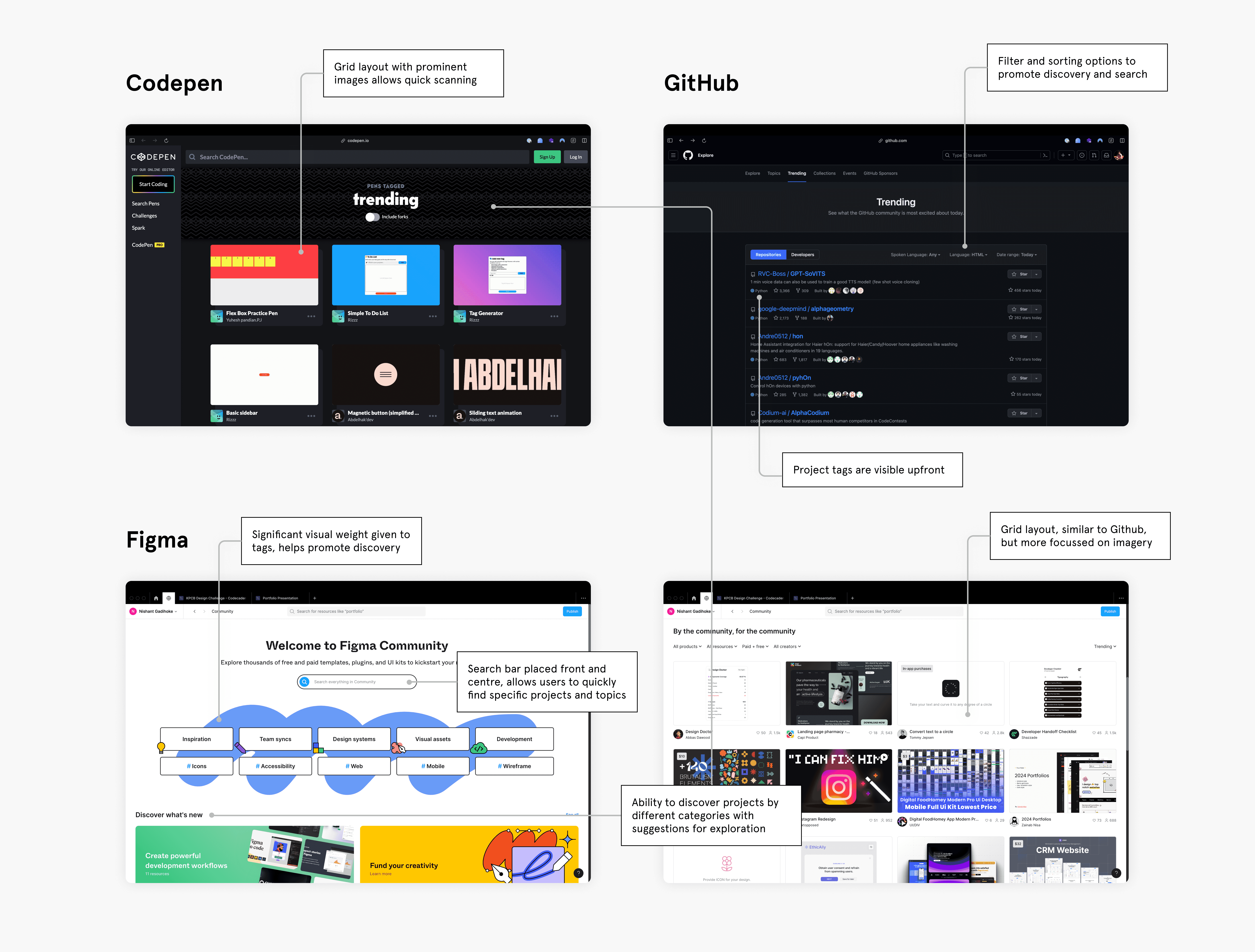
Competitive Analysis
Before jumping into sketching out ideas, I decided to conduct a very quick competitive analysis to see how other platforms are able to successfully showcase projects from the community.
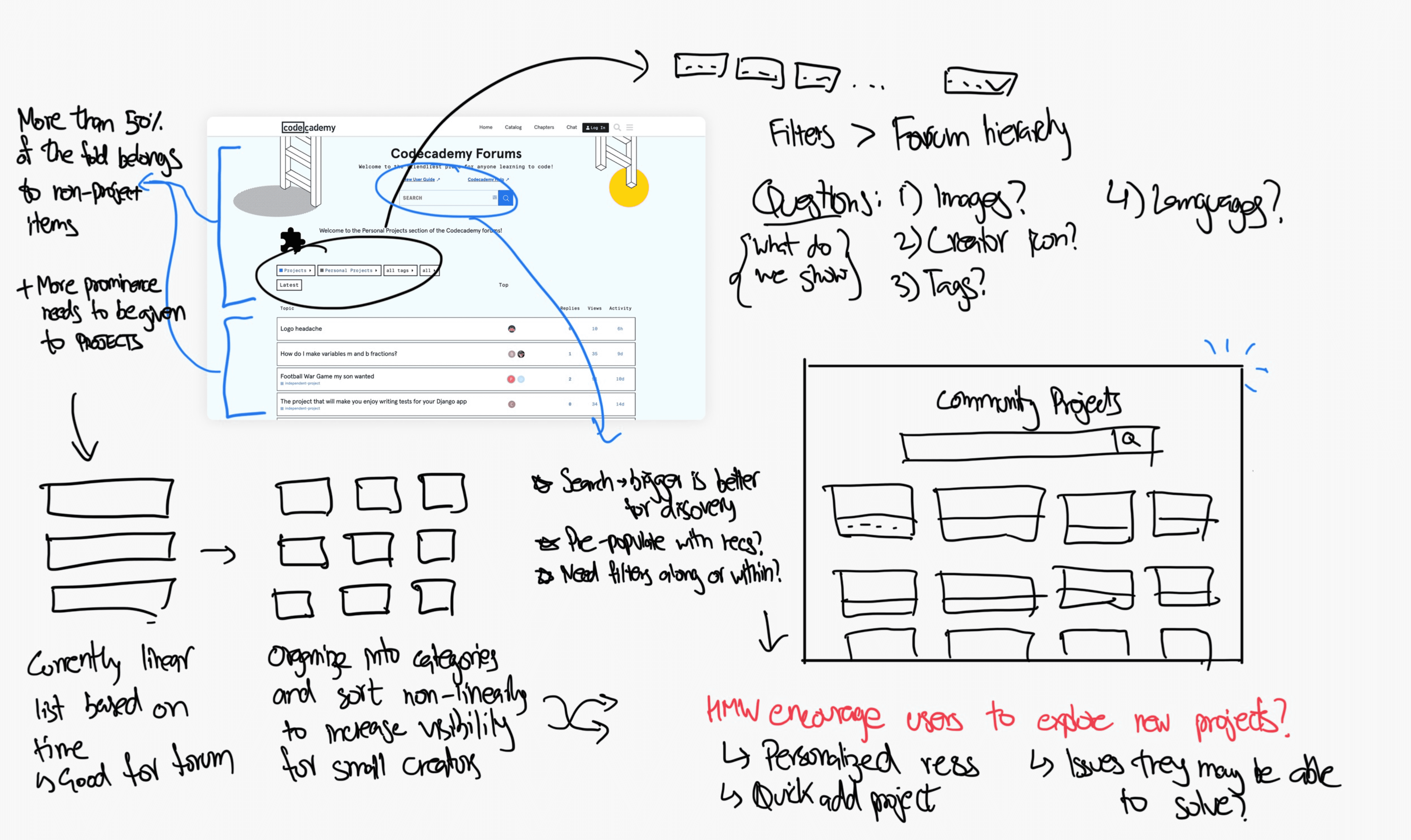
Sketches
Based on my learnings from the competitive analysis and a rapid usability study, I dissected the current interface and ideated on how it could be made better.
Design
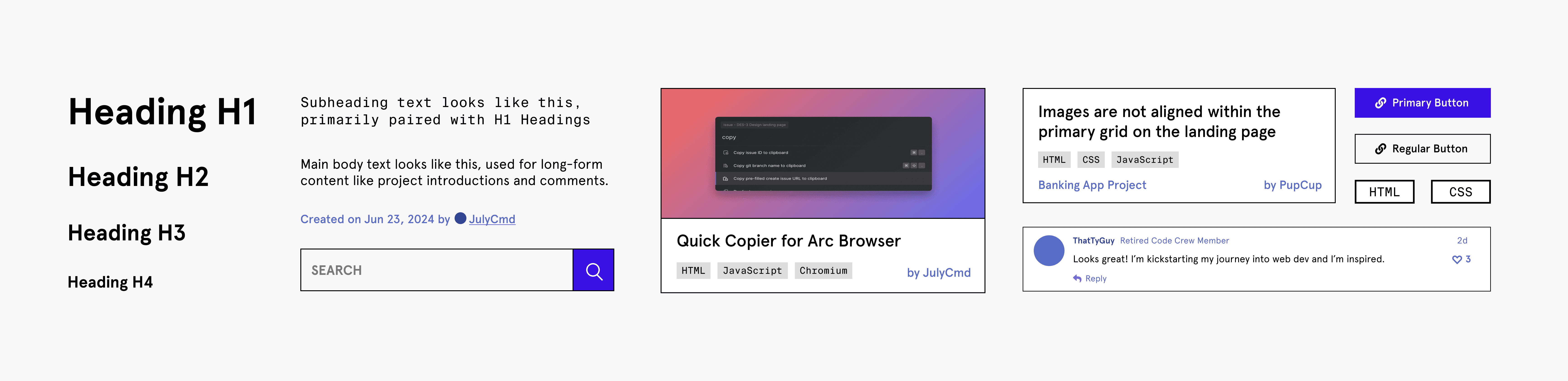
I began the design process by grabbing screenshots of the current interface and quickly designing repetitive elements including headings, cards, and the grid. This gave me a mini-design system to work with. In my experience, working in medium fidelity is often easier to comprehend when testing and comparing iterations because of reduced abstraction.

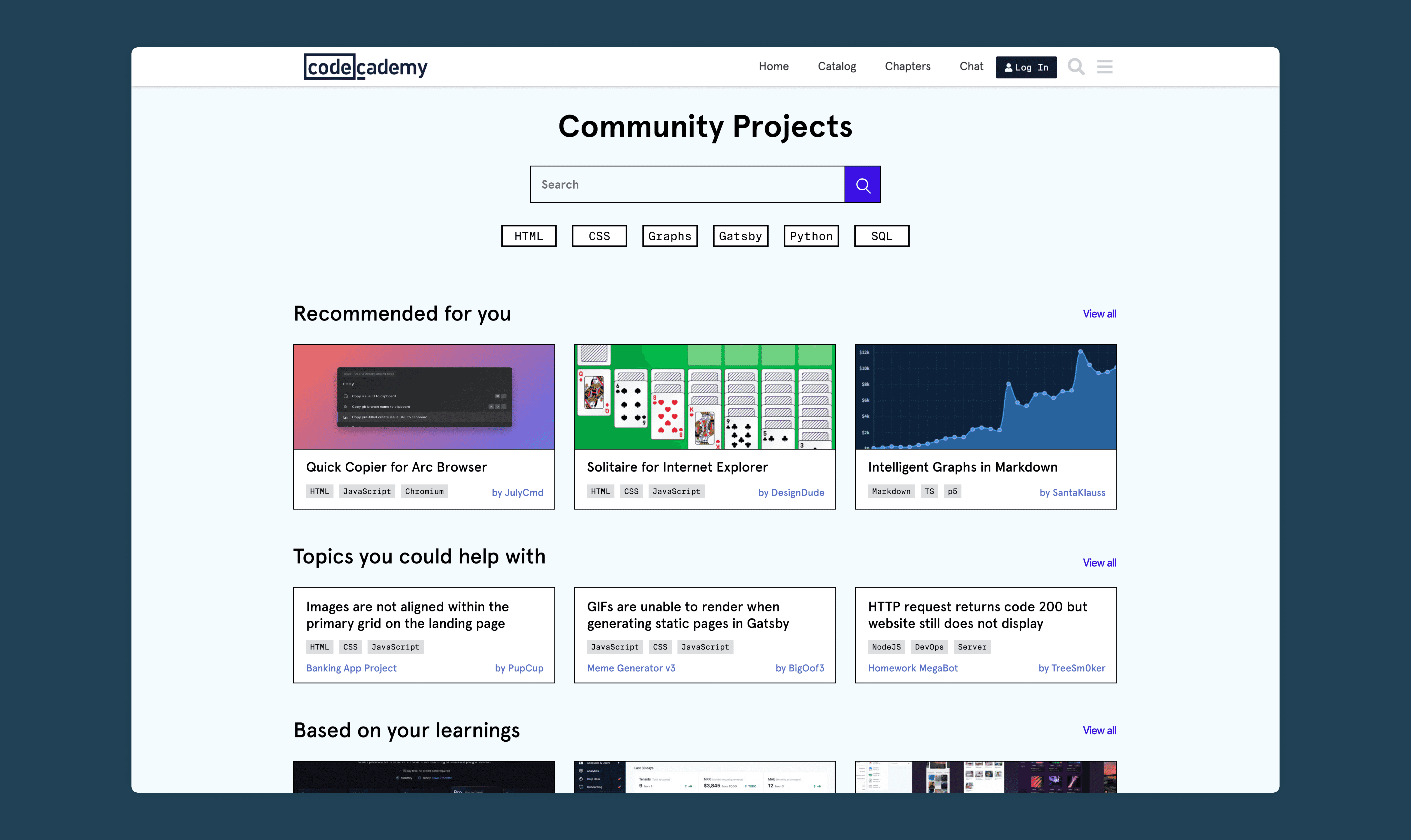
The Home Page
The guiding principle of the home page was to put the projects front and centre, thus enabling discovery. To do this, I shifted the projects upwards and organized them into a tile-like grid versus a linear list. Not only would this help scannability across the page and reduce cognitive load on the user, but it also broke up the monotony of text by introducing imagery for each project.
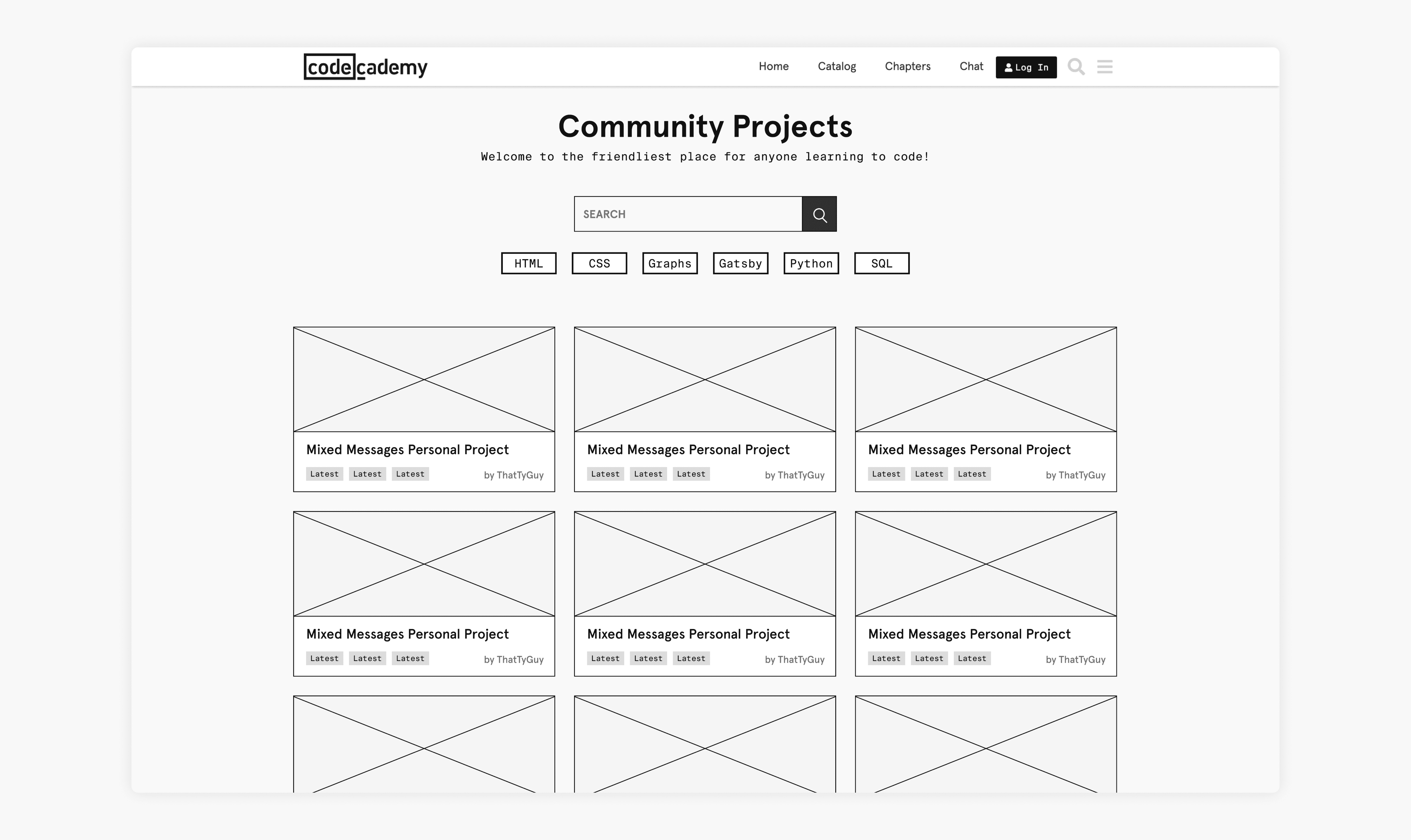
Rapidly testing this for usability with my initial interviewees, I got feedback that the majority’s preference would be to search or click on the tags instead of scrolling indefinitely. This was an interesting observation that made me rethink how the projects could be organized. An idea from one of the interviewees was to “introduce some way to see how I can help other people with my skills.” This made a lot of sense, as it would encourage users to contribute meaningfully while keeping the content tailored to them based on their coding journey.
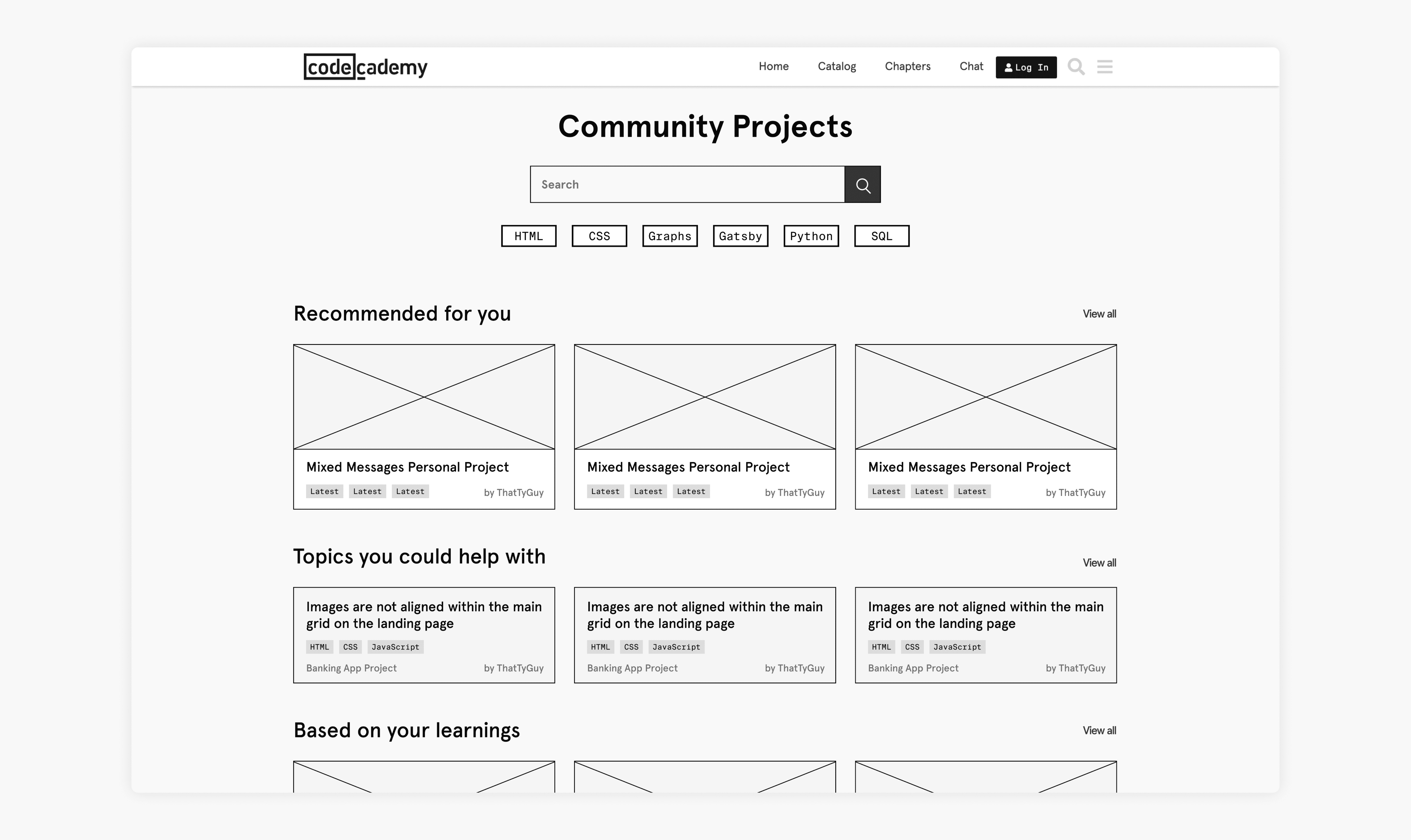
I ended up slightly increasing the size of the search bar based on user behaviour and chunking the projects into different categories and issues they could resolve. Next, I moved on to the individual project page
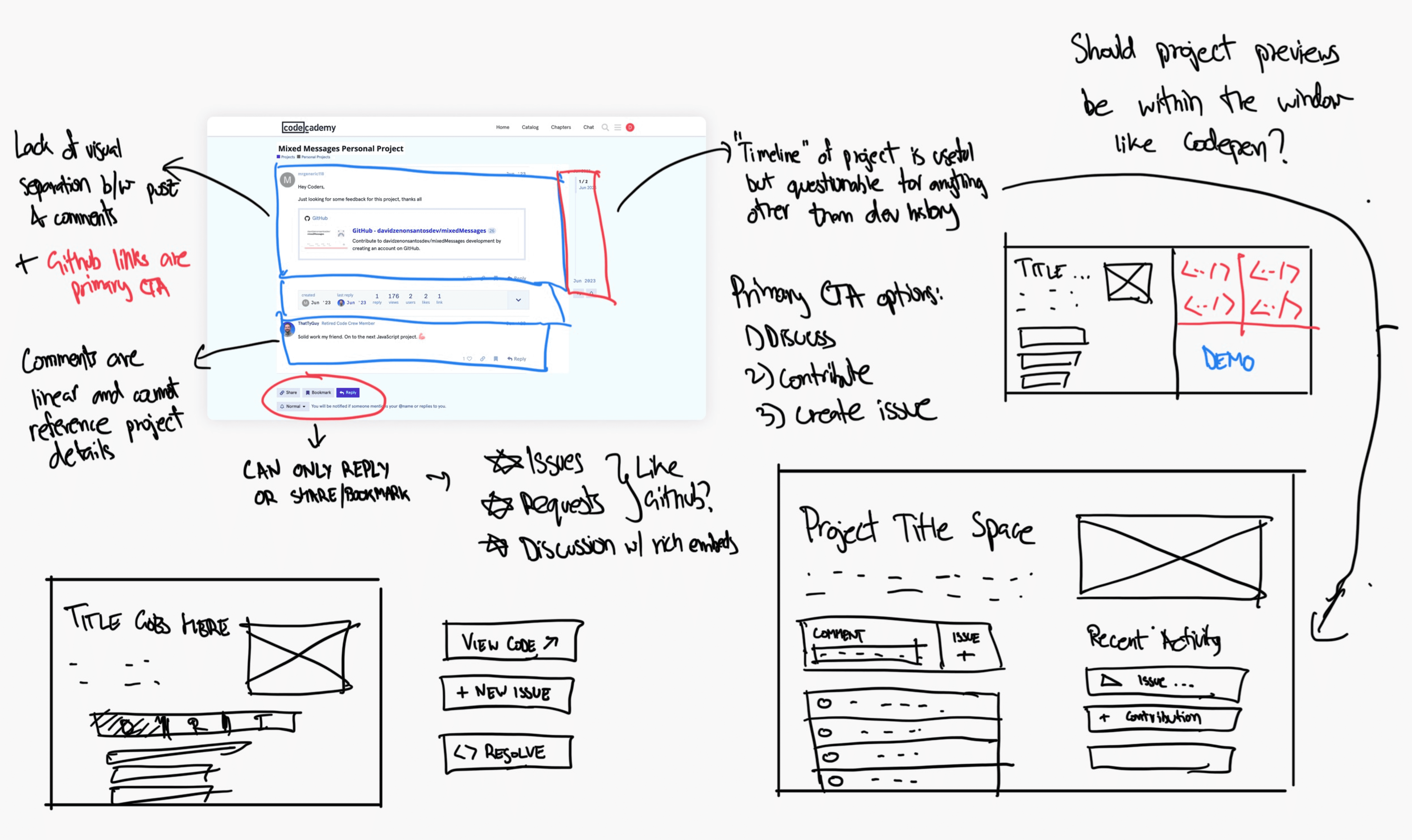
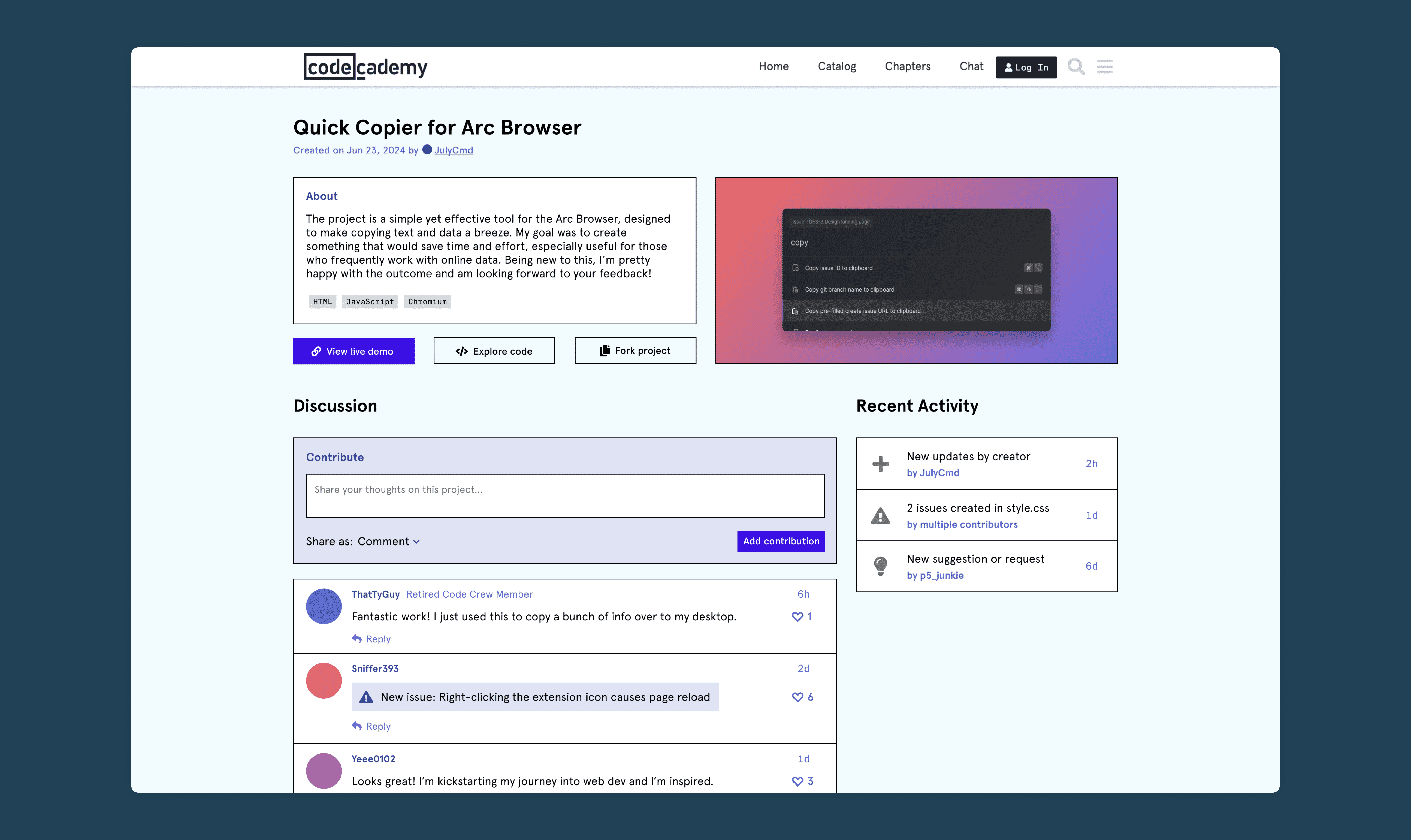
The Project Page
Applying the same principles of facilitating engagement and connection, I cleaned up the interface by separating the thread into a section that described the project and a section that allowed discussion around it.
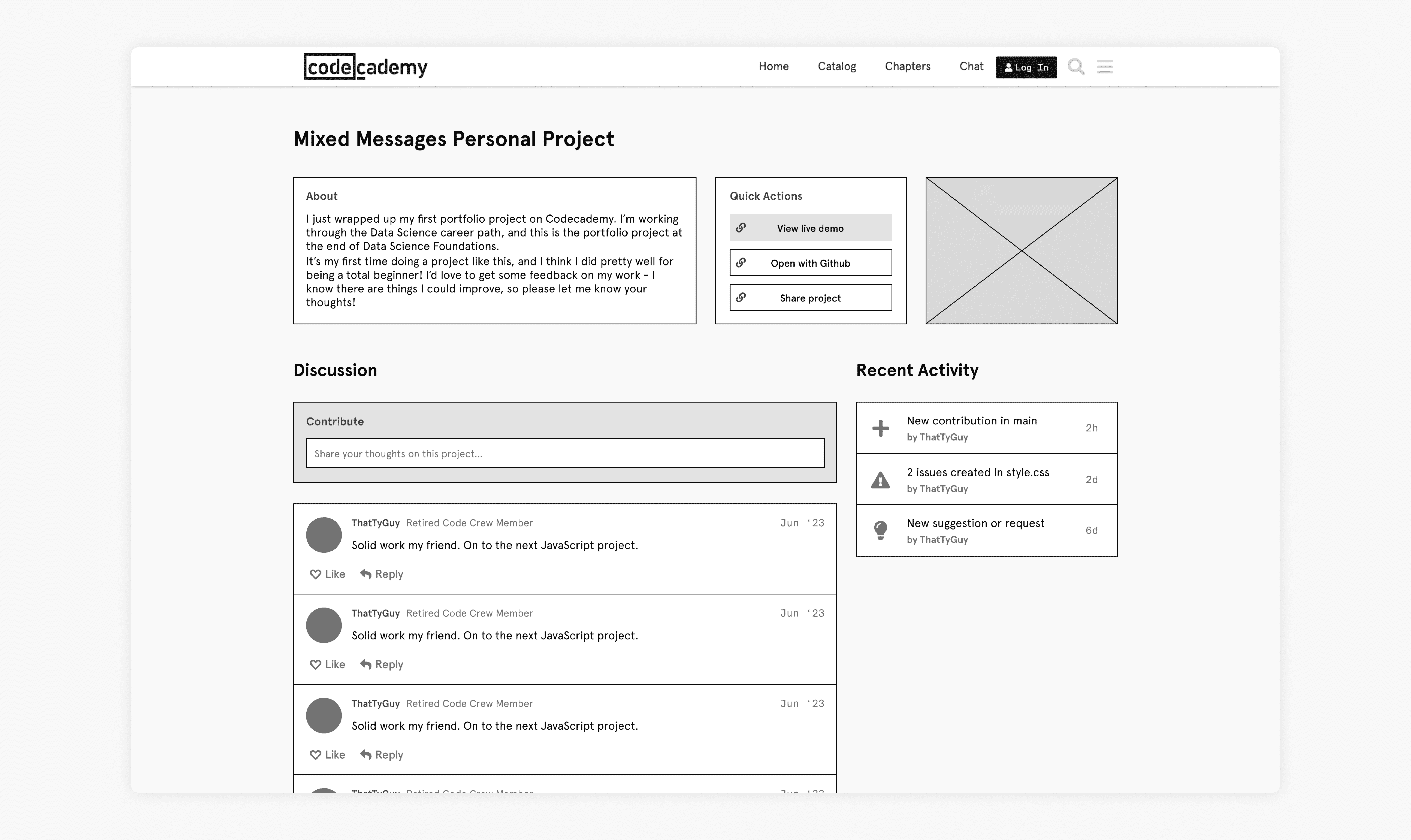
The main issue I discovered with this was that the buttons in the quick actions were drawing more visual attention than the project description or discussion areas. Further, the recent activity section indicated that users could create issues and suggestions, but I entirely overlooked the creation process for those. So, I decided to move the buttons below the description and inserted more ways to create engagements.
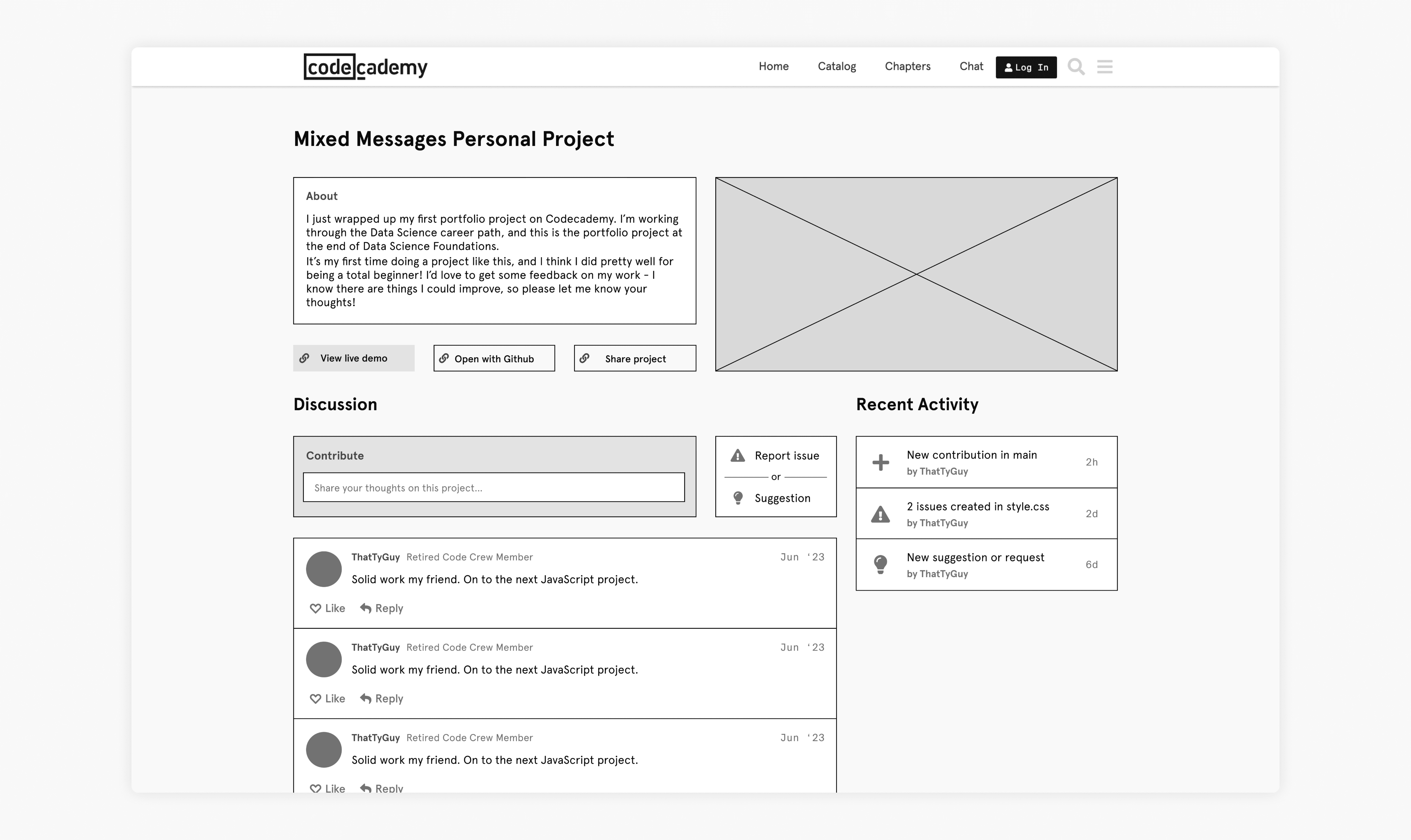
Showing this to the interviewees, the majority’s first reaction was “too many options.” The newly added buttons to report issues and suggestions were very close to the options of viewing the project and code, and users were left confused about which ones to click first. Further discussion with the participants revealed that another idea to increase engagement would be to encourage forks or ‘remixes’ of a project similar to GitHub. With these insights in mind, I iterated once again.
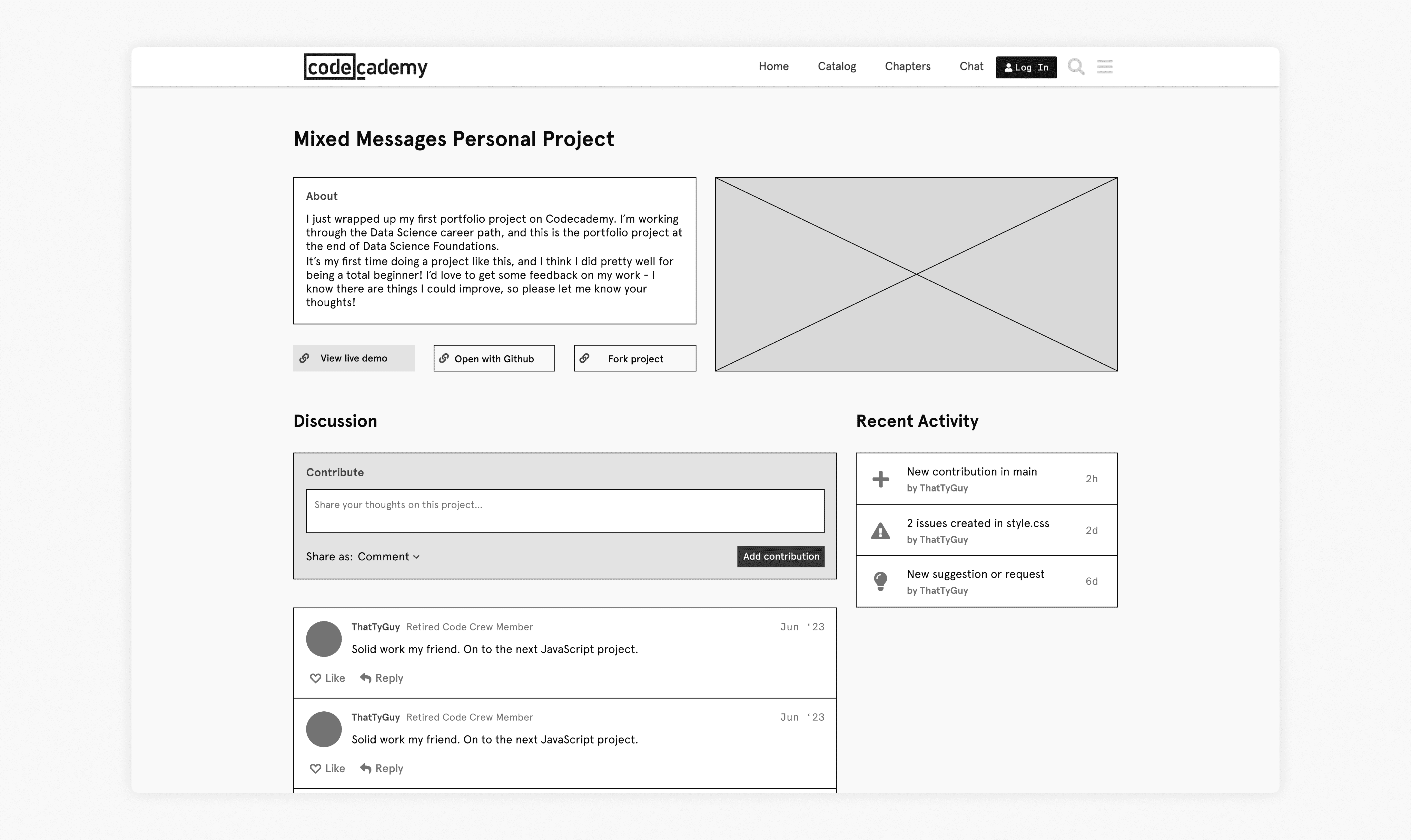
The decision was made to give more visual weight to the ‘contribute’ box where users could add their contributions in the way of comments, issues, and suggestions. The option to change contribution type was behind a dropdown menu since I realised that a lot of users would come up with ideas and discover bugs from the codebase itself, where an inline reporting feature could be added in the future.
Delivery
After settling upon the final information architecture, I decided to add Codecademy’s design elements of colors, typography, and spacing to present a solution that would look in place on their current website.
Oh, and I also updated my localized design system incase any PMs at Codecademy decide to build this out ;)
Testing Success
Asking the initial set of participants for their final thoughts on the before and after of the redesign, all participants agreed that they would be more likely to explore and contribute in the updated design. Further, they appeared to be excited about the possibilities for the platform and came up with various ideas for new features that could be built on top of this.
Future Considerations
The current state of this project simply serves as a starting point to base a more rigorous and comprehensive solution to the existing problems. Some ideas to consider for the future would be:
- Remixes: Include ways to show remixes or forks of an existing project, that would further demonstrate collaboration and engagement amongst Codecademy users.
- Integration with learning: Introduce project discovery within learning pathways, helping learners visualize what their course content could be put to use for.
- Further testing: Conduct extensive testing to see how user behaviour confirms or (more likely) argues against assumptions made in the design process.
Learnings
Throughout this project, I was designing based on assumptions of what the company and users want out of their products. While I was able to test some of my theories, it was a unique exercise of iterating while being aware of the shortcomings of the process.
Establish guiding principles
During multiple points of iteration and testing, I leaned on the guiding principles defined in the beginning. Having a North Star not only helps keep the project on track but also helps ensure that the correct problem is being solved.
Spend time researching
Perhaps the most valuable time spent during this redesign process was analyzing how other companies organize their content. This helped me focus on using the right tools to provide a better UX.