TurboTax Document Checklist
Redesigning the document upload flow for TurboTax customers across Canada and USA


Context
- Completed over 6 weeks, this was my capstone project of my 8-month internship at Intuit. As the lead designer on this project, I extensively collaborated with partners across design, engineering, and PM. Shipped to production in North America in early 2023.
Role
- Design Research
- Interaction Design
- Visual Design
Tools
- Figma
- UserTesting
- Google Suite
Team
- Renee Lin
- Armin Tabrizi
- Mohamed Ramadan
The Issue
TurboTax, part of Intuit, offers online tax filing solutions. This case study focuses on their Full Service product, where users upload their documents for experts to handle their tax filing.
I started by exaxmining the existing user experience. My aim was to identify specific problems customers were facing so that we could directly address these issues and establish a baseline to measure success. The current state document upload flow was causing two major issues:
Unclear requirements
Users are unsure about which documents to upload and where to find them, leading to churn. Further, the long list of tax forms offers little context and can be overwhelming.
Downstream effort
Tax experts spend excessive time in back-and-forth communication to collect all necessary documents, consuming valuable resources, during tax season.
Discovery
Internal Feedback
As the lead designer on this project, I conducted an internal survey within the org to learn about areas of high impact around the document upload flow that others might have identified from their research and projects.
User Interviews
Next, our team conducted 1-on-1 interviews with customers over Zoom to gauge the overall document upload and handoff user experience and identify design issues. I alternated between interviewer and note-taker for these interviews.

Insights
The data collected from the internal feedback sheet and interviews with users was analyzed and then grouped into the following key insights.
Document Organization
Users struggled with the unstructured upload interface and frequently missed key documents.
Image Quality
Phone uploads often resulted in poor document legibility, leading to more work for experts.
Inefficient Communication
Experts have to schedule multiple calls with customers to gather all the required information and docs.
Organizing Insights
Next, our team conducted a journey mapping workshop with other designers to map the data collected from the above methods and plot it visually along the user experience. I was the primary facilitator for the workshop. This exercise helped narrow down which screens and flows were causing inefficiencies in our customer experience.
As a result of the journey mapping workshop, we created the following how-might-we statement to solve for:
HMW help customers better organize documents and increase document readiness upfront to reduce the downstream effort for experts?
Ideation
Ideation Workshop
As the first step in the ideation process, I conducted a solution ideation workshop with the design team to come up with solutions for the HMW statement, then grouped the ideas by themes.
Some ideas that emerged from the ideation workshop:
Gamifying Document Uploads
- Pros: Potential for faster processing times as users engage more actively.
- Cons: Limited scope for rewards beyond the existing service offering.
Document Checklist
- Pros: Provides a clear, upfront checklist to users, reducing expert effort.
- Cons: Demands engineering resources to automate the process.
Guidance via Call
- Pros: Potential for faster processing times as users engage more actively.
- Cons: Limited scope for rewards beyond the existing service offering.
We decided to pursue the document checklist option after consulting with the engineering and products team to ensure feasibility and timelines.
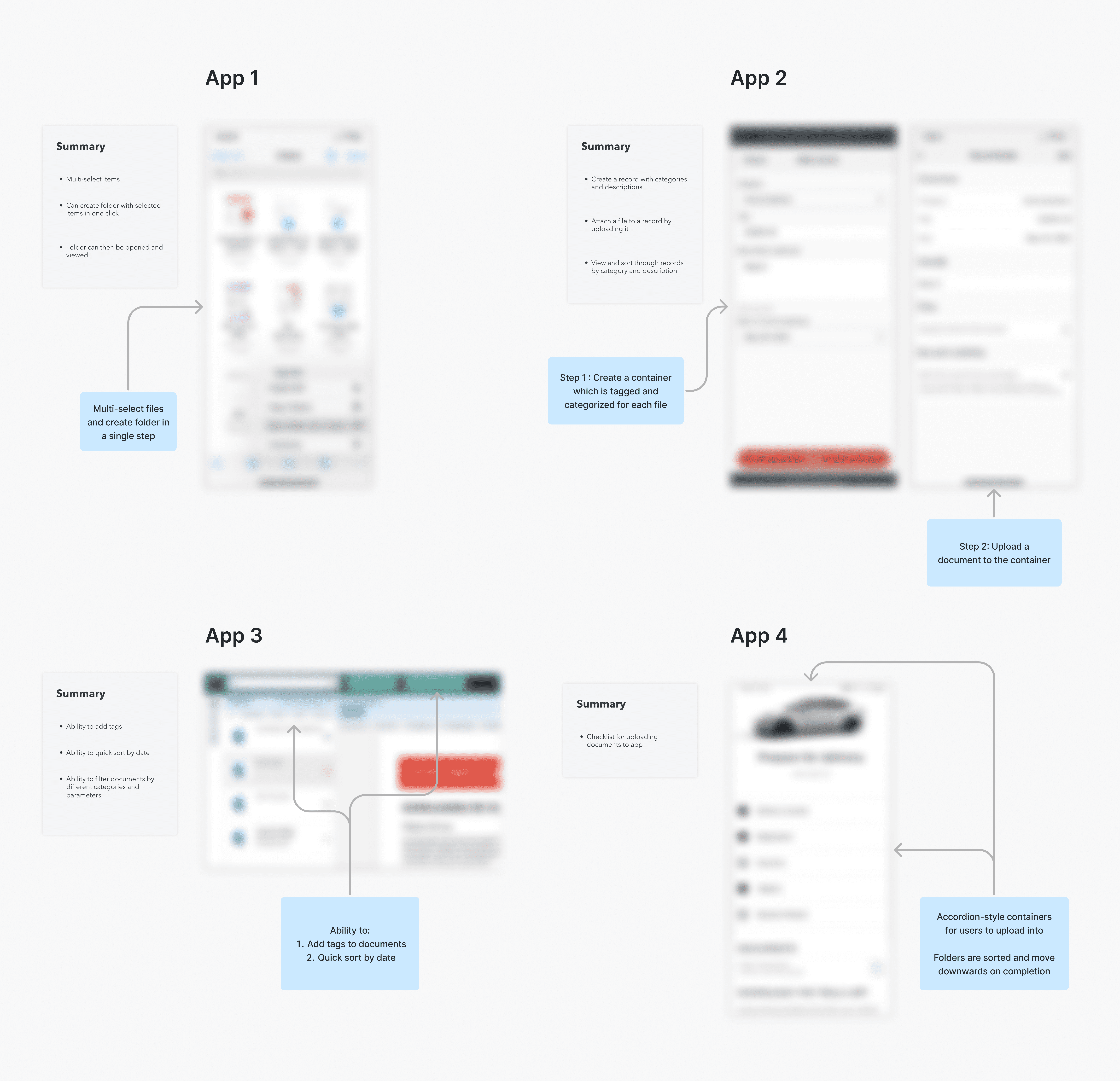
Competitive Analysis
Before diving into the design, our team’s direction was to conduct research in the market and see how other technology platforms help their customers organize information. My role was to quickly gather a variety of document upload patterns (within a 4-hour timeframe)
Implementation
Logic and Flow
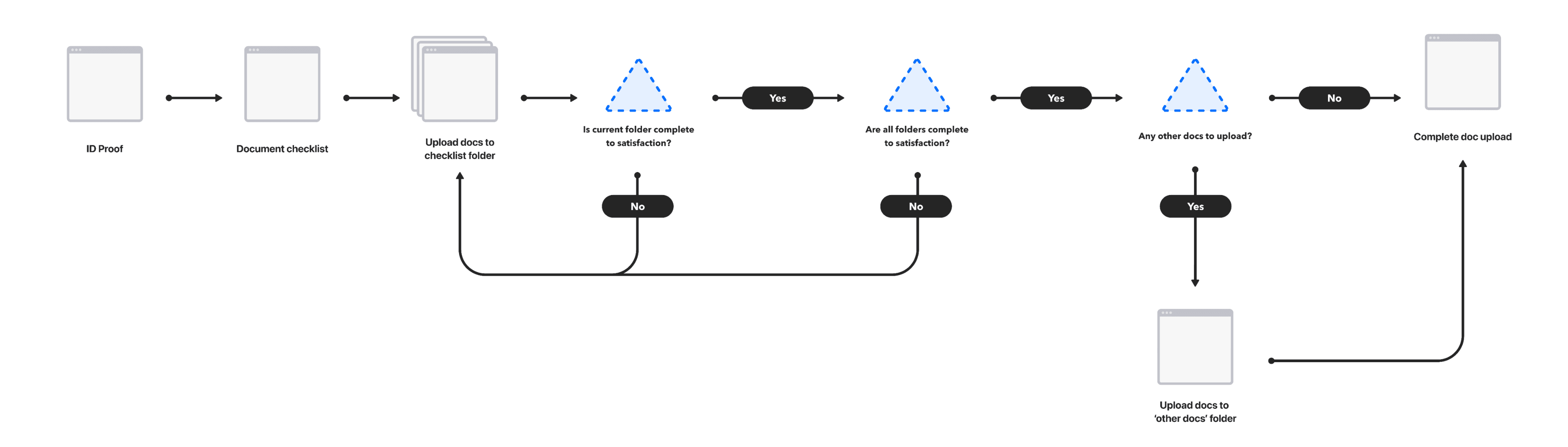
After looking at various competitors and finding a direction we liked, I mapped out the logic of the document upload process visually and communicated it with the development team who was beginning to work on the technical side of the project.
Visual Design
I began with medium-fidelity rapid prototyping using existing design system components. This allowed me to quickly put together the building blocks without spending too much time on the details.
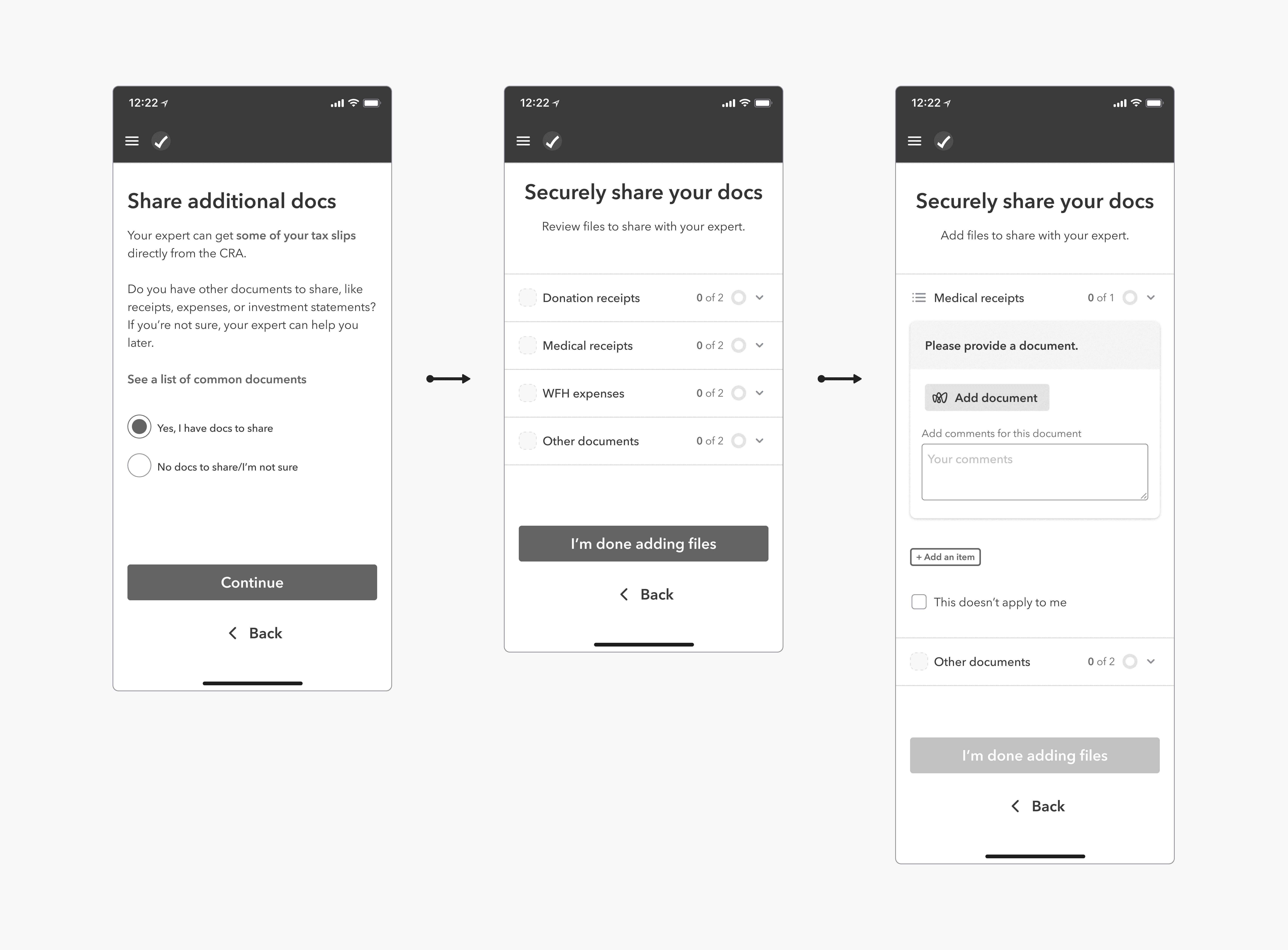
Inspired by the competitive analysis, the general idea of a vertical list that can be expanded and collapsed seemed to worked well. However, the information architecture wasn't in place quite yet, with unclear hierarchy and inconsistent buttons. Further, the first page where customers are asked if they have any documents to upload seemed redundant since the engineering team was automating that check.
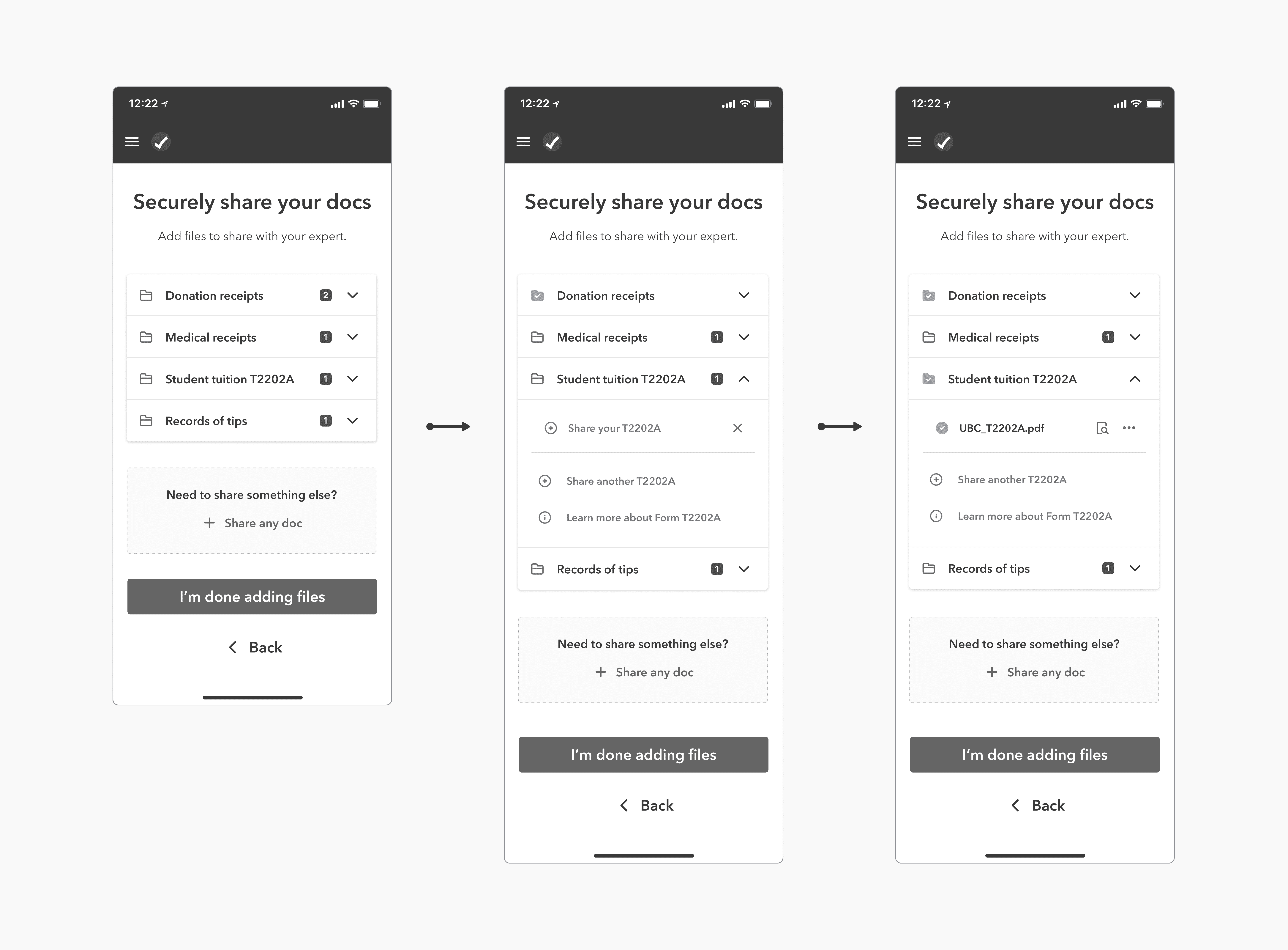
I cleaned up visual design, and established a standardized hierarchy within a checklist item that made more sense. Working closely with the design systems team at Intuit, I began to understand which components could be nested to create this checklist. Another issue that came up was the label beside the document folders. Initial testing with users showed that they were confused as to whether it meant documents required or uploaded.
During our design iterations, we decided to revert to the previous version of the document counter for clarity. Additionally, we added visual cues to indicate incomplete folders, thus reducing the cognitive load placed on users when scanning through the page.
Finishing Touches
Later in the process, we were informed that the ‘upload other documents’ component would not be ready for production in time, so we had to fall back on another checklist item, with a slightly different visual representation as a compromise.
I was also requested to create versions for native mobile and desktop versions.
Results
Learnings
Reflecting on the this project, I realized the importance of user-centric design and collaborative effort. Applying Intuit's principles of designing for delight allowed me go beyond the craft and find ways to save the customer and the company valuable resources.
Communicate early, communicate often
Talking to cross-functional partners including PMs, developers, and marketing can help to read between the lines and anticipate hiccups before they emerge.
Design is messy, and that’s okay
The path to the finish will always have unexpected twists and turns. But it’s part of our job to embrace the roadblocks and find elegant ways to get around them.