Planta
Designing a mobile app to help people transition into a plant-based diet


Context
- This project was completed as part of a 300-level class at Simon Fraser University's School of Interactive Arts + Technology. Students were asked to rapidly prototype a series of screens for a hypothetical mobile app in a specific subdomain.
Role
- UX Design
- Research
Tools
- Sketching
- Wireframing
- Prototyping
Team
- Pouria Delfanazari
- Cedric Wong
Introduction
As part of IAT 334, a required course for my major at SFU, we were required to design for a domain within the food and healthcare space. It was up to us to pick an idea for a mobile application and present the complete flow from ideation to prototyping, testing, and finally creating an MVP.
Our team decided to create an interactive system in the form of an app that helps people transition into a plant-based diet.
How might we design an app to help people transition into a plant-based diet?
Research
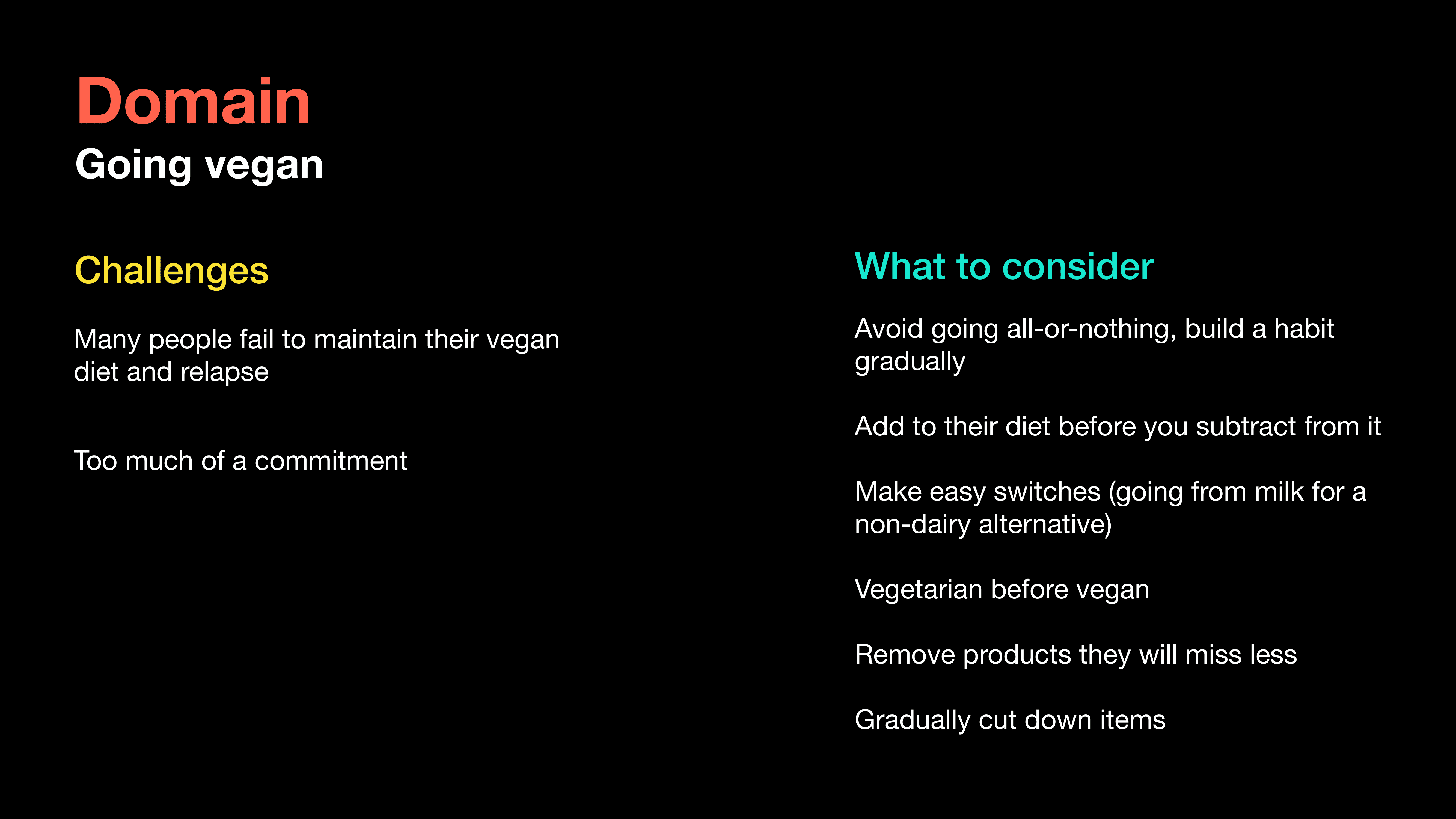
We conducted brief surveys amongst our peers at university to understand what kinds of challenges are faced by people who are in the process of going vegan.
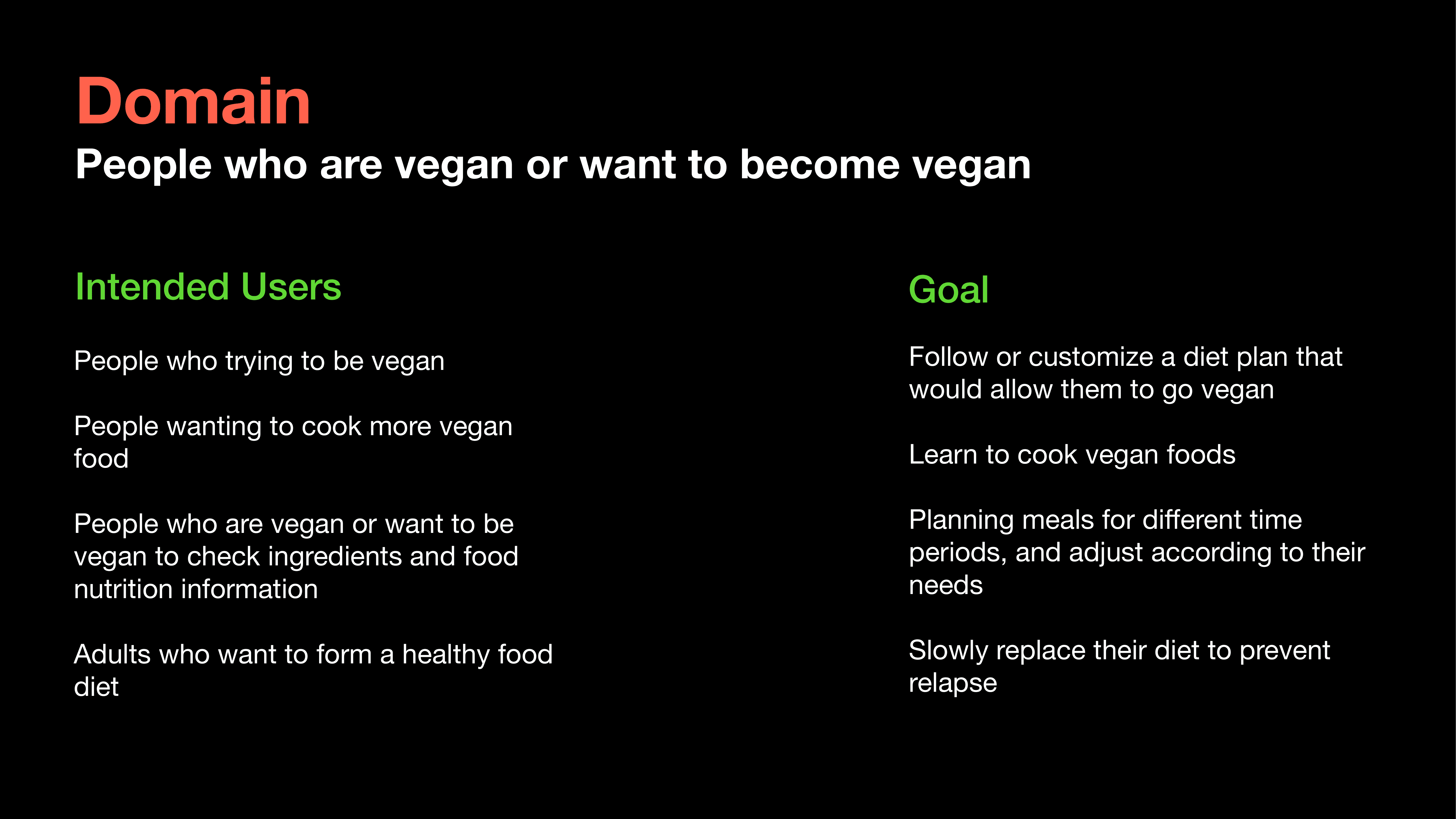
Next, we conducted 5 interviews with people who had tried transitioning to a plant-based diet or were already following one, to better understand the audience we were designing for. This led to us creating 2 personas that represented our audience.
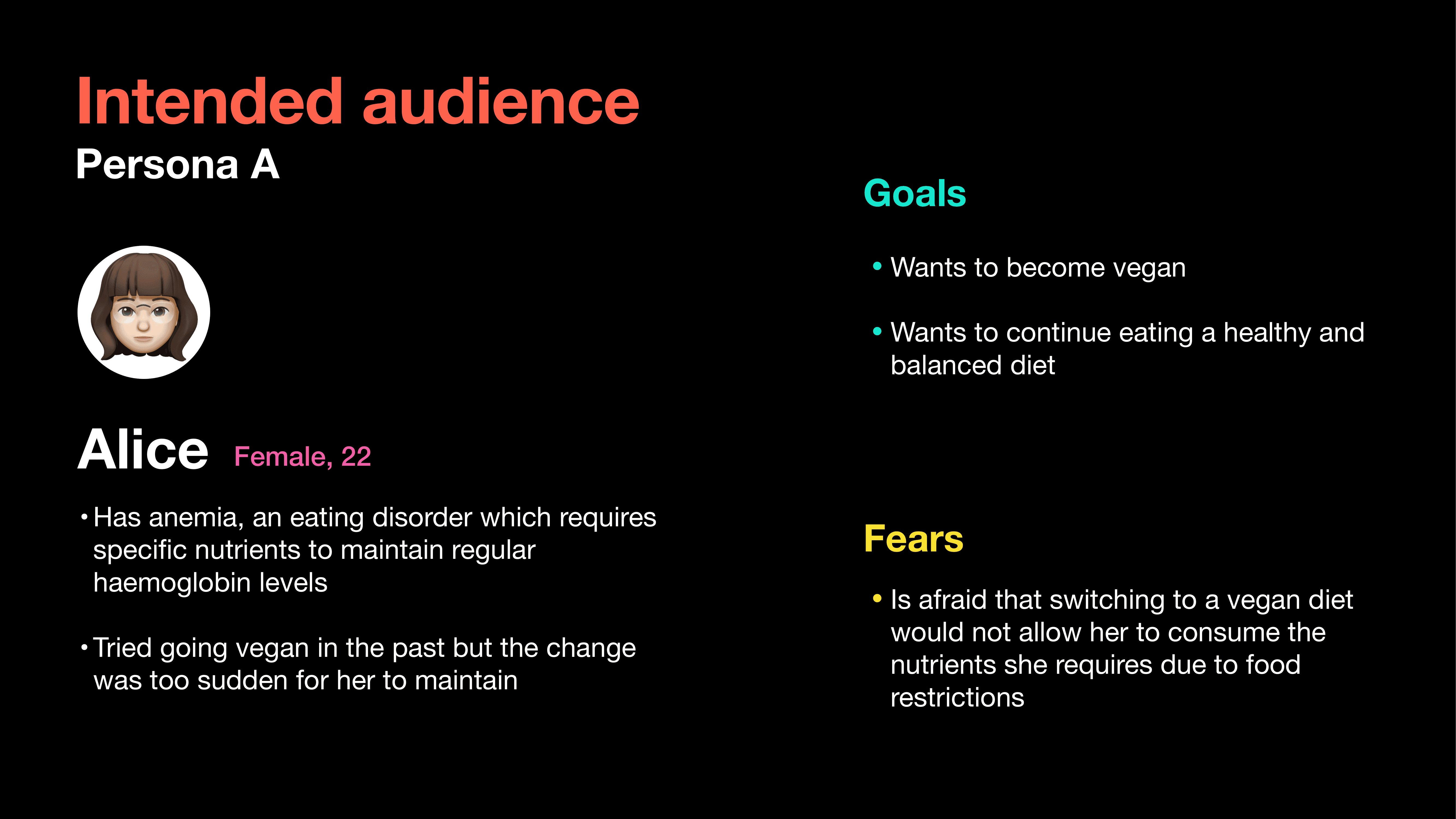
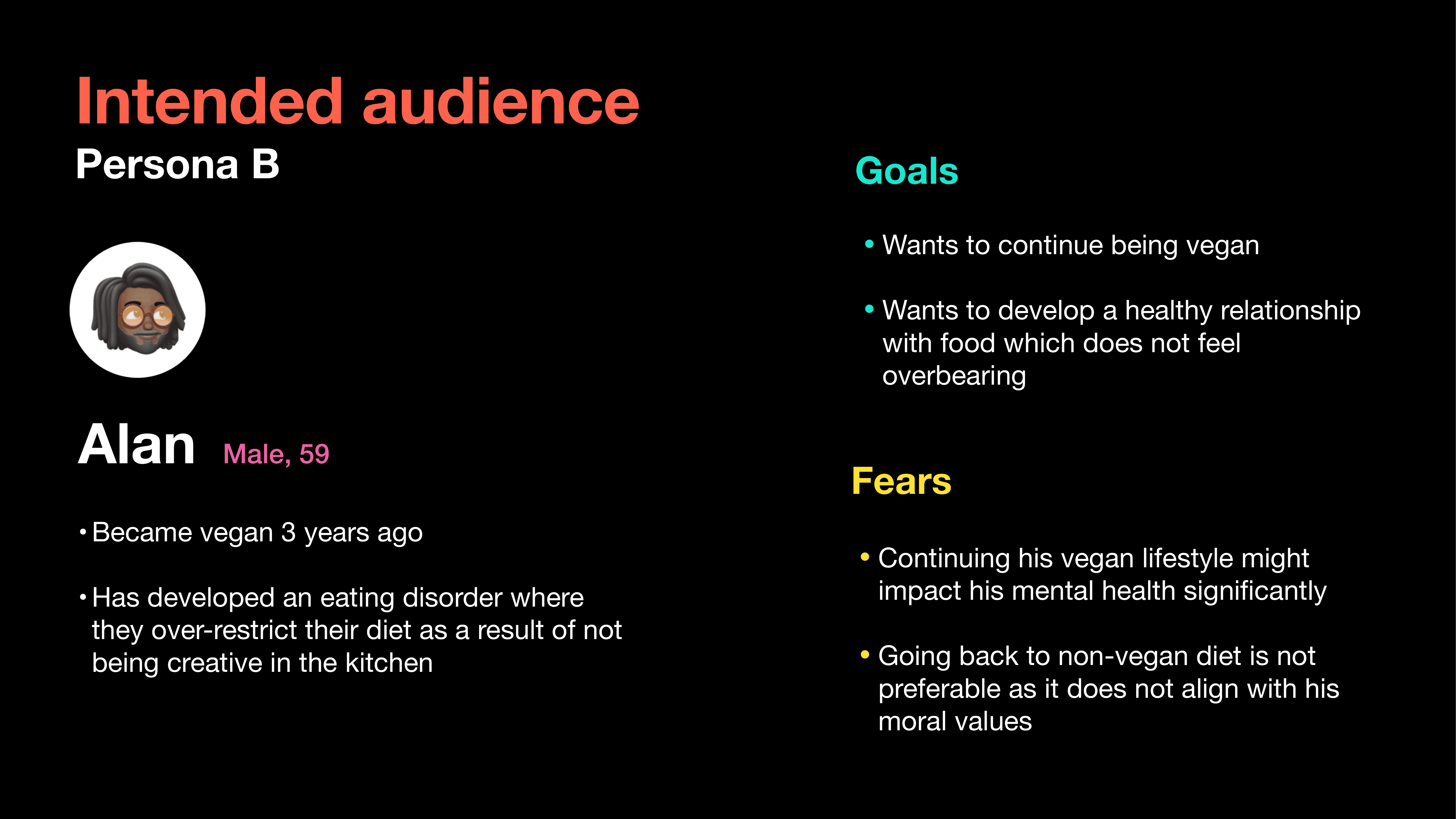
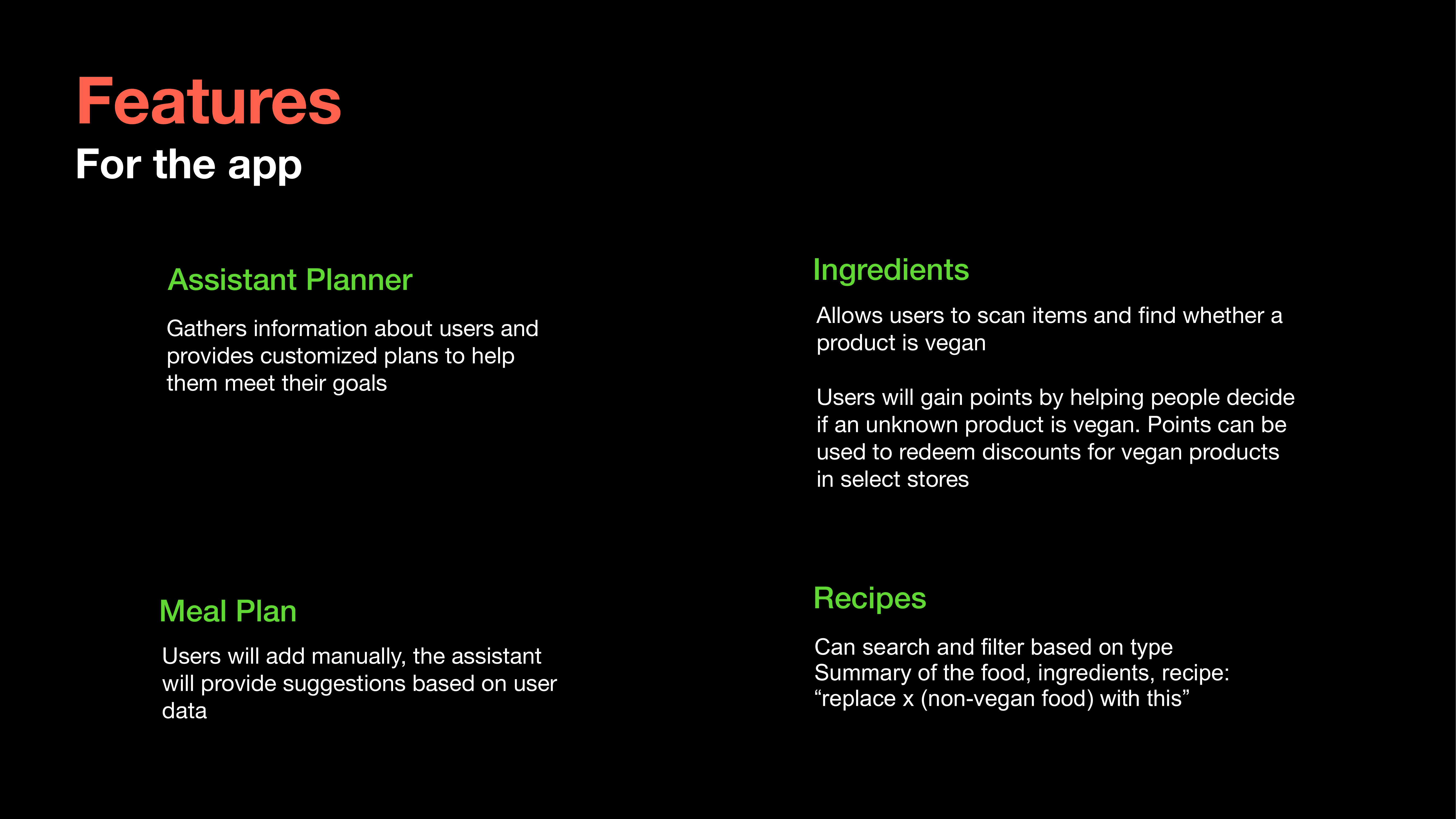
Based on the pain points of these personas, we brainstormed intervention ideas and features for the application.
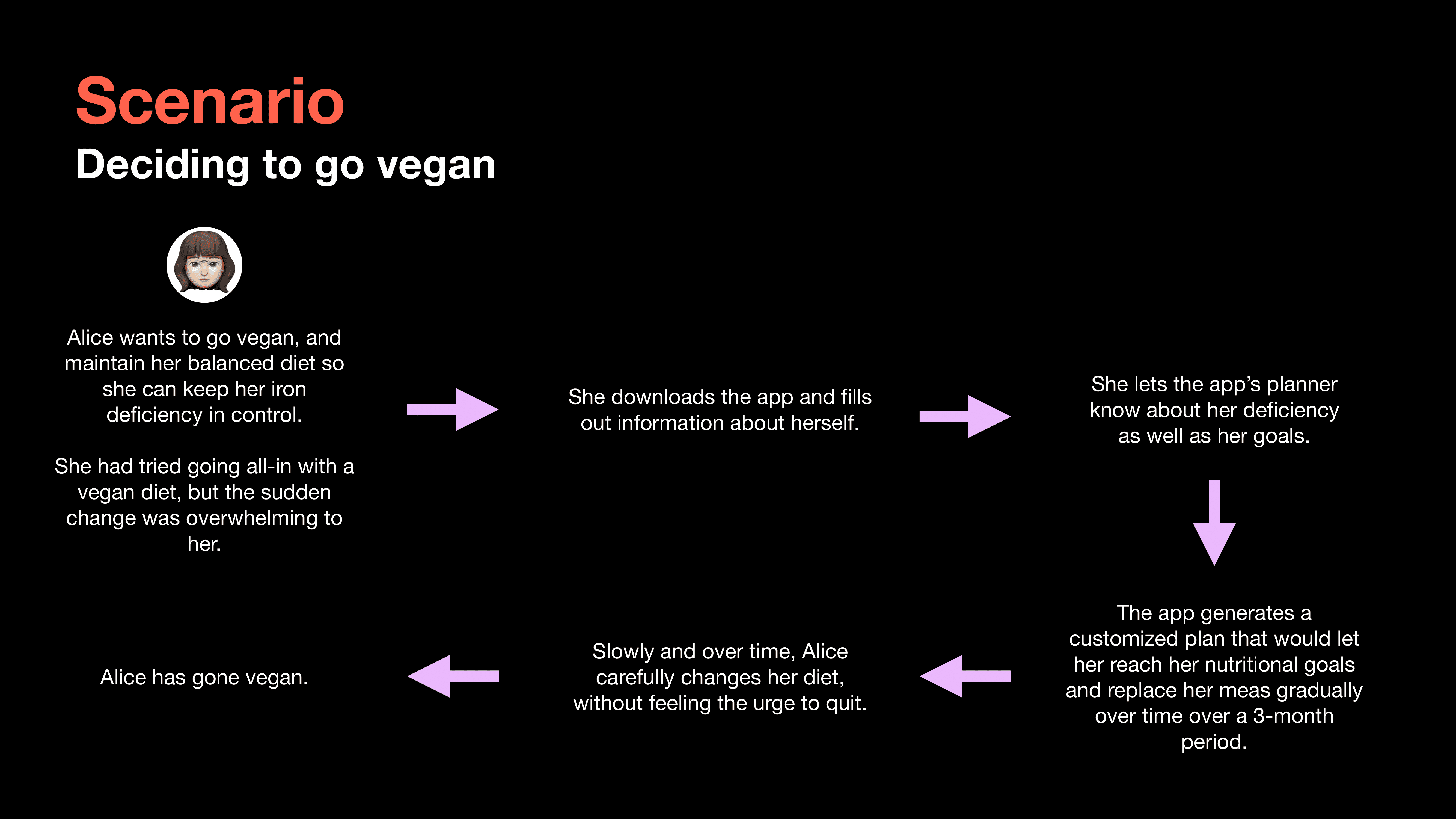
This brainstorming helped us create a journey map with the intervention in place.
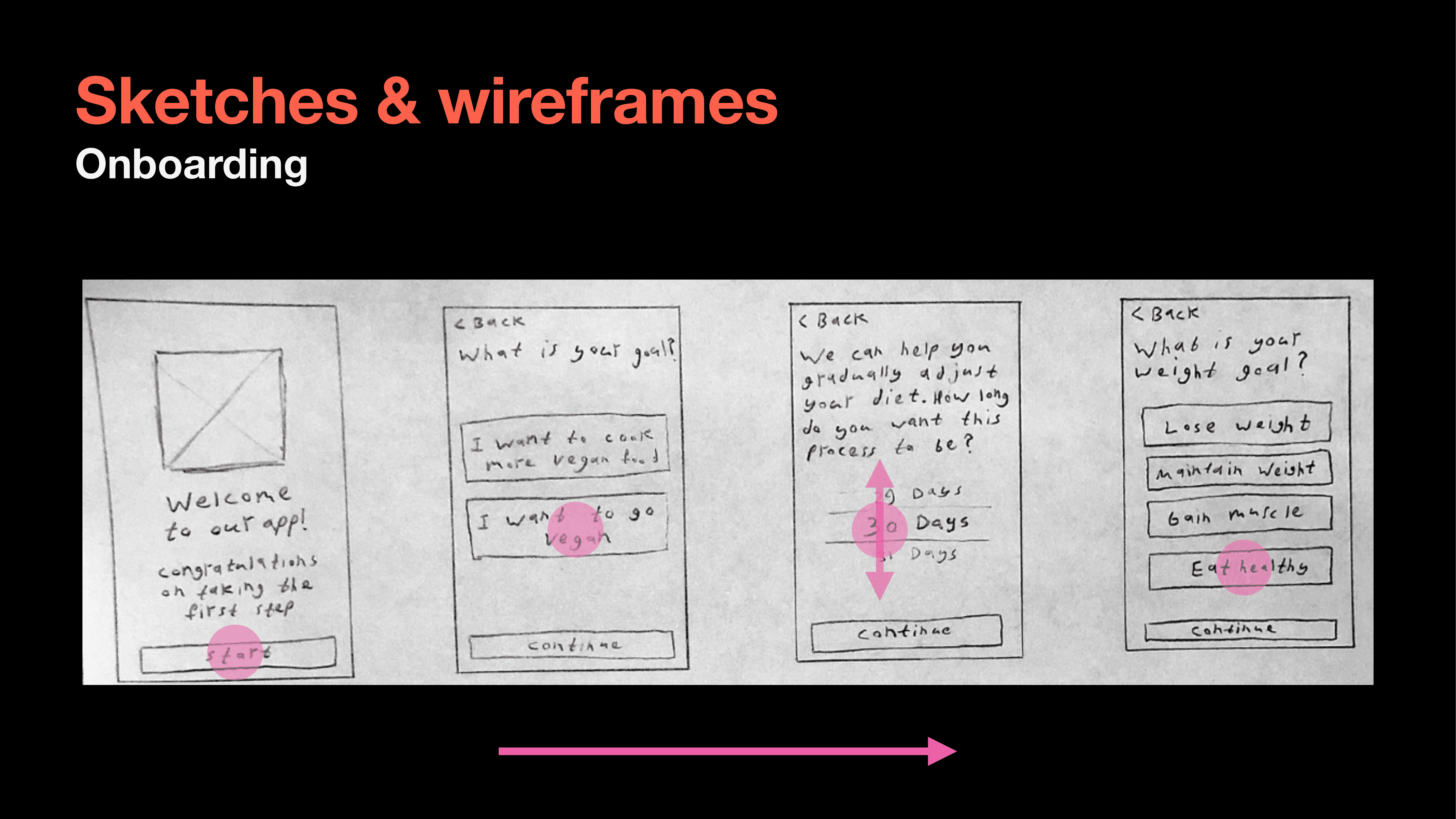
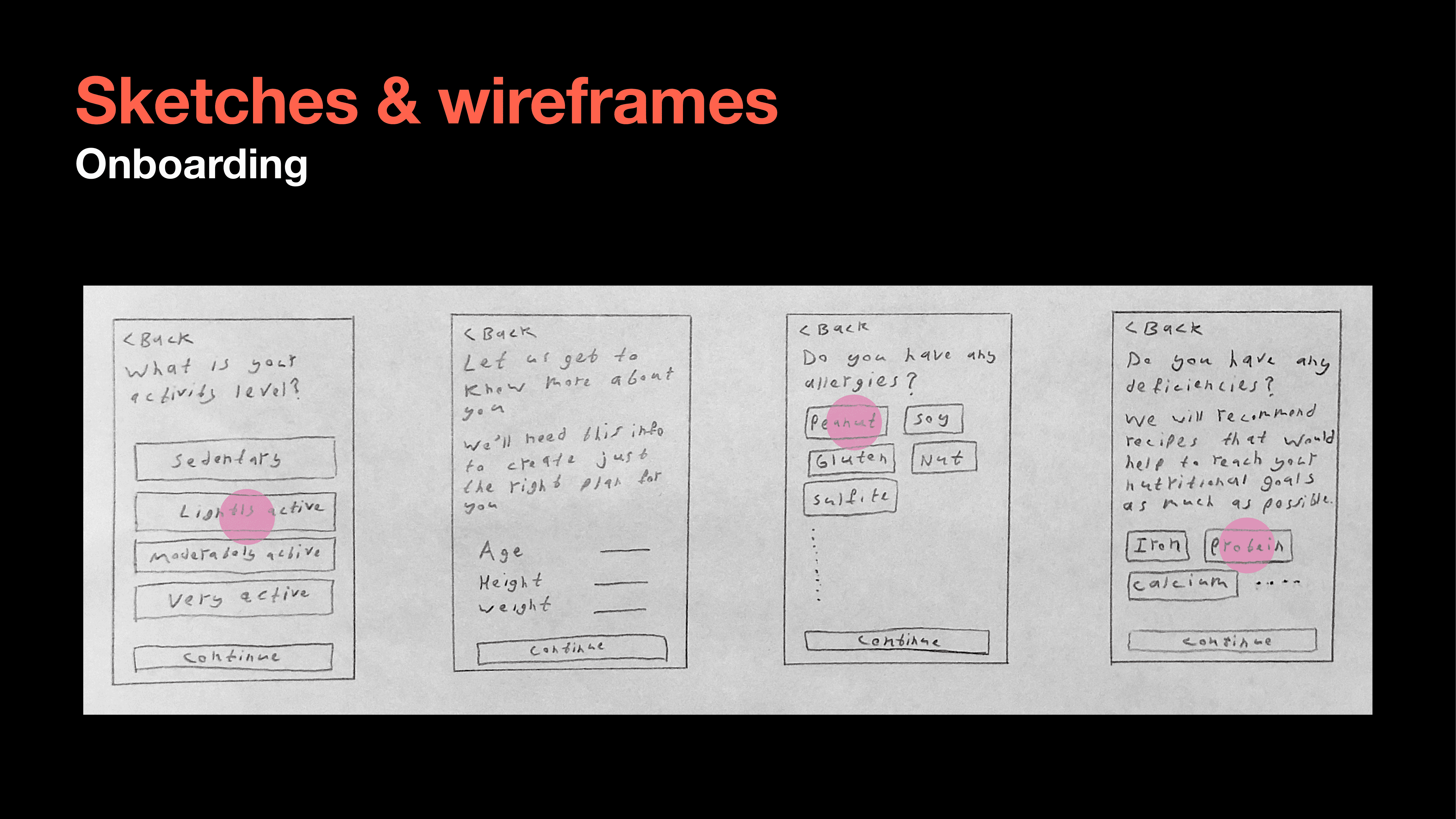
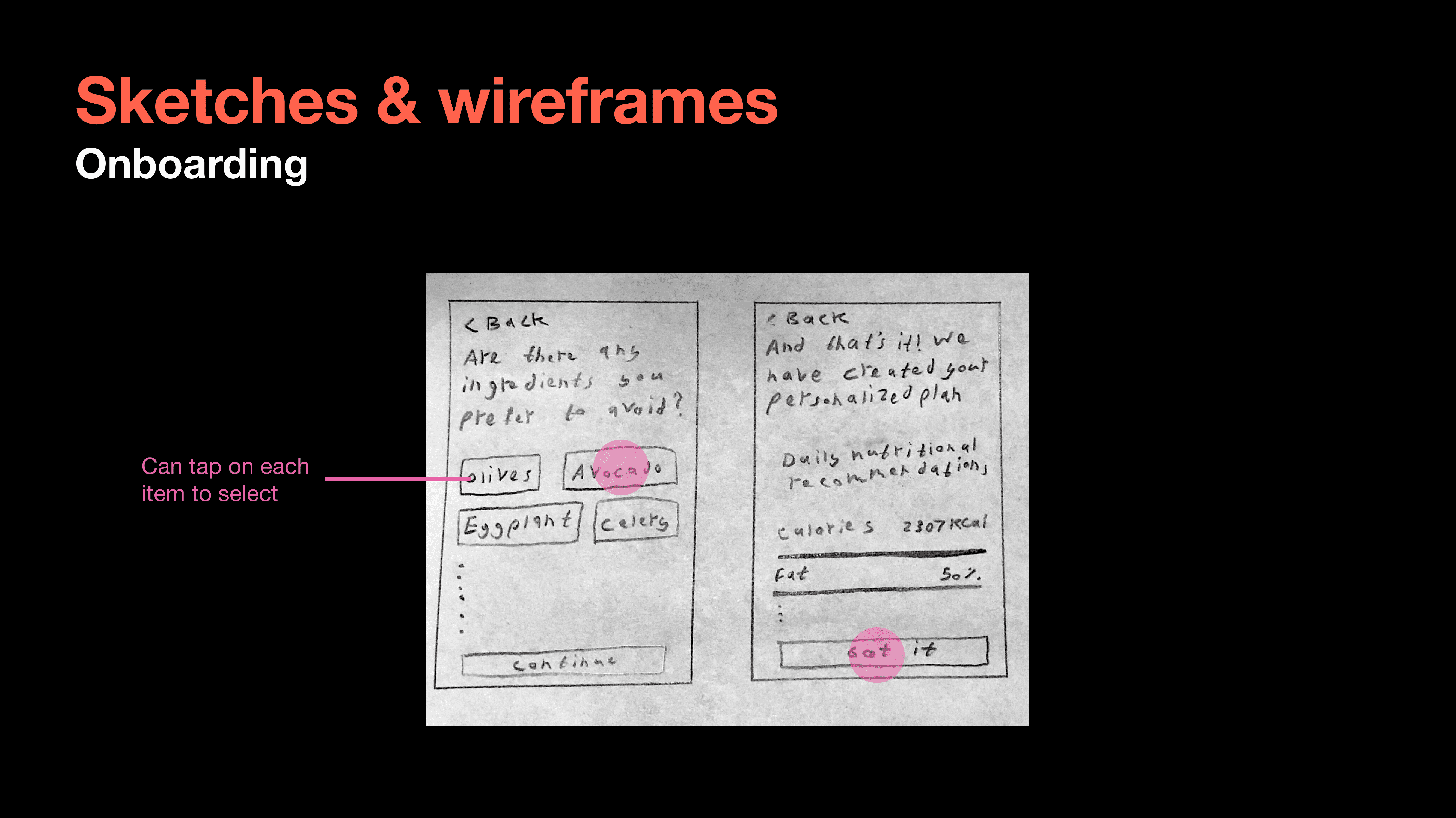
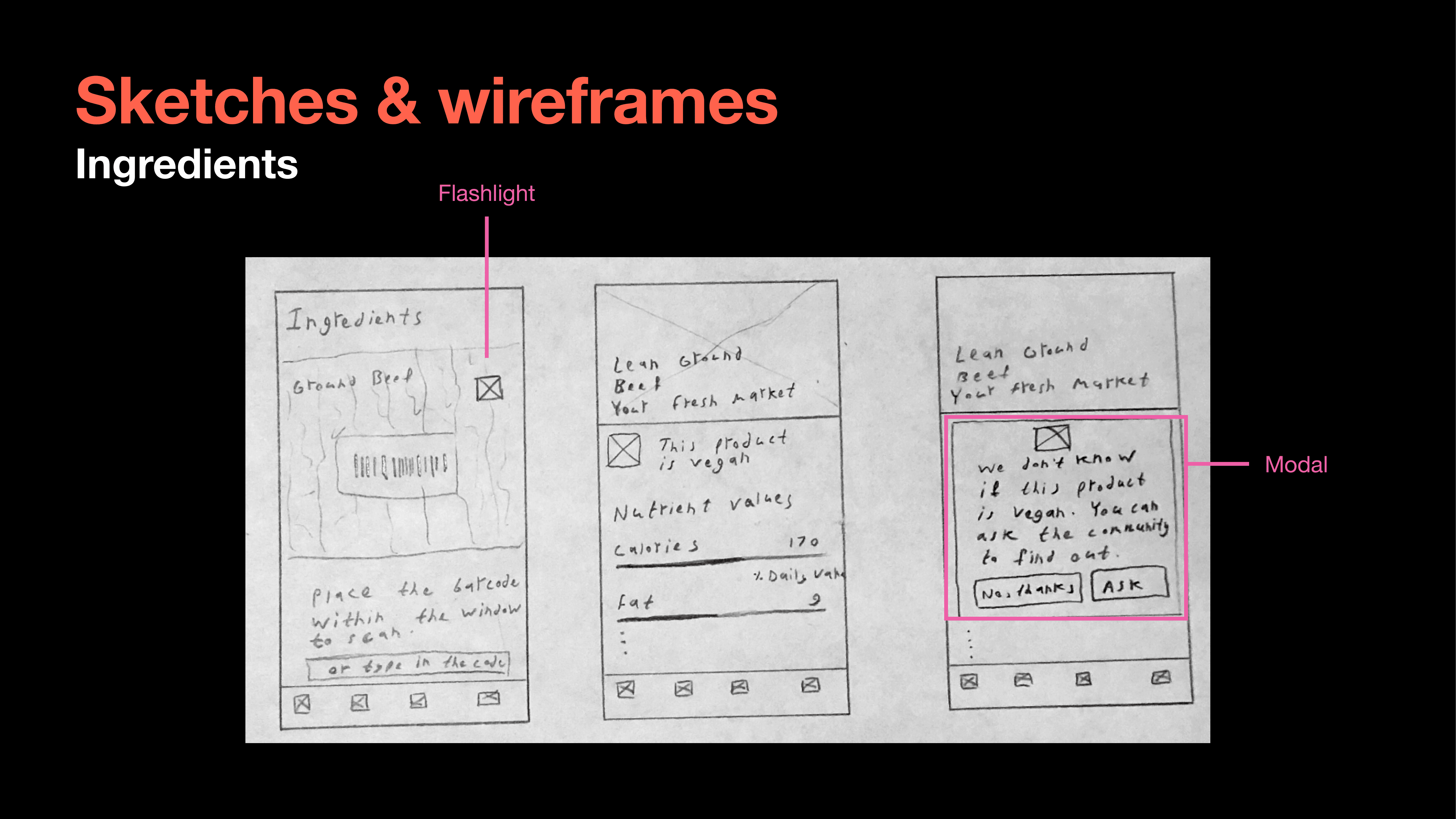
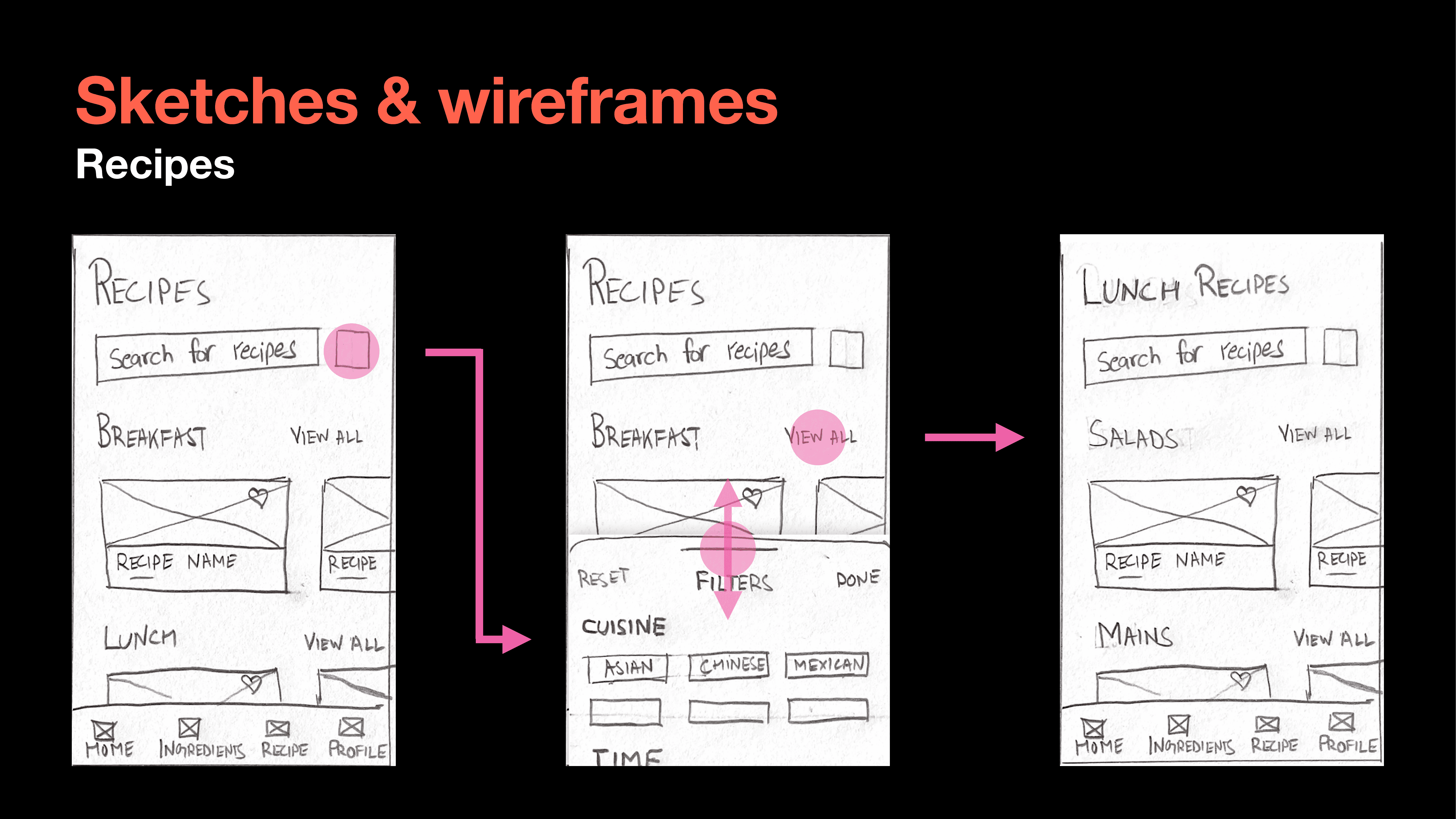
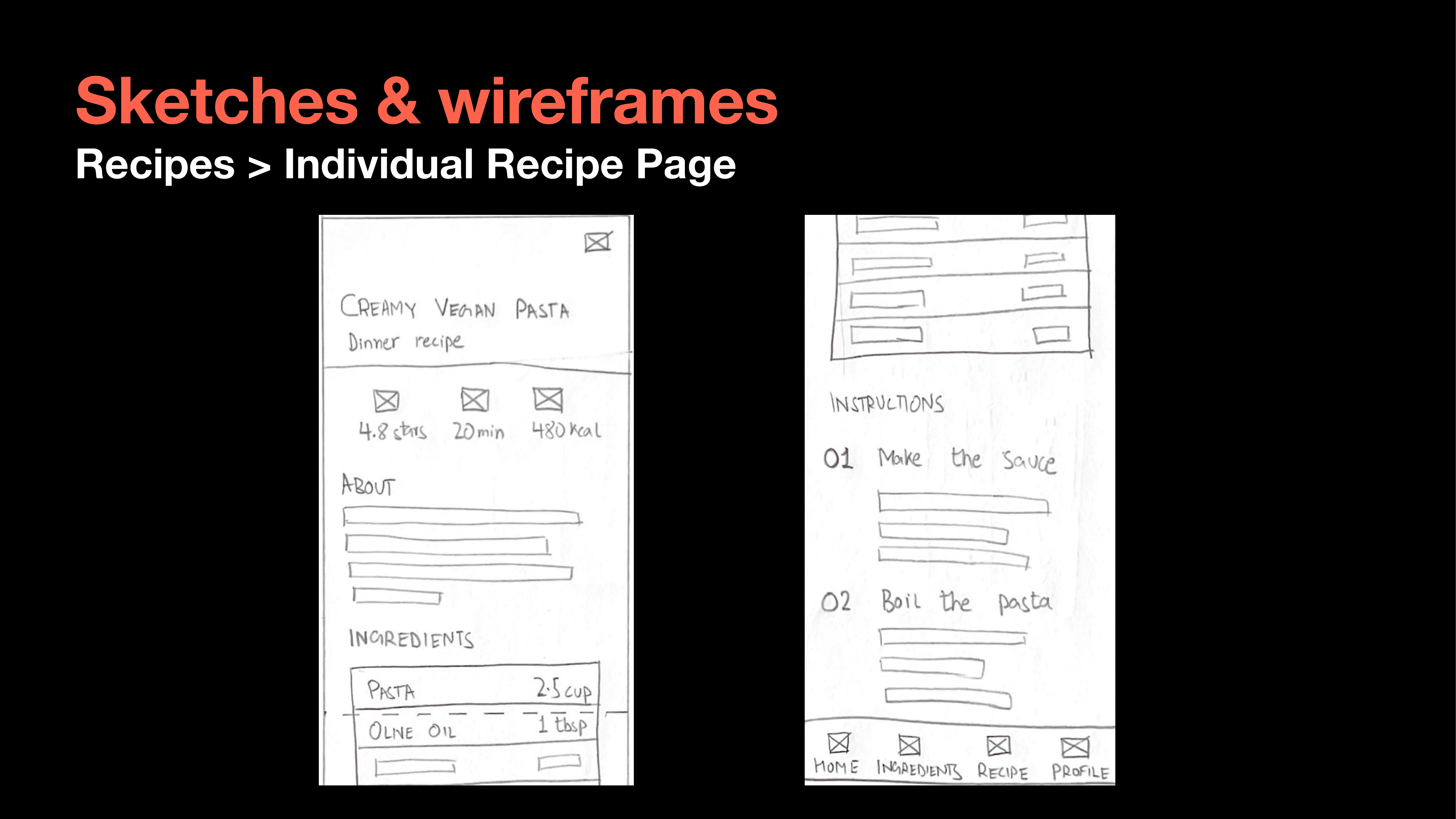
We then proceeded to sketch out initial wireframes for these pages and iterated on them. This helped us quickly change and move things around without committing to higher fidelity mockups.
Design
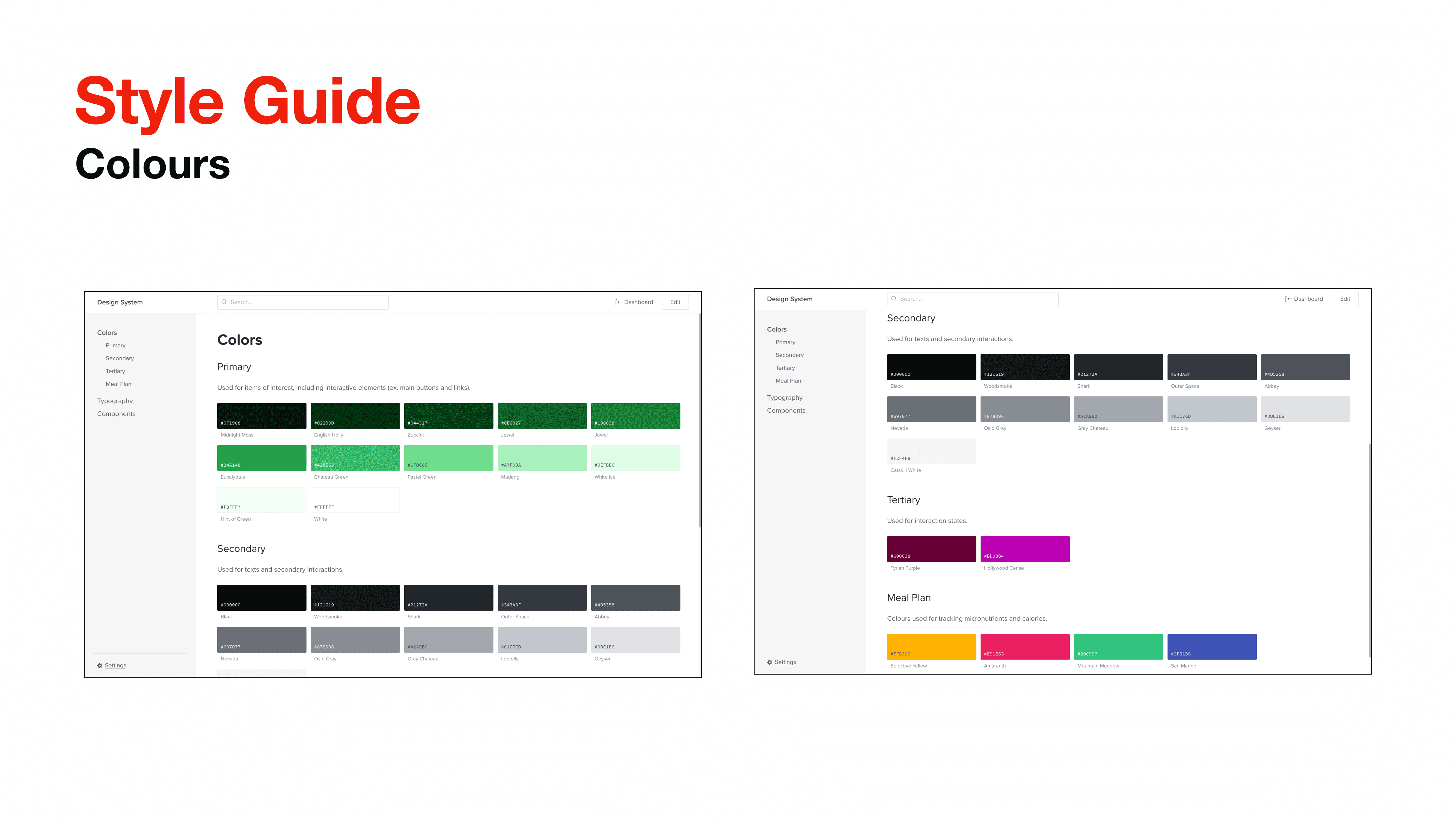
Once we finalized the wireframes and skeleton of the application, we created a micro-design system that laid out our typography, color palette, and other design specs.
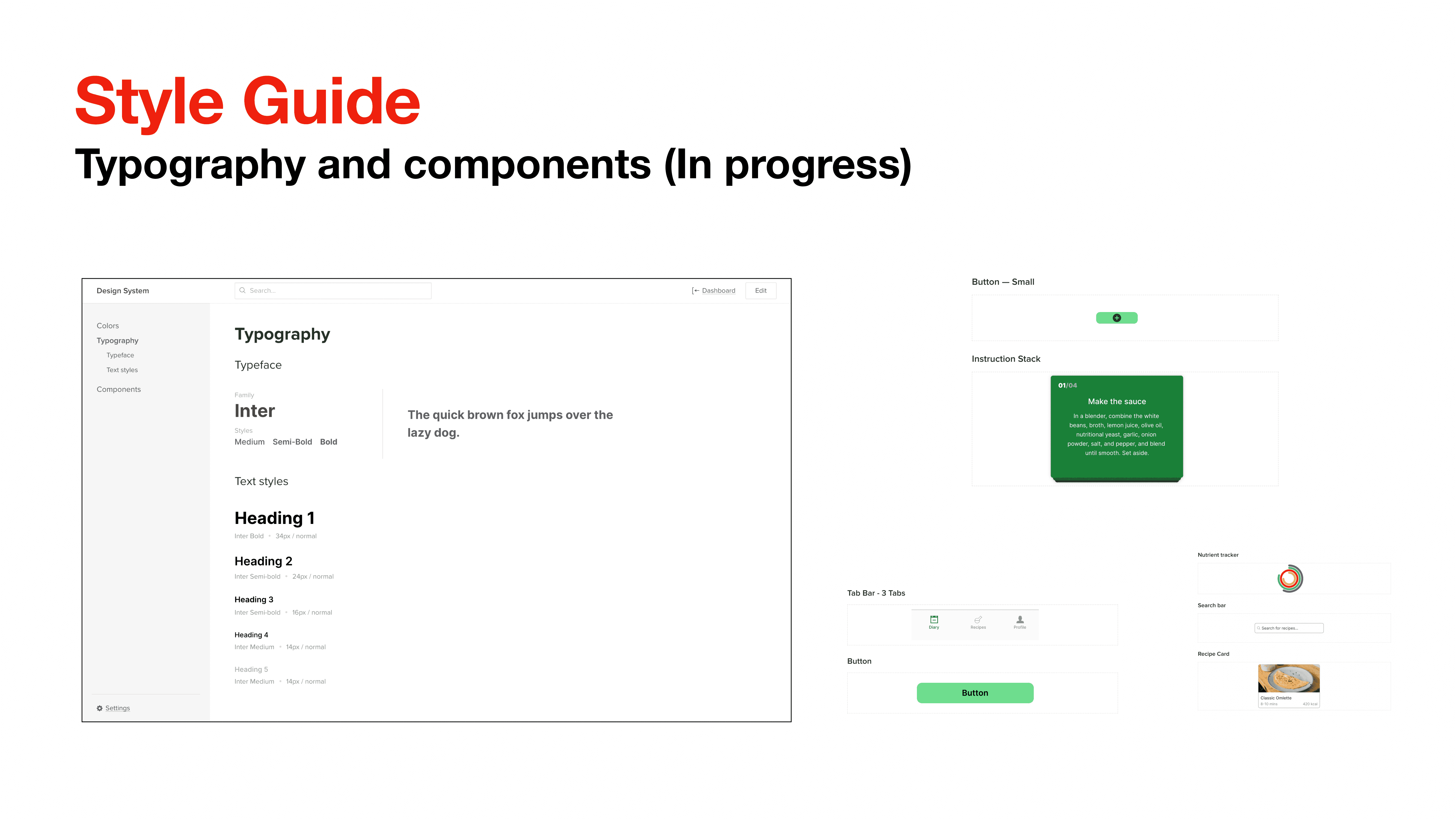
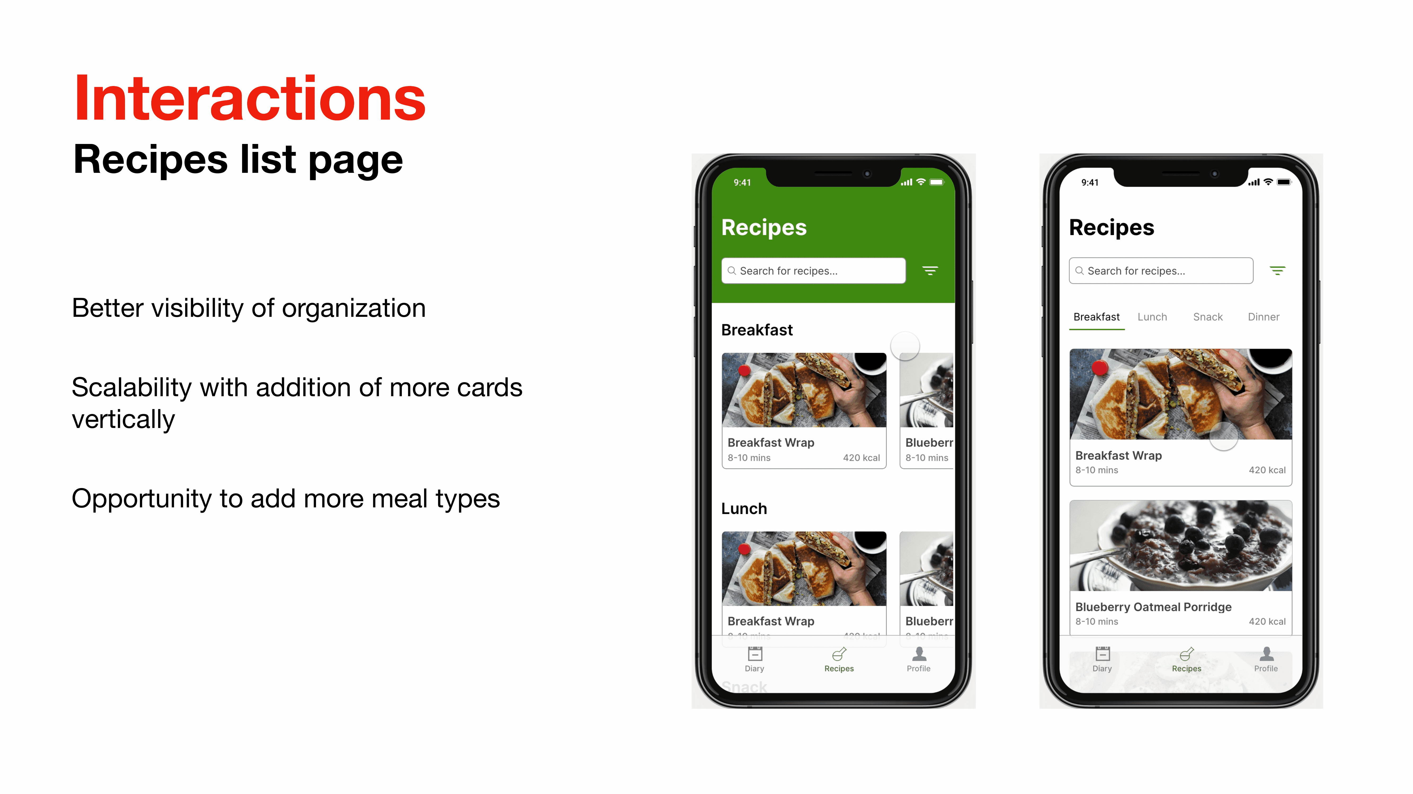
We then started designing interactions for each of our pages that we mocked up in higher fidelity.
Testing
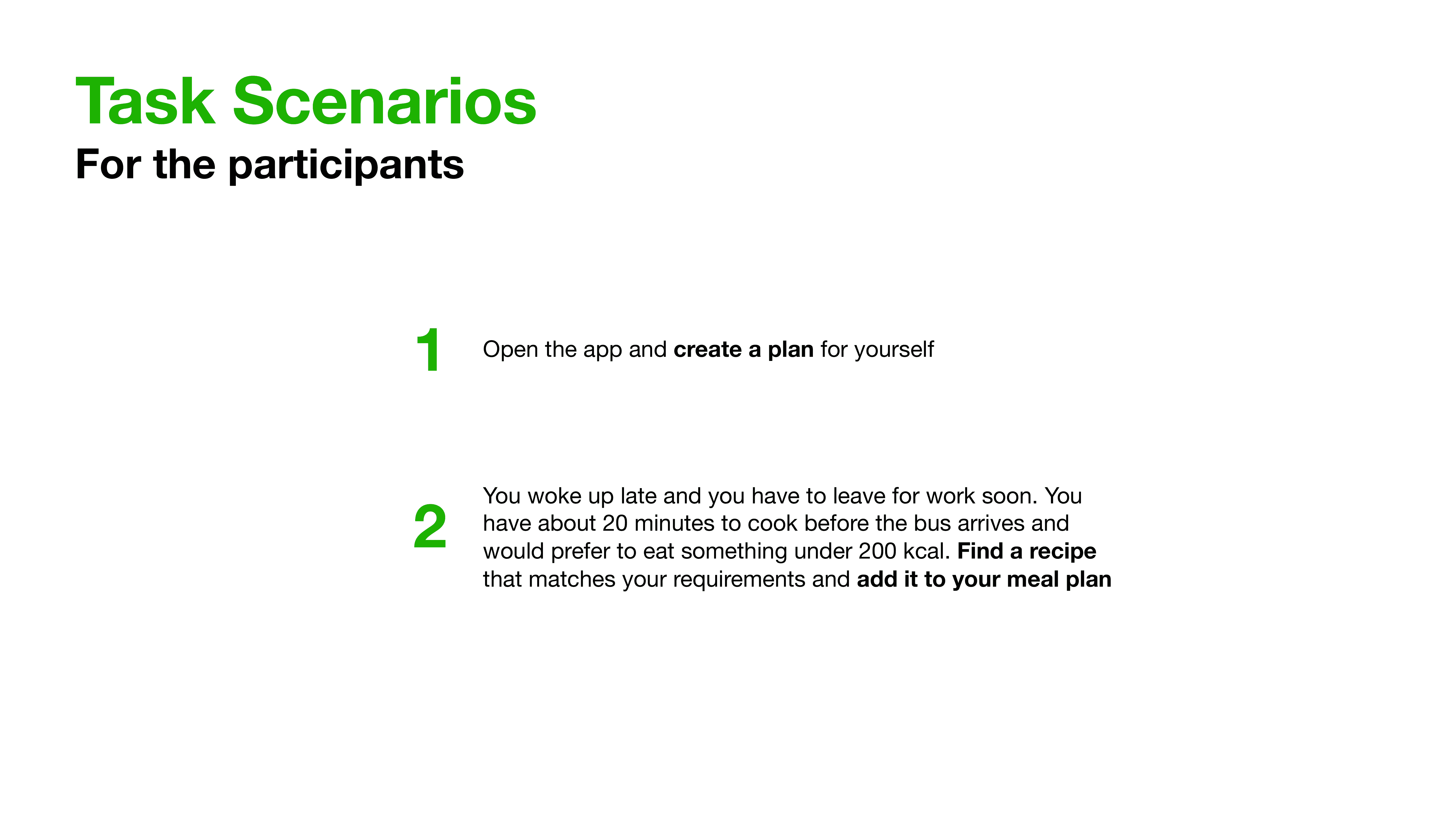
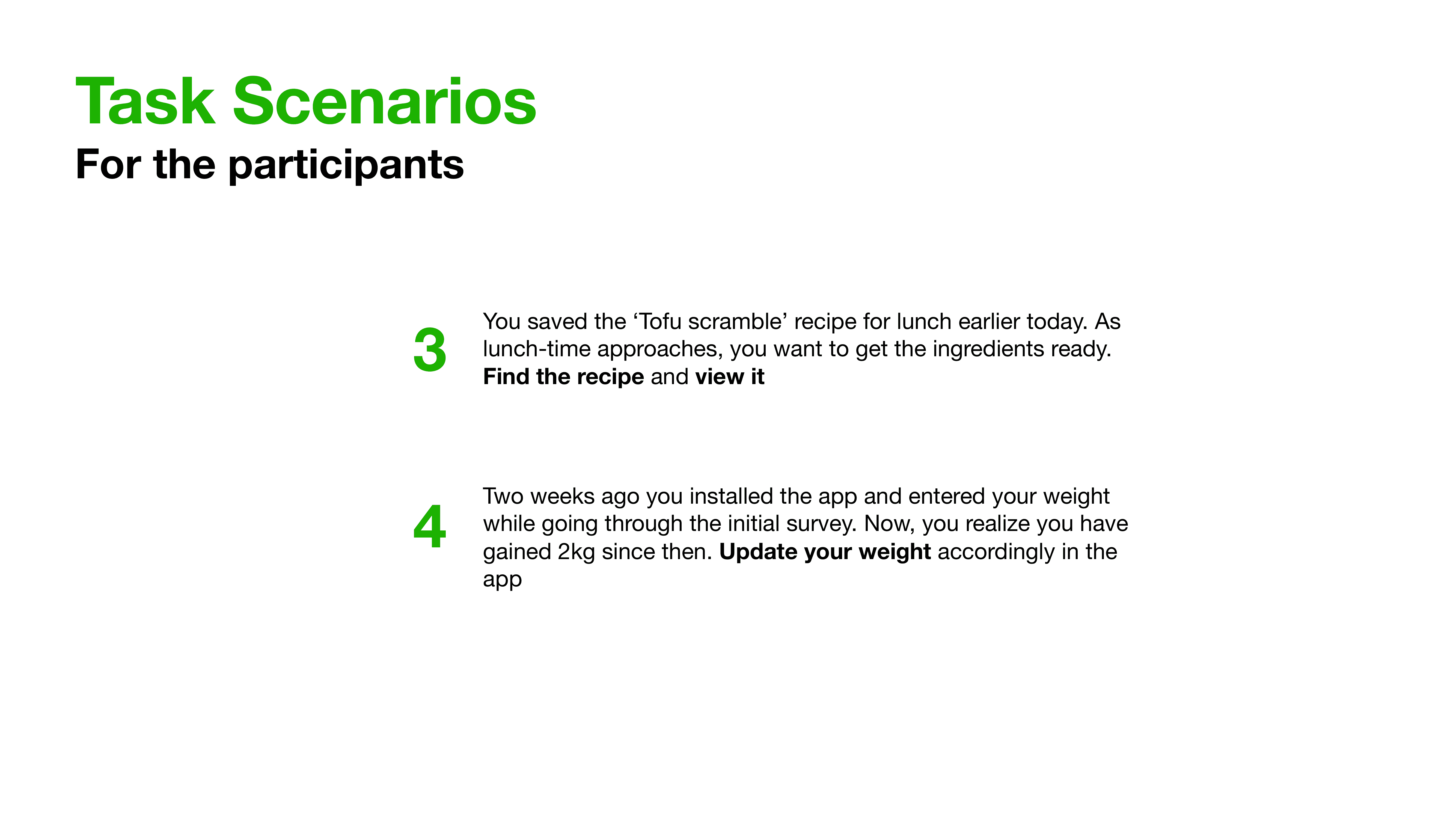
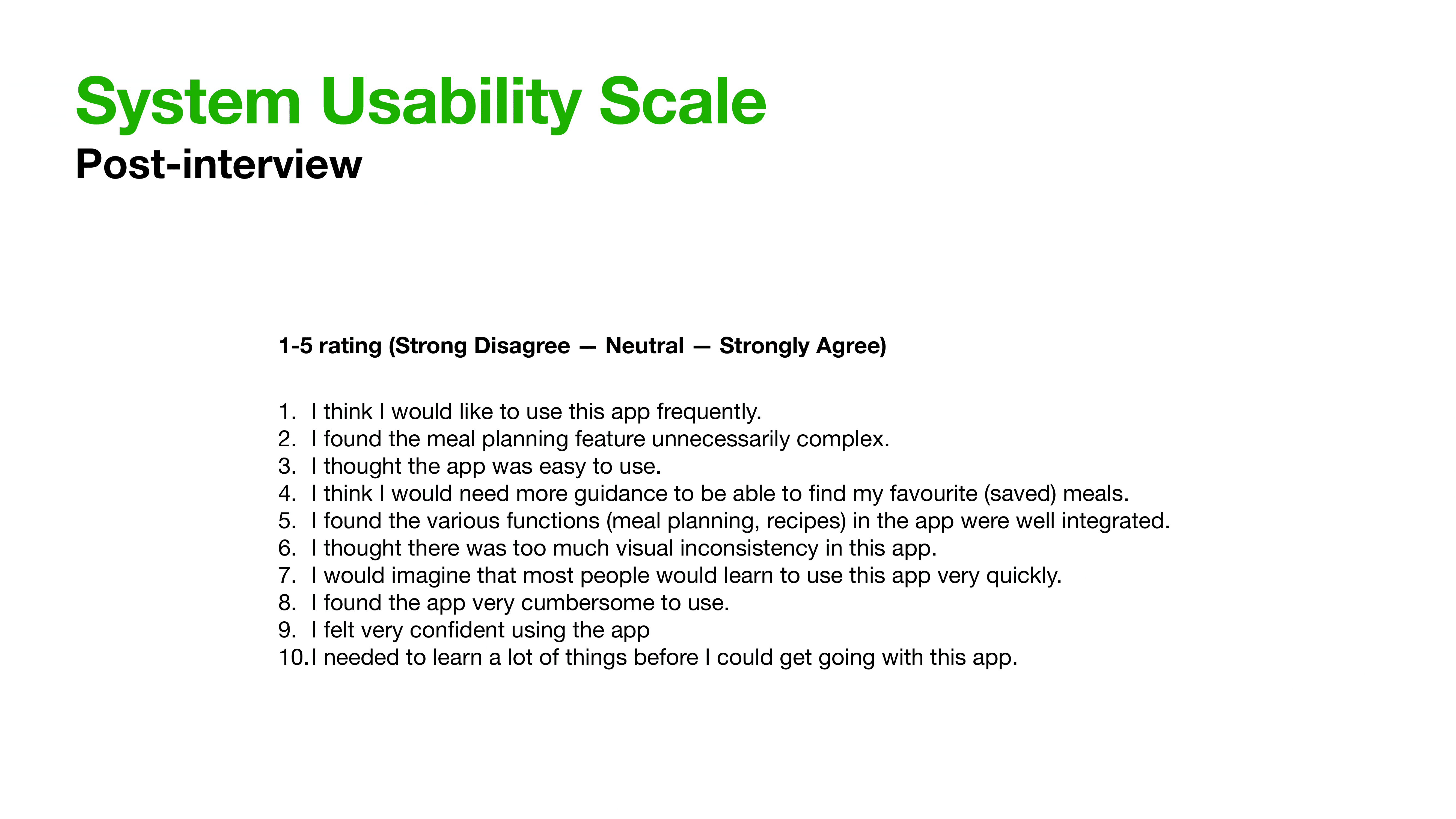
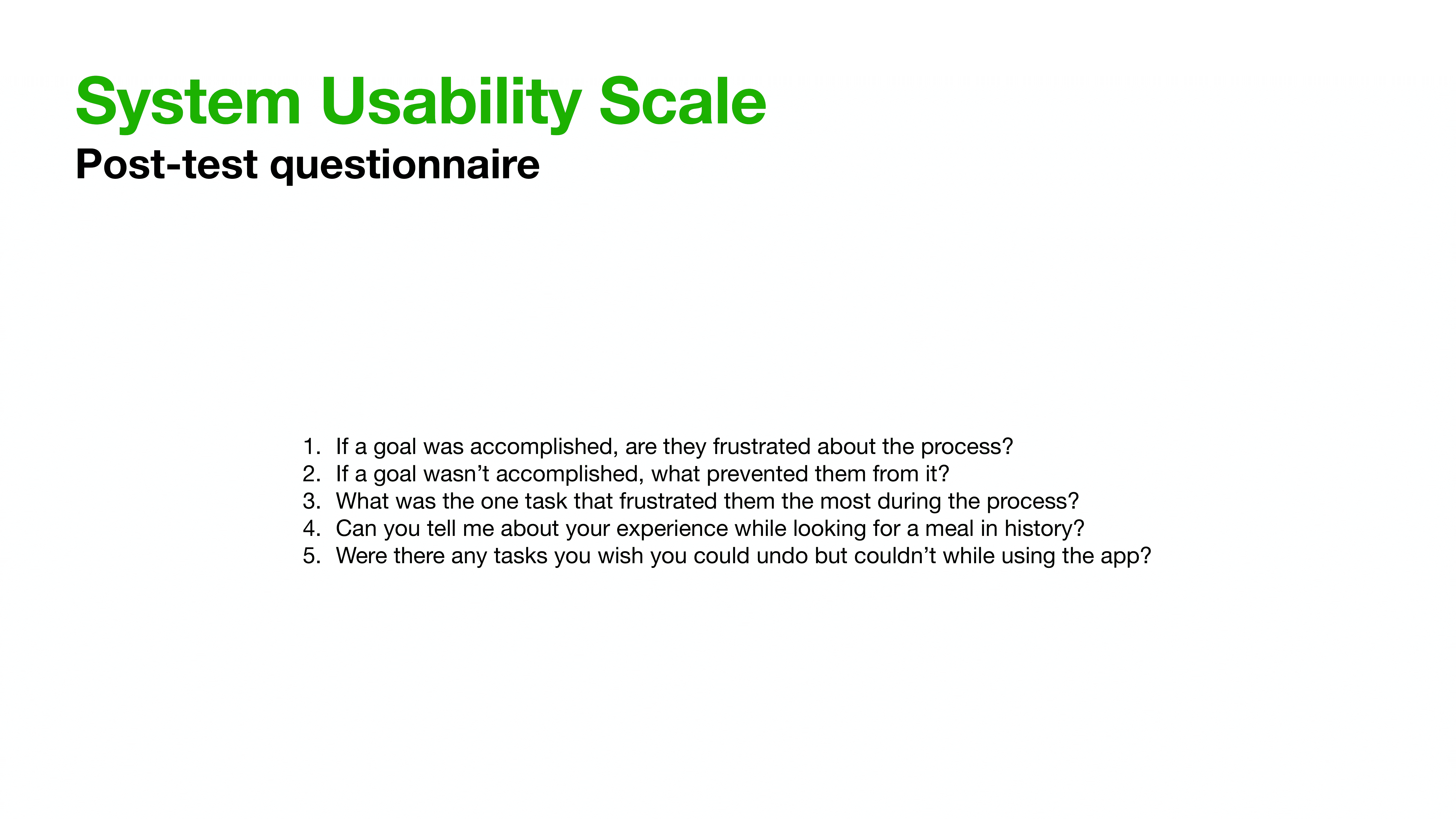
At this point, we decided that we needed to test our design decisions before moving forward. We created a usability test that focused on measuring effectiveness, efficiency, and satisfaction during tasks.
We created 4 task scenarios that the user had to complete and a post-interview questionnaire that measured both quantitative and qualitative data.
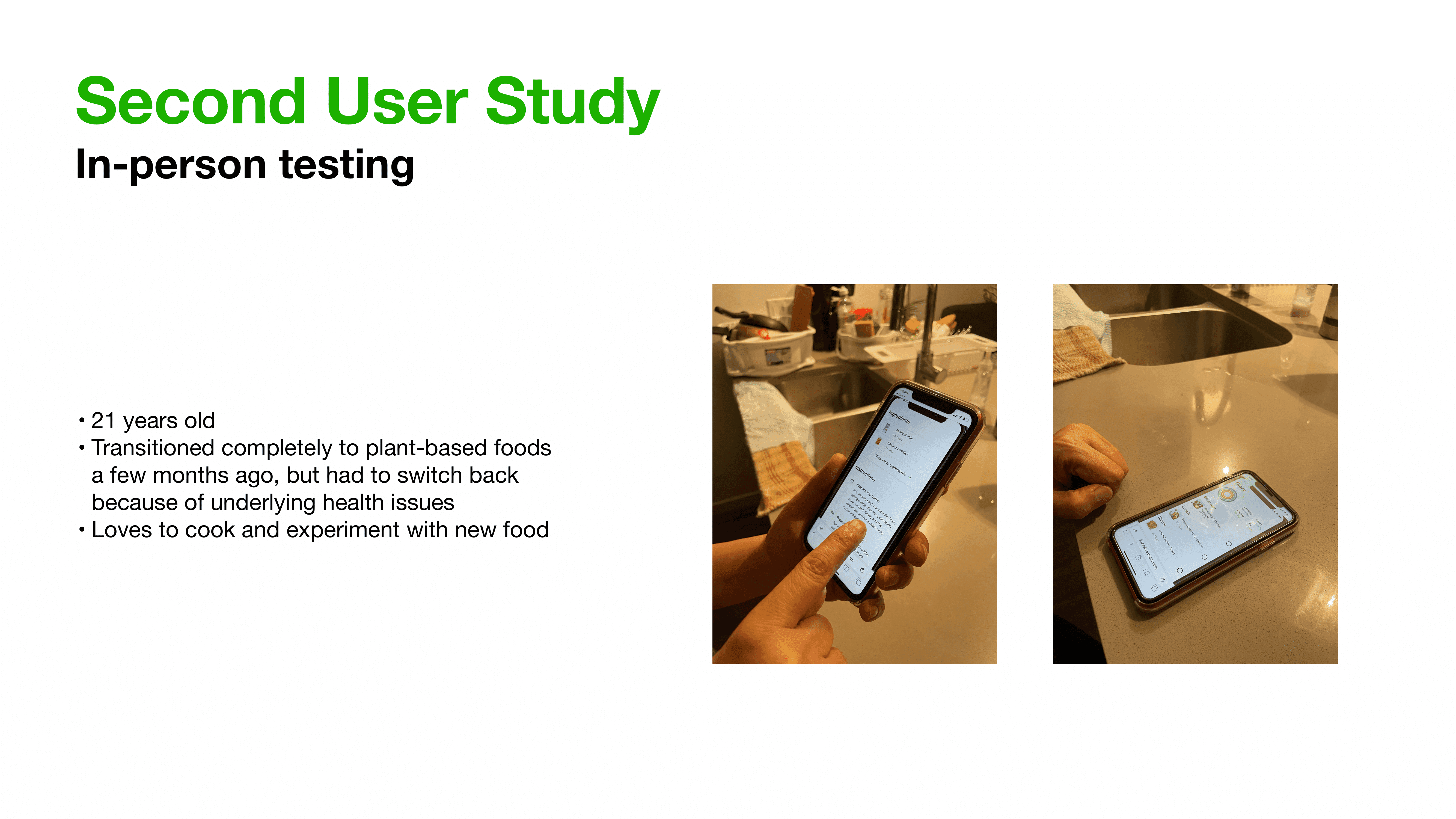
We ran 2 user studies through a mixture of virtual and in-person testing and then noted their feedback and actions.
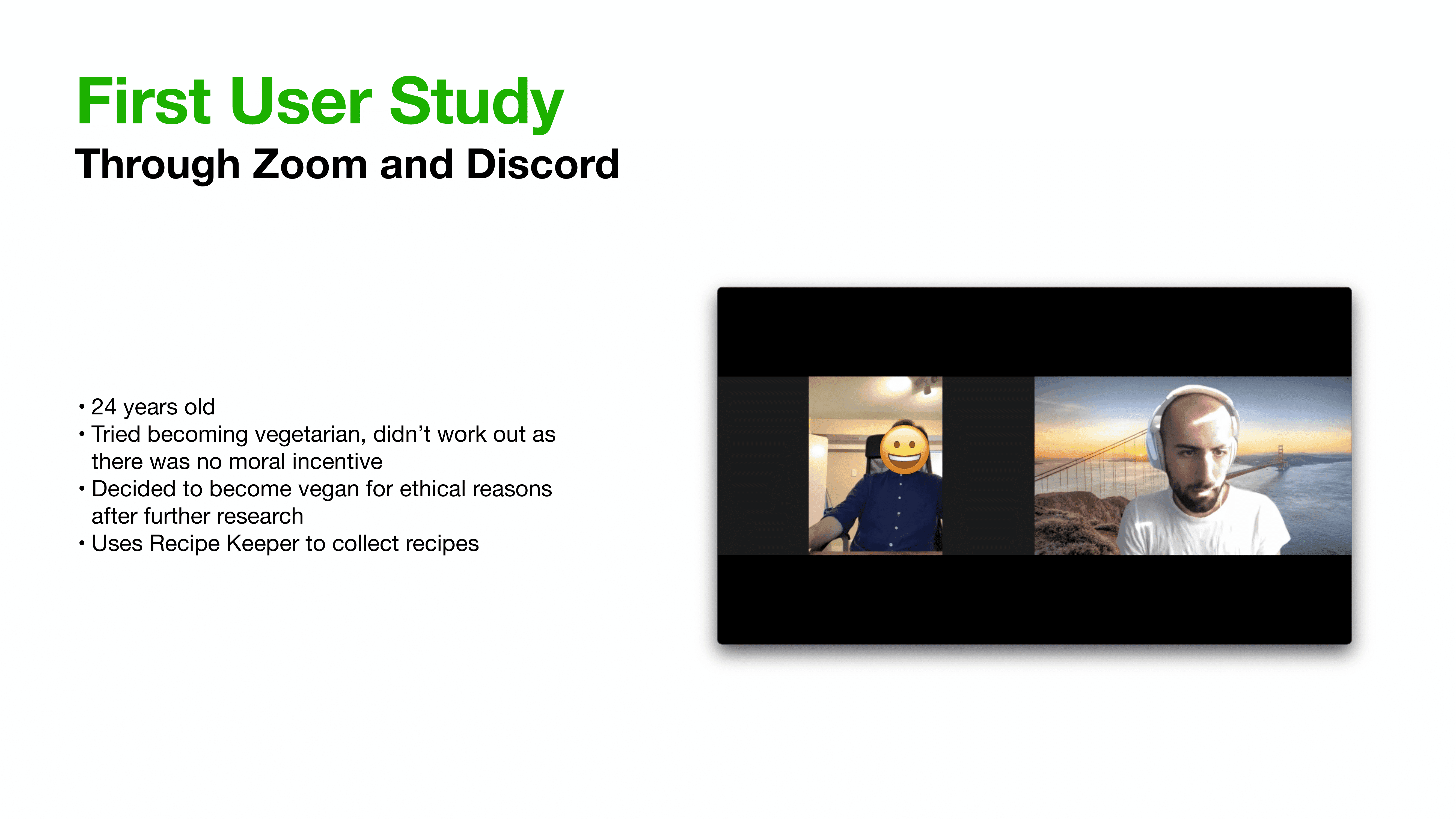
The feedback we got from these user studies was compiled into actionable changes that needed to be made to our existing prototypes.
Finally, we created an MVP using UXPin and presented it in class. Our team scored the highest points for this project that was graded on thoroughness of testing and consistency in design.
Learning
This project was completed on a three-week timeline and I would have liked to spend more time wireframing and researching before moving on to prototyping.
My biggest takeaway from this project was learning to collaborate and voice my opinions in a remote-first environment because of the pandemic. This pushed me to be clear and concise in this communication both with collaborators and with study participants.