Oswald Labs
Creating an accessible interface for the visually impaired internet users


Context
- I co-founded Oswald Labs, an accessibility technology company, in 2016. This platform, Agastya, was our flagship product and was built over a few months with tens of collaborators across design and engineering. This case study is a small piece of a much larger project.
Role
- UX Design
- User Research
- Development
Tools
- Figma
- HTML/CSS
- JavaScript
Team
- Anand Chowdhary
- Mahendra Raghuwanshi
Introduction
At Oswald Labs, an accessibility technology startup that I co-founded, our organization’s goal was to help people with visual impairments consume rich content on the internet.
This project involved heavy UX research and testing to ensure that our product truly solves for our end users.
How might we make websites friendly to people with dyslexia and visual impairments?
Research
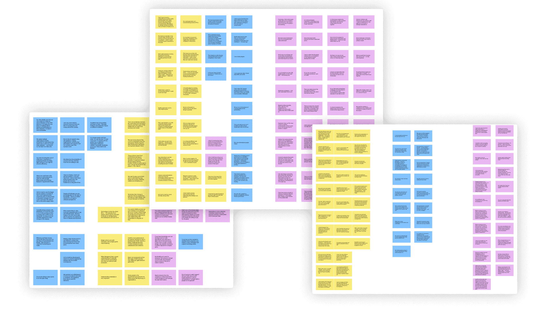
Before engaging with this project, our organization had already identified that the space of web accessibility needed work by consulting with academia and other industry members. Thus, our research was guided towards finding specific pain points and opportunities related to accessibility on websites and we conducted multiple user interviews to find these.
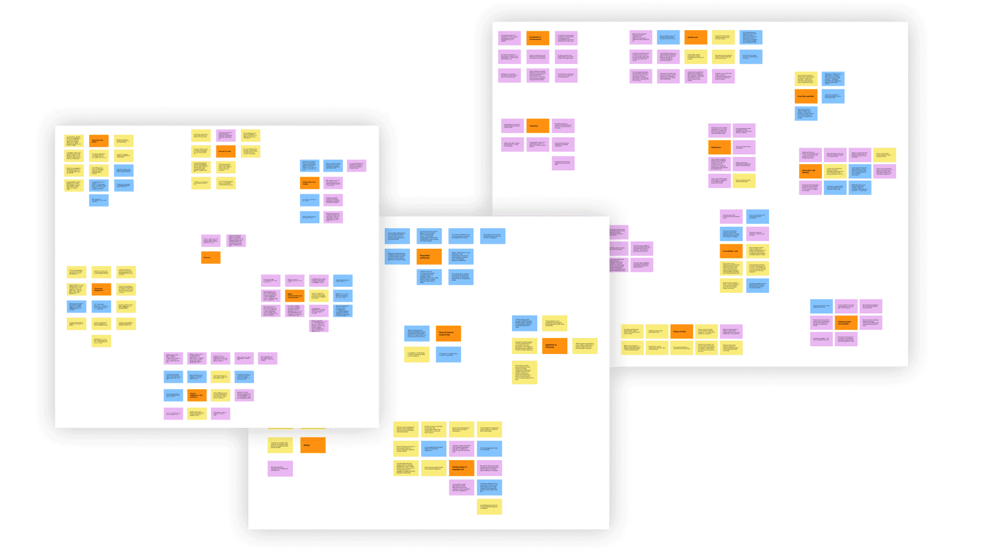
Next, we sorted these insights by creating affinity diagrams to better understand the results of our preliminary research.
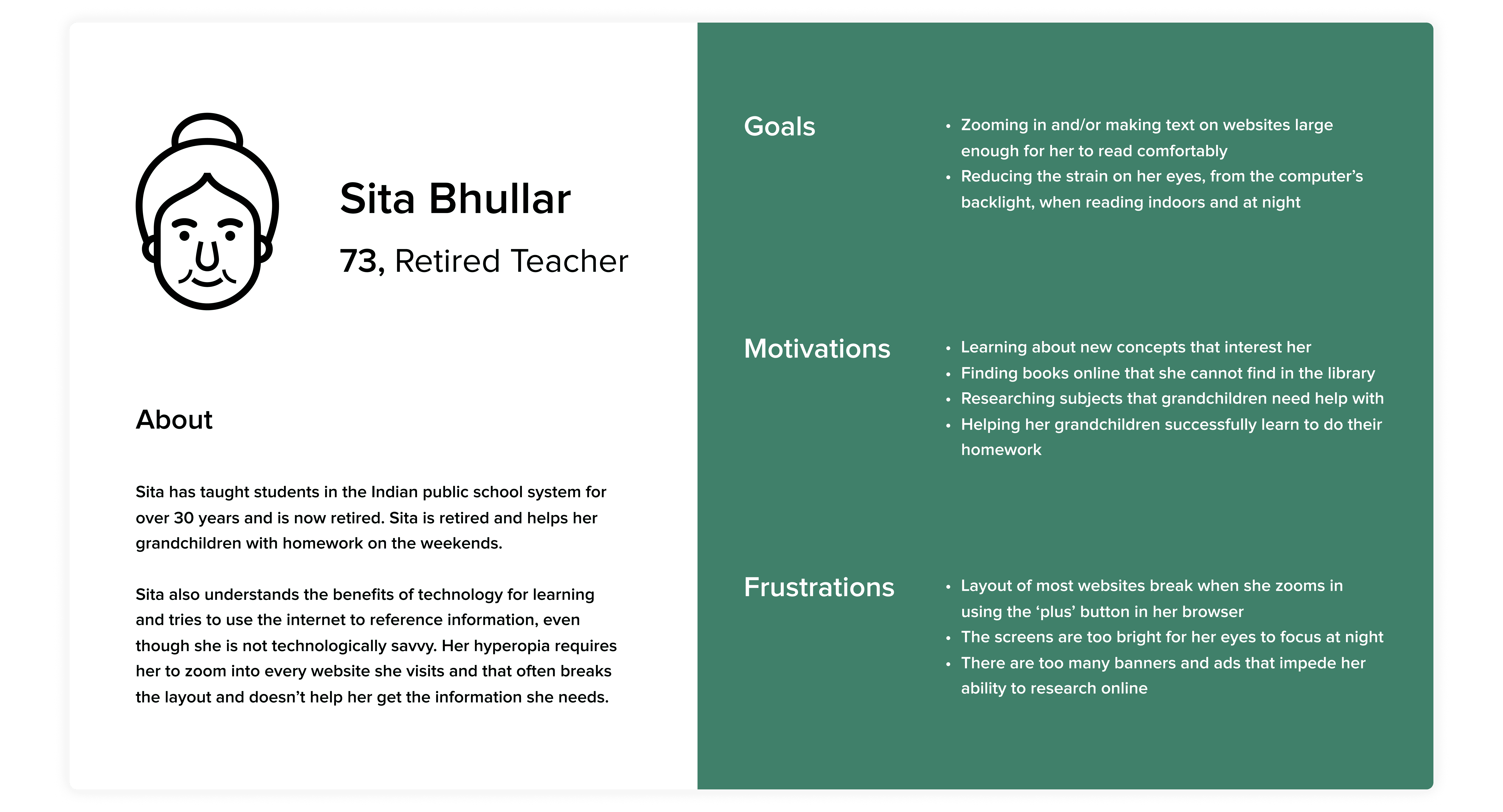
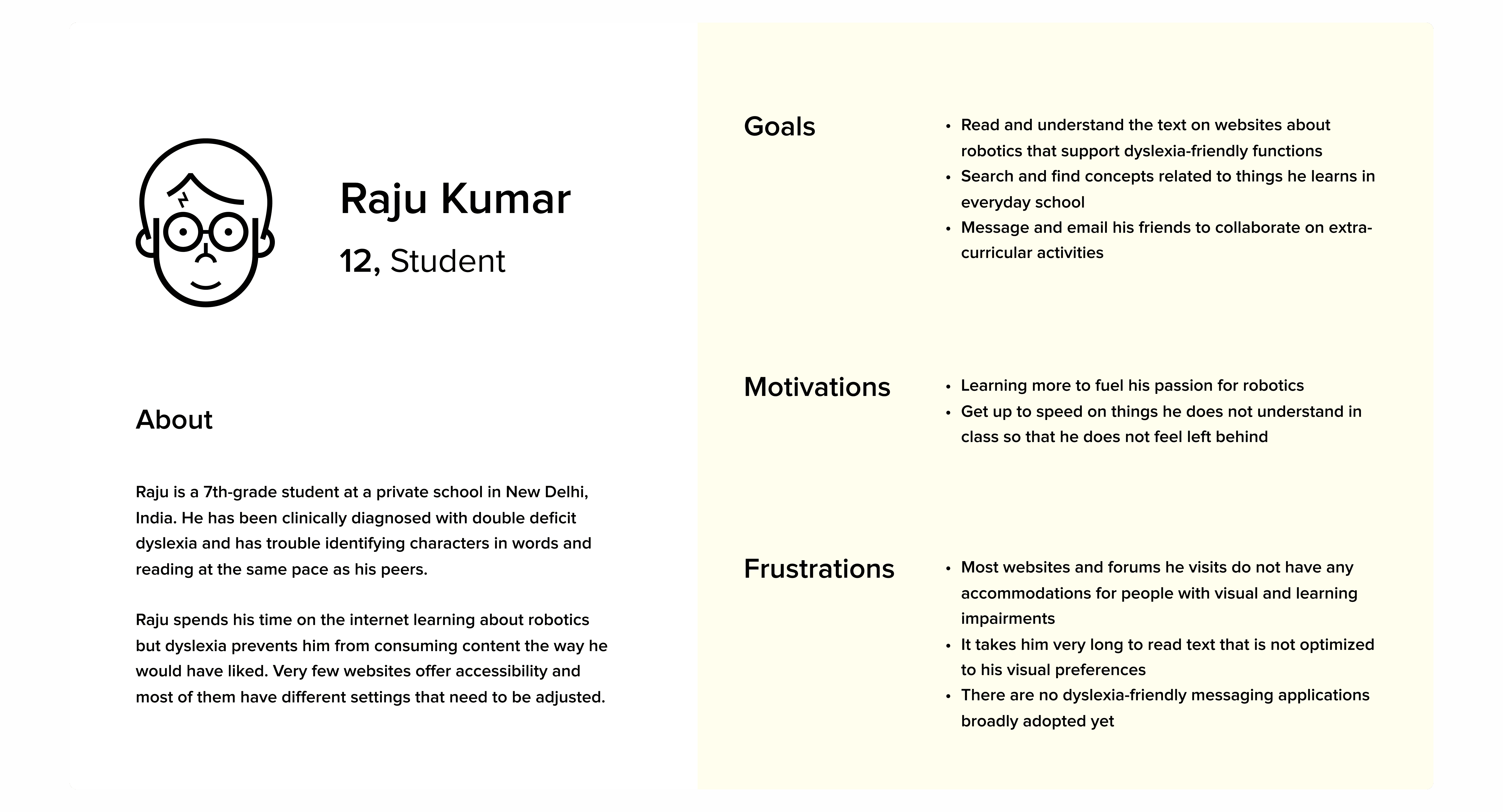
We then created personas that reflected our research so that we can refer to their needs and goals during the design process.
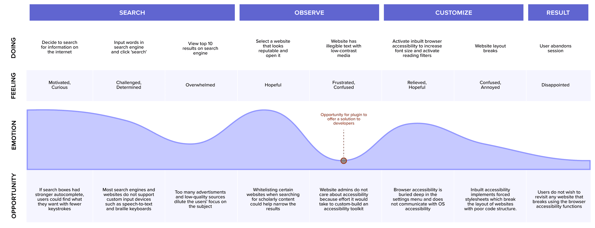
Finally, in the research process, we created journey maps for our personas that clearly laid out which parts of their experience needed the most improvement.
Design
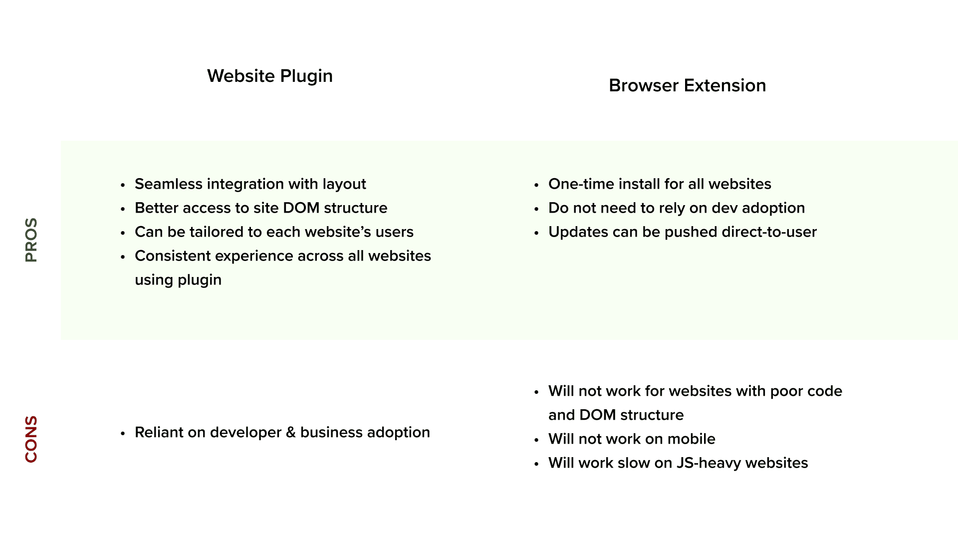
Our team came up with two broad solutions that could be implemented on websites: a chrome extension and an in-site plugin. Through conducting first-impression interviews and aligning with the business goals, it was determined that an in-site plugin was the best solution to serve the needs of our users.
We first created divergent low-fidelity wireframes and then iterated by aligning on feedback from constant usability testing.
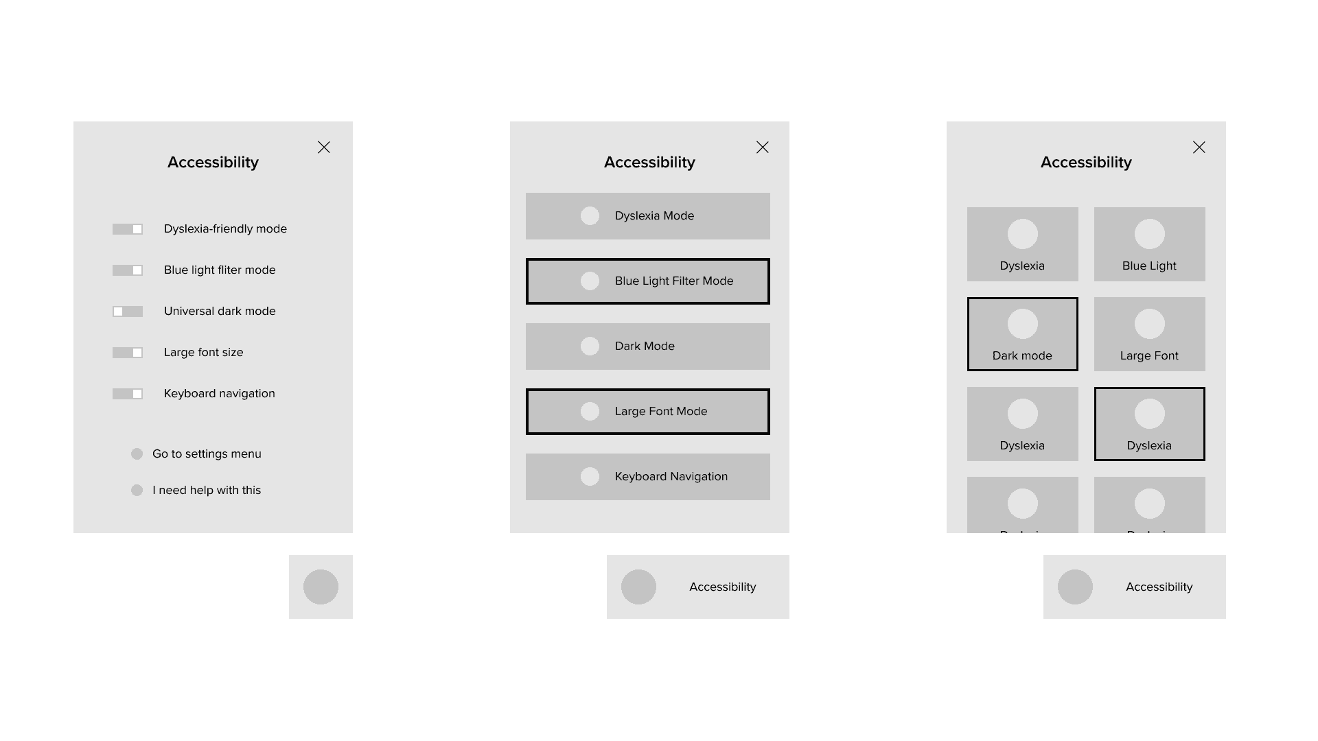
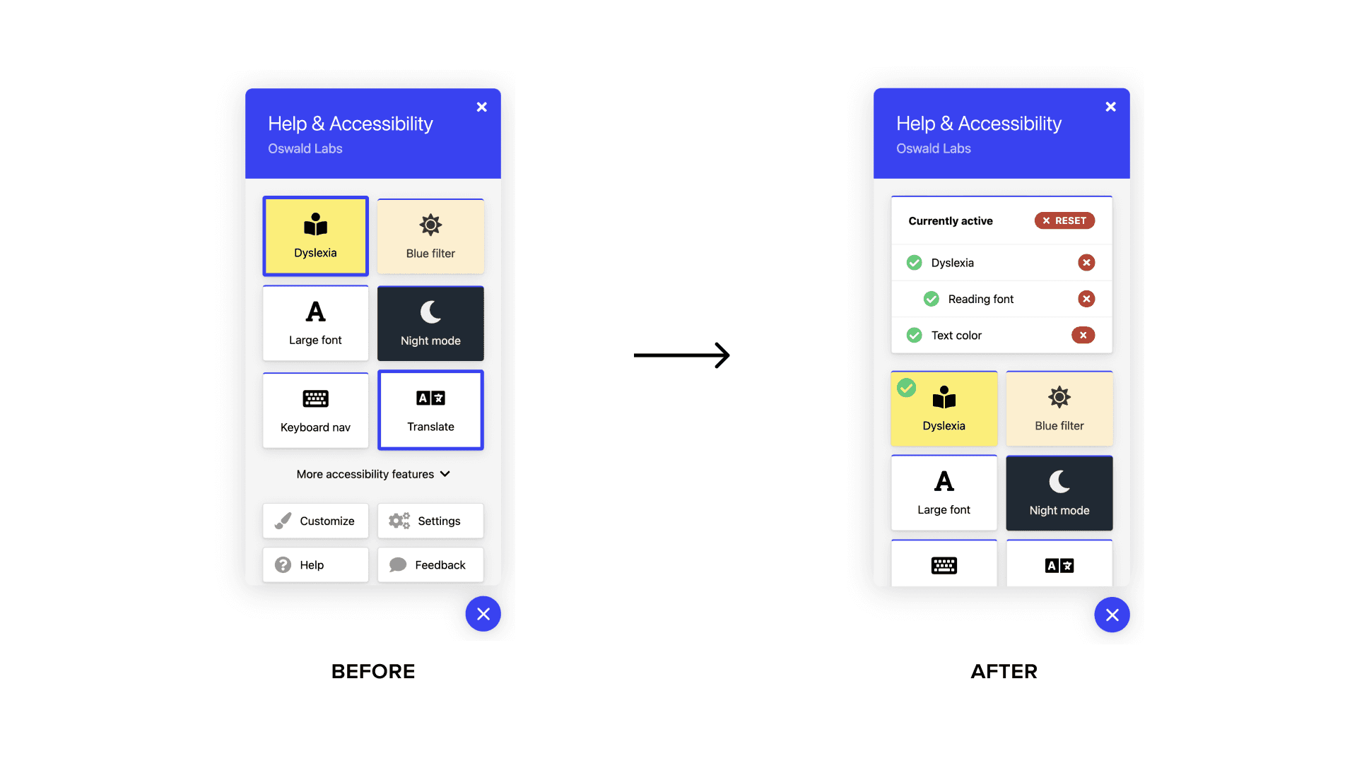
Our initial iterations listed all of our accessibility modes and features on the screen when the user opens the plugin. However, users reported that this was overwhelming to them and often made them close the plugin before getting to the mode they wanted to activate. We solved this by making the most common accessibility modes, such as dyslexia-friendly mode and dark-mode, visible on the home screen and hiding the rest of them under the ‘more’ button. Users could then customize their home modes from the settings as well.
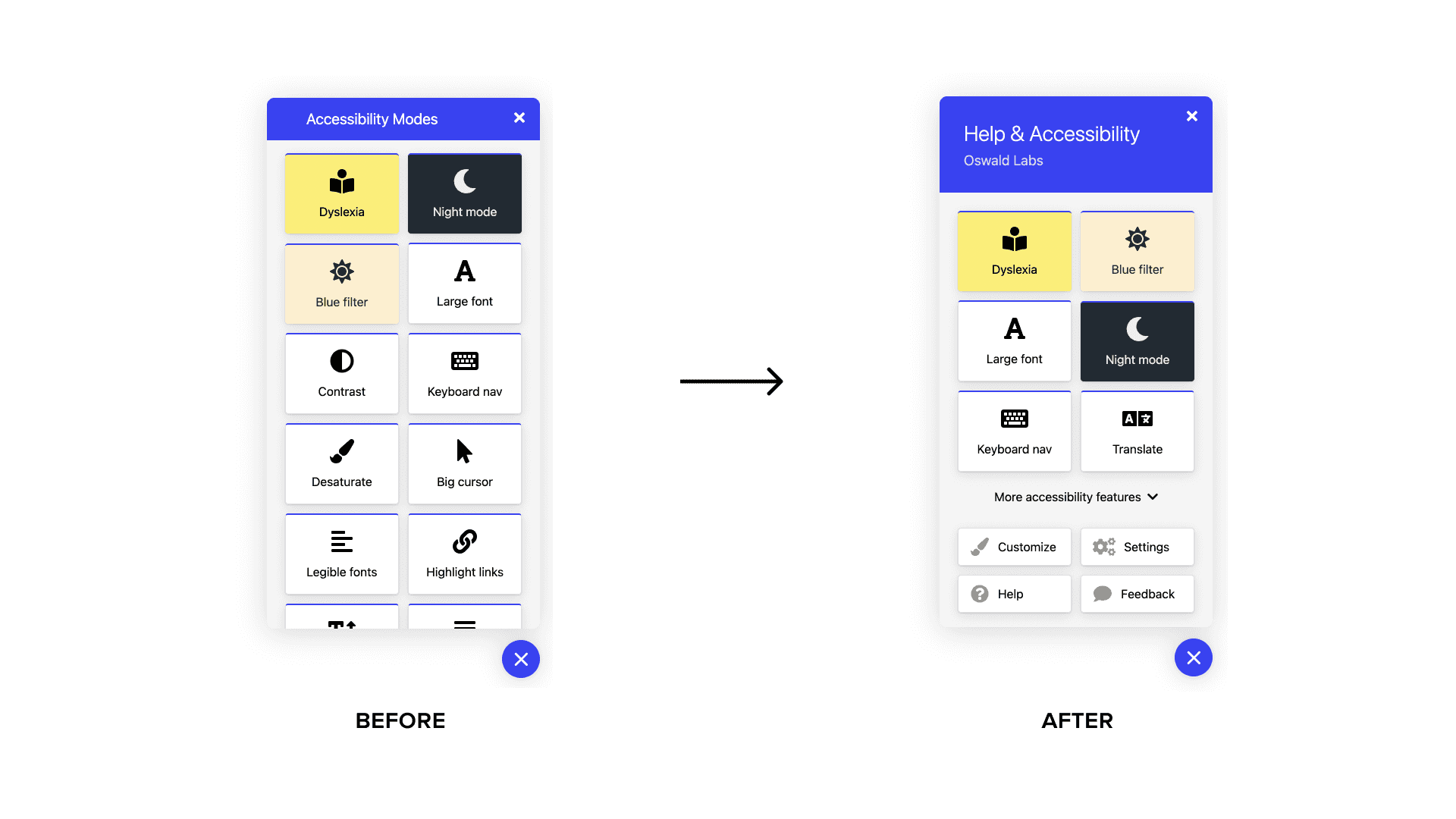
Another common issue noted was that users did not have a clear way to determine which visual modes were ‘on’ and had to enter each mode to find its setting. We solved this by adding a top-level list of all activated modes which users could then disable or reset with one click. This change saw our participants report a 22% increase in the rate of effectiveness of the tasks defined in our usability test.
Evaluation
After multiple rounds of usability testing, we wanted to see broader insights on our plugin’s effectiveness at solving user pain points. We published our plugin in beta and collected insights and data from users across the globe via analytics and satisfaction surveys.
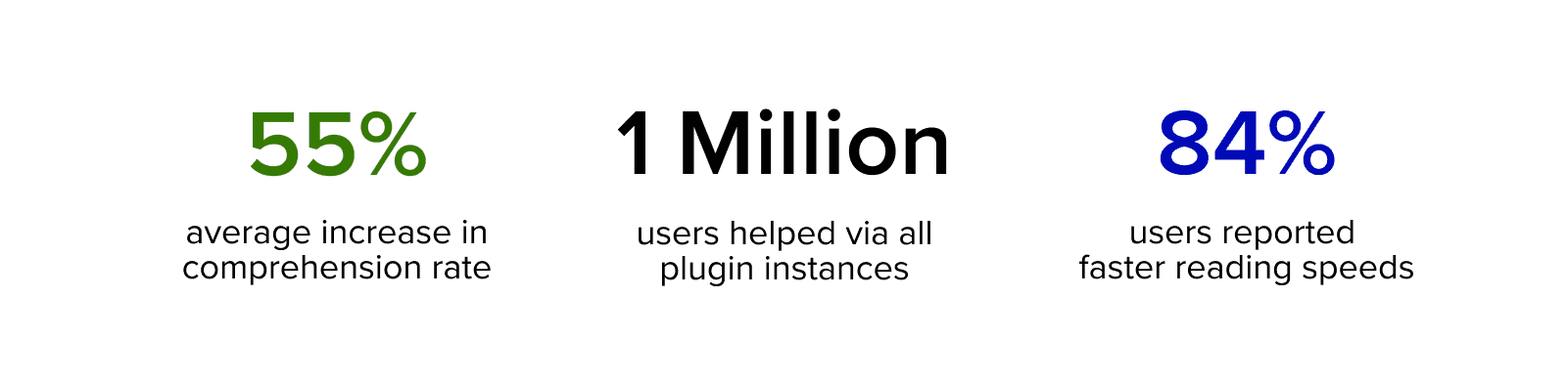
Since the completion of this version of our accessibility plugin, Agastya, we have reached millions of users and are active on hundreds of websites on the internet today. The product has undergone multiple iterations since and has evolved to become the flagship product of Oswald Labs.
Learning
This project was focused on solving UX problems for a significant population of people connected to the internet. Thus, it was imperative that the interface of a UX tool was designed with usability and function at the forefront.
It was exciting to build a product that would be used by millions of users on a daily basis. My biggest takeaway from the project is that iterations and user research can never be enough and it is important to recognize that design is always evolving.