Science World
Driving engagement for patrons of Vancouver’s premier science museum
Context
- This project was completed as part of a 200-level information design class at Simon Fraser University. Over 4 weeks, our team was required to audit a local tourist attraction and create an intervention to improve the visitor experience. Special thanks to Science World Museum.
Role
- User Research
- Personas
- Interaction Design
Tools
- Interviews
- Personas
- Journey Mapping
Team
- Nate Kim
- Rochelle Tri
- Zachary & Mark
Introduction
As part of an information design class at my university, we were required to research Science World, a local science-based museum, and find common pain points of visitors regarding interactivity. Our end goal was to create an intervention that helped patrons of the museum have a more immersive experience while visiting.
How might we help patrons of Science World feel more immersed?
Research
Our first step was interviewing patrons of Science World. We conducted multiple in-person interviews with patrons actively touring the museum and gathered their thoughts.
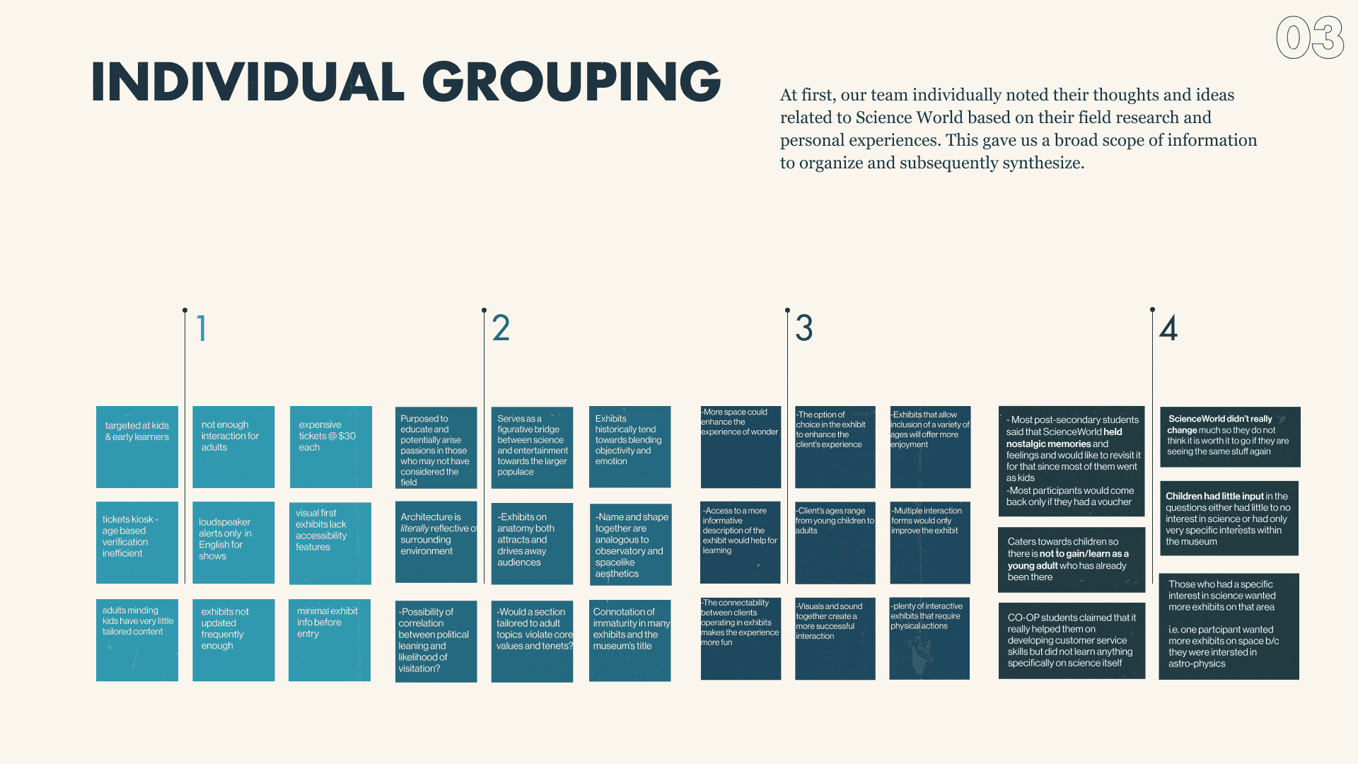
Next, we grouped these insights by commonality and then converged them into broad topics.
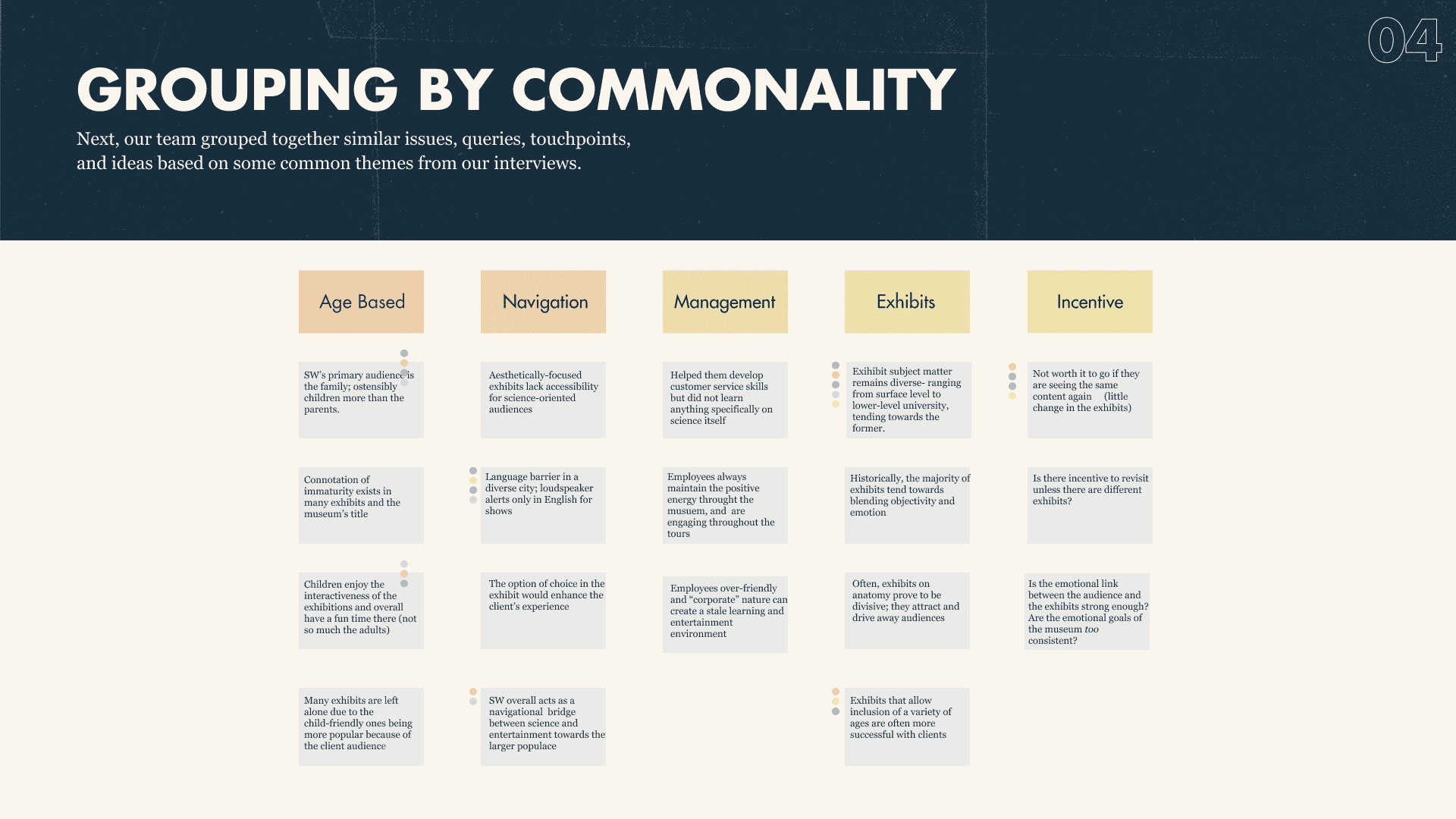
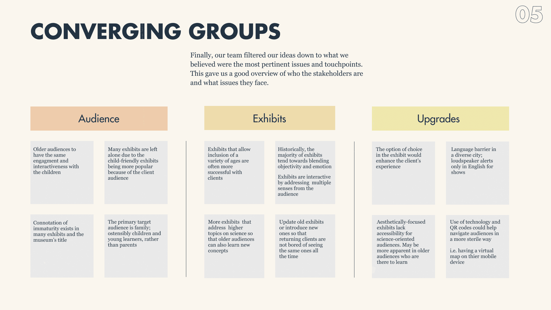
After analyzing data from our interviews, we were able to form 3 key insights that could offer room for exploration.
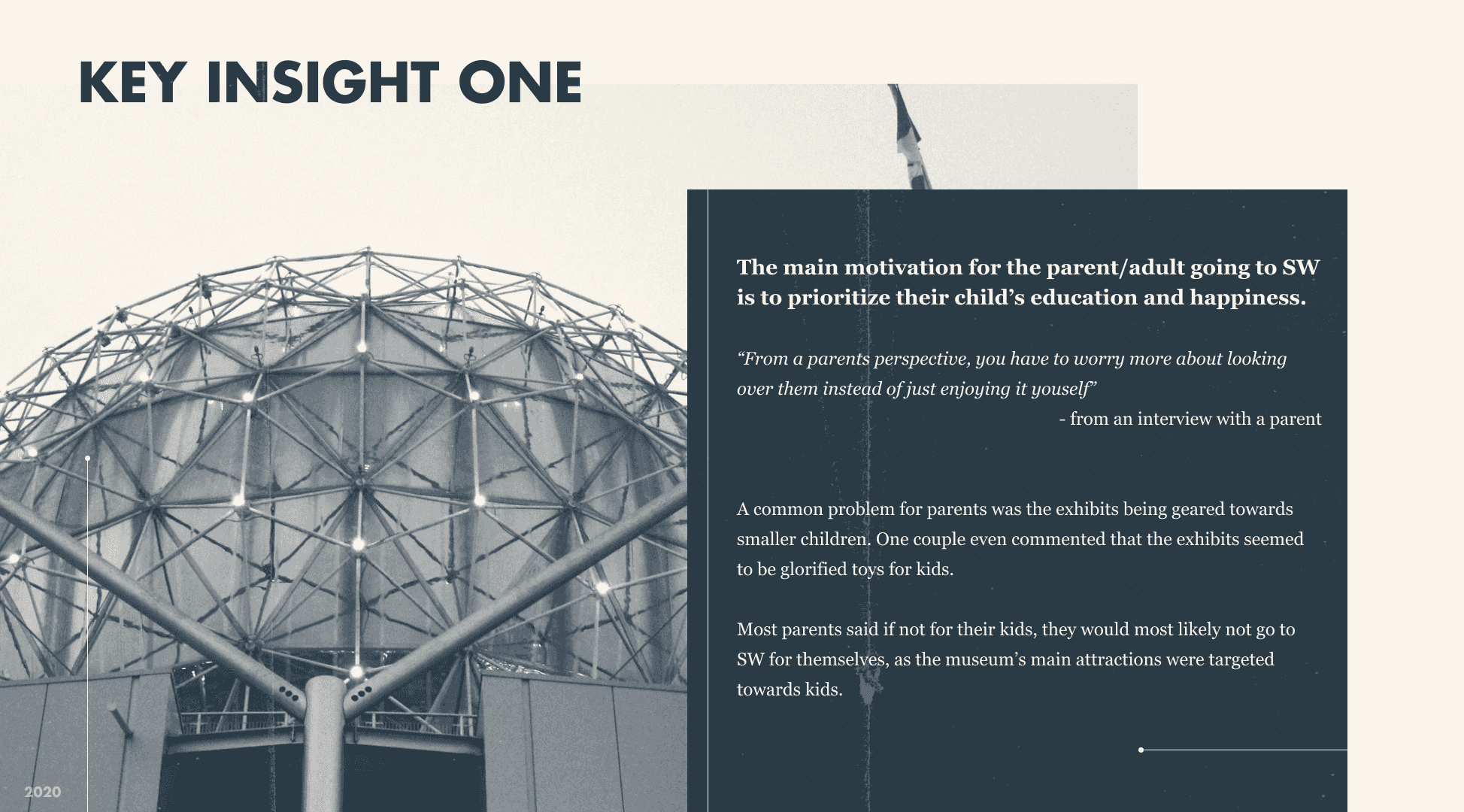
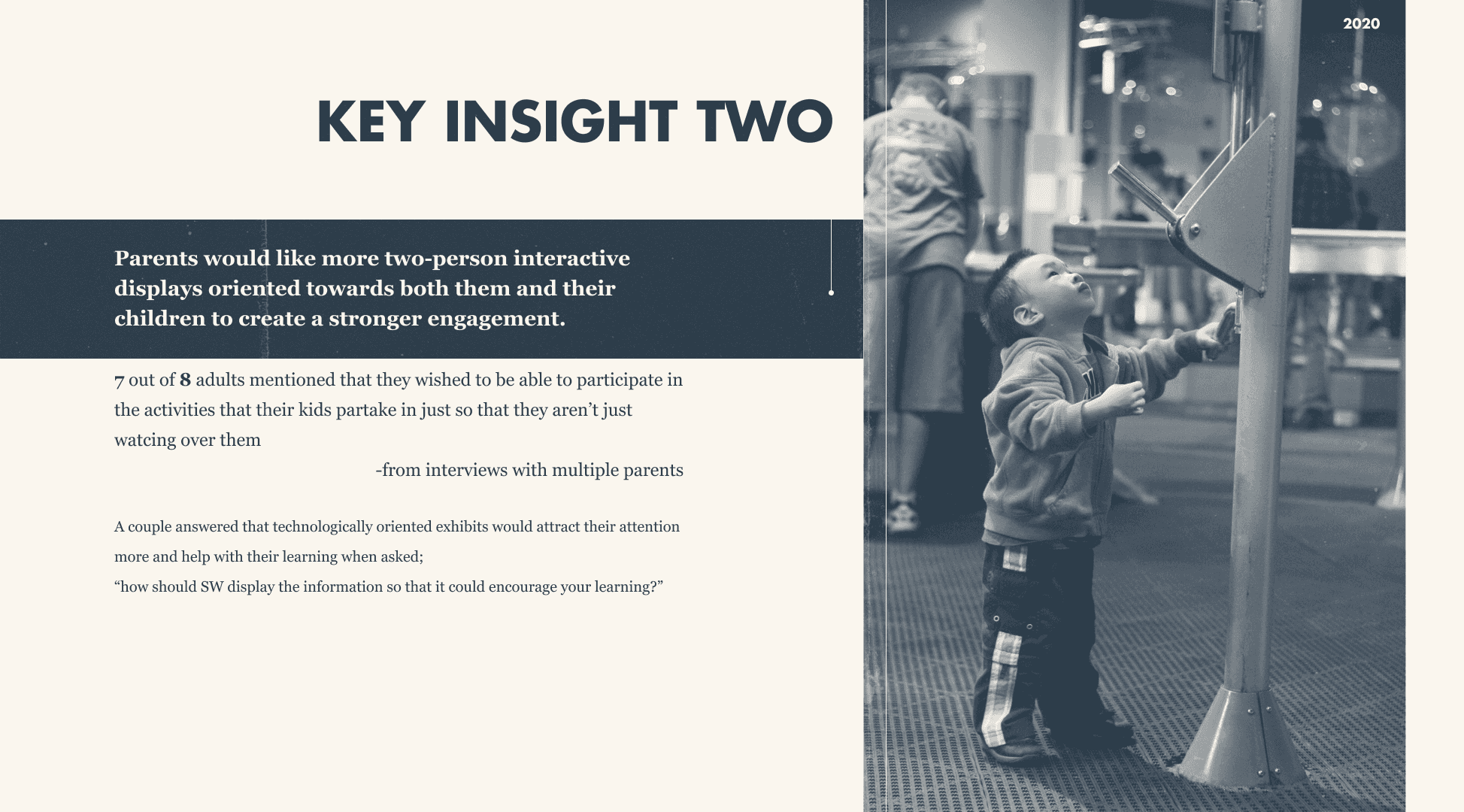
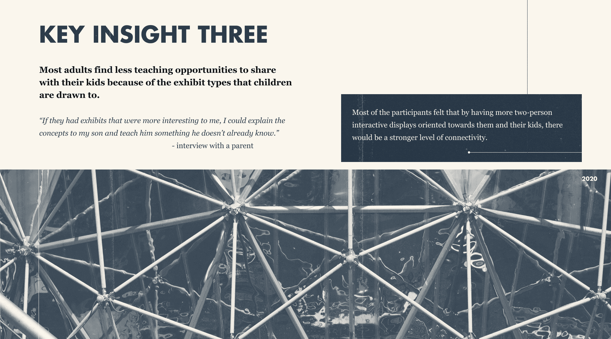
All 3 key insights had the common nature of expressing differences in interactivity for children and parents accompanying them. This helped us frame a problem statement which we could solve for.
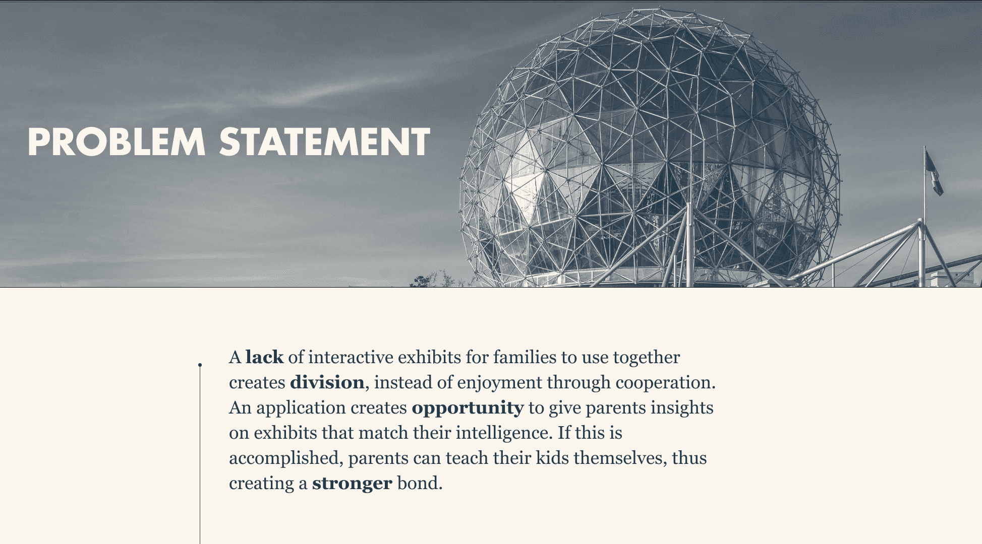
To ensure that we accurately address the painpoints of patrons, we created 2 personas that we believed represented the target demographics, including their goals and frustrations.
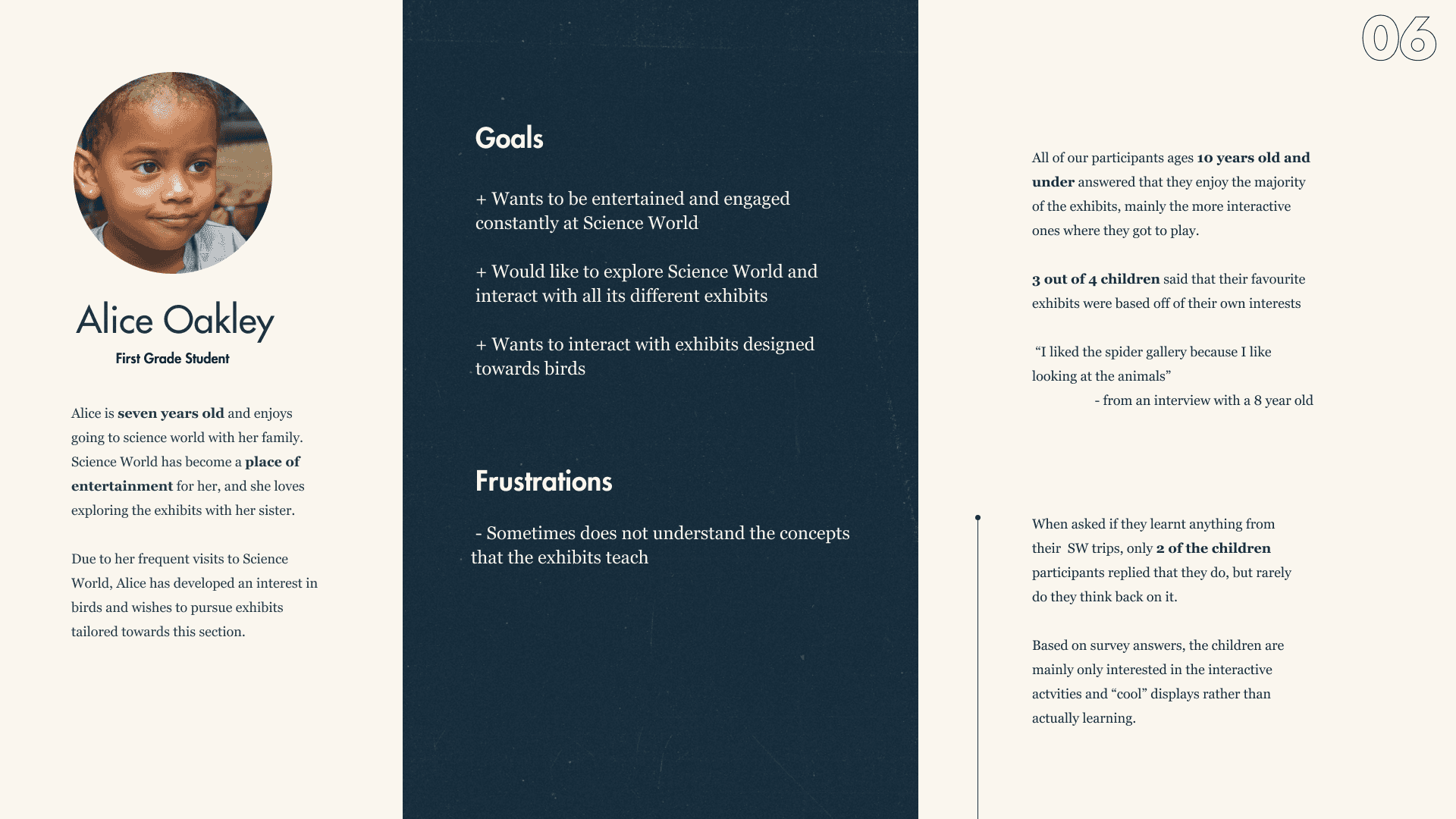
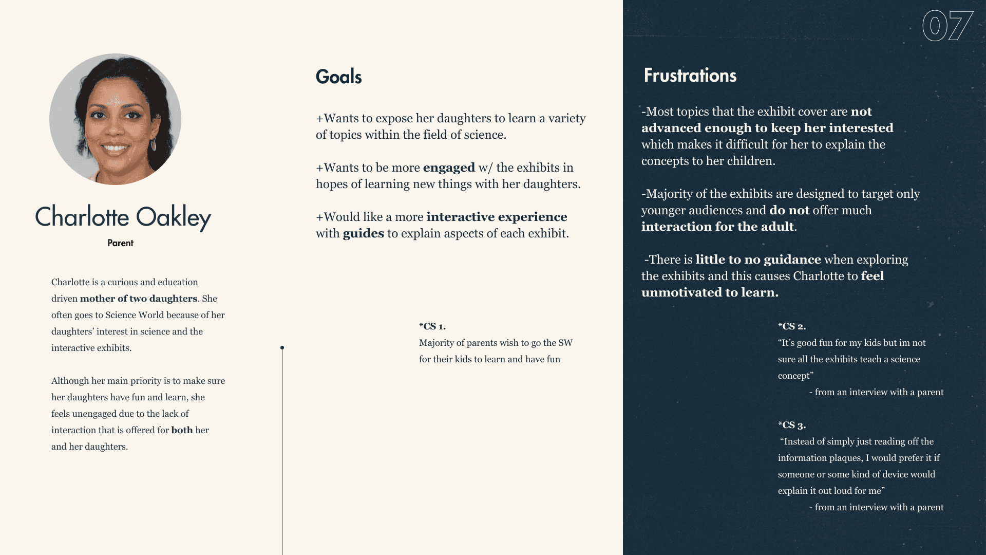
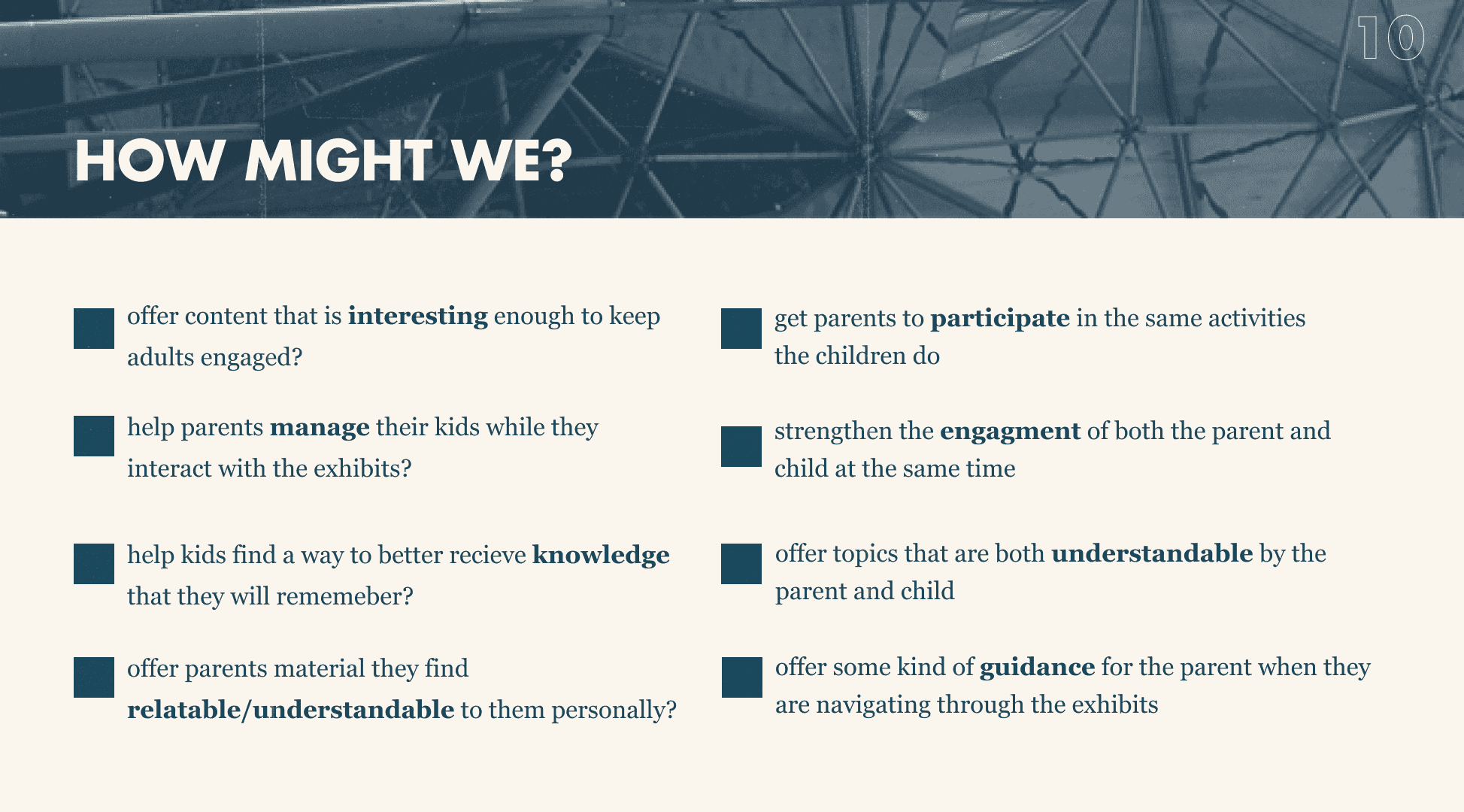
At this point, our team decided to compile a list of “how might we” statements that could be used as a platform to concretely ideate upon.
I led the brainstorming session of ideas, where we allowed ourselves to diverge and think of interventions across physical and digital platforms.
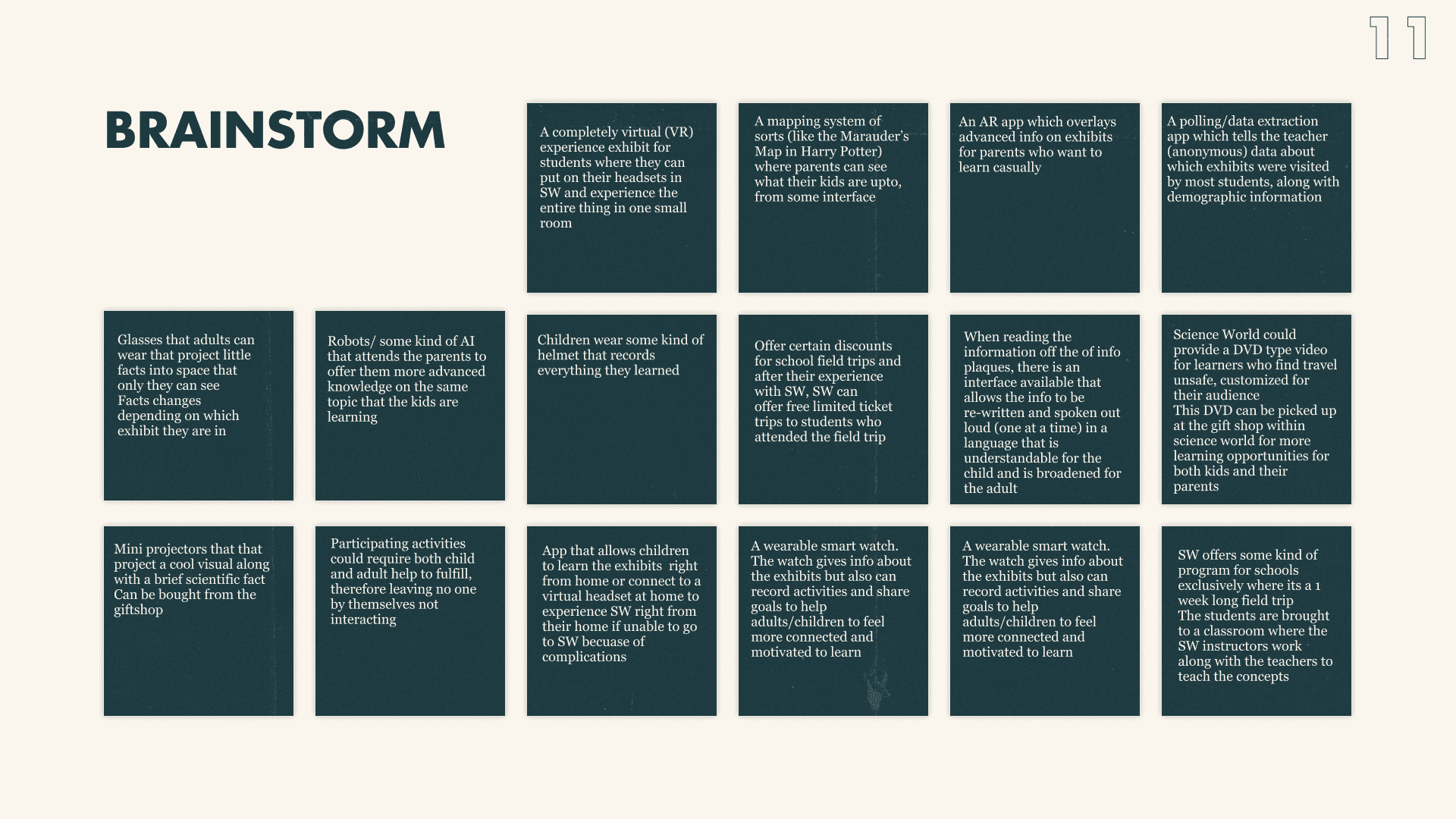
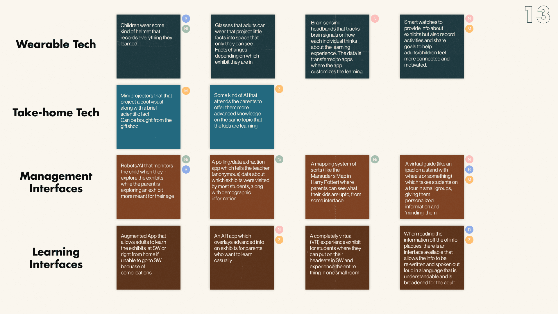
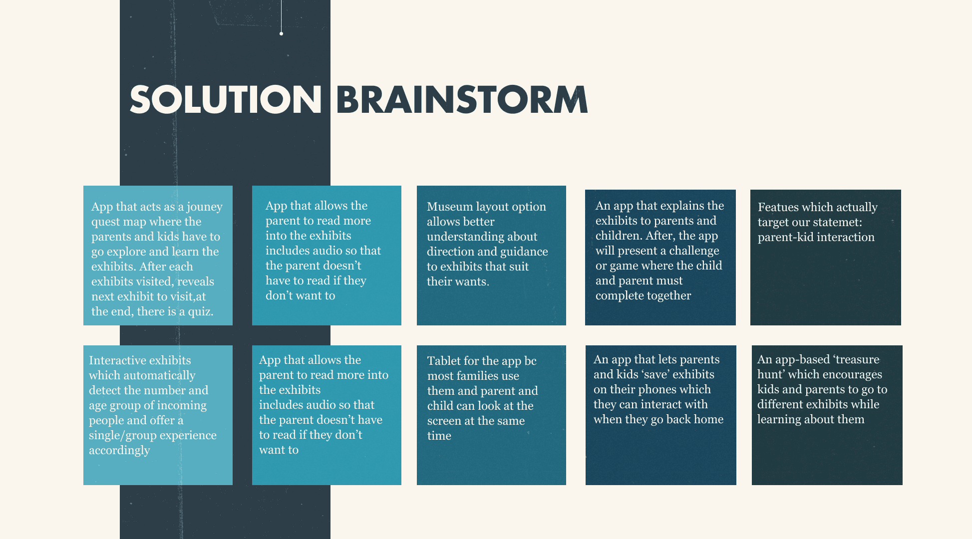
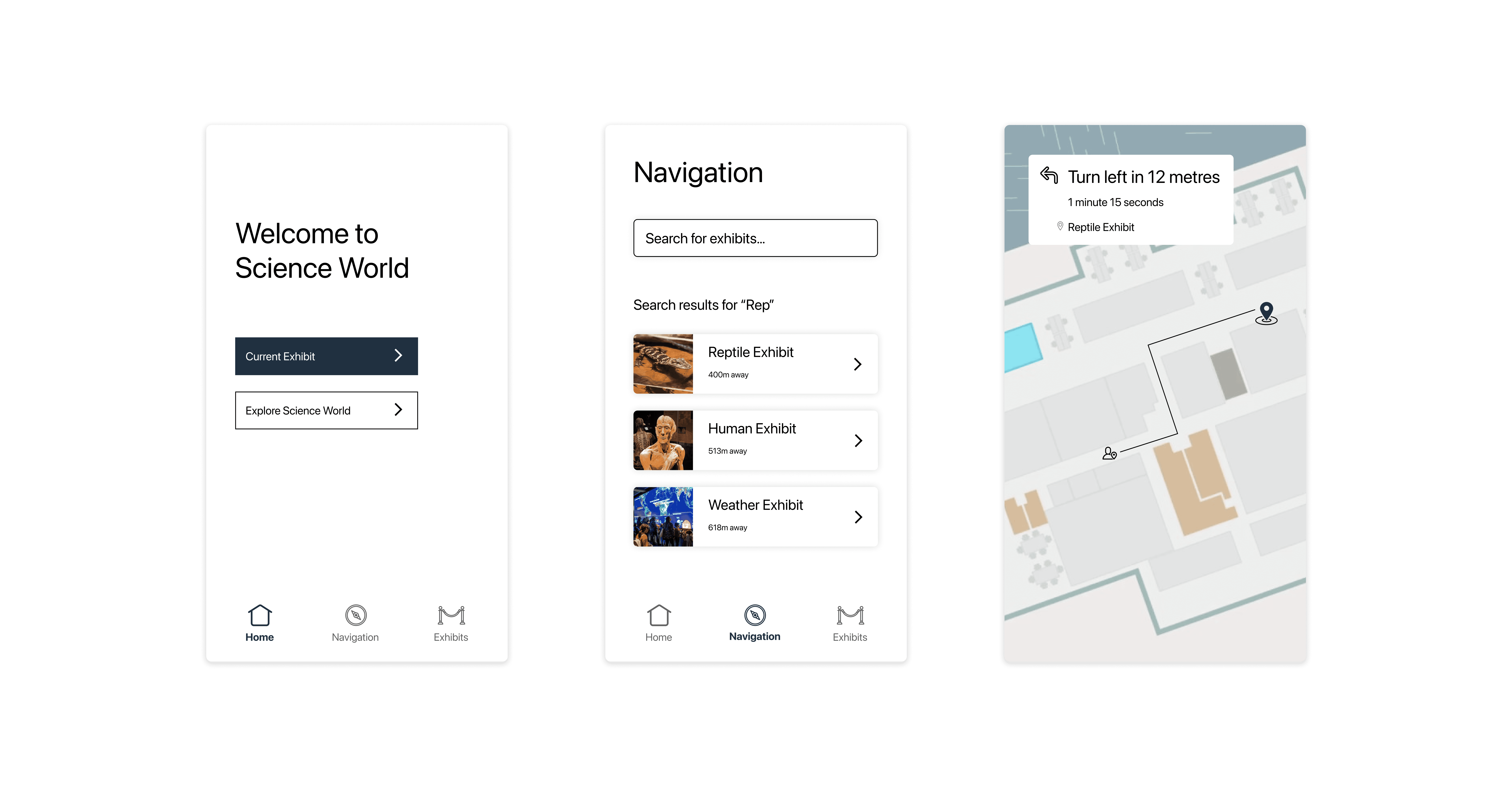
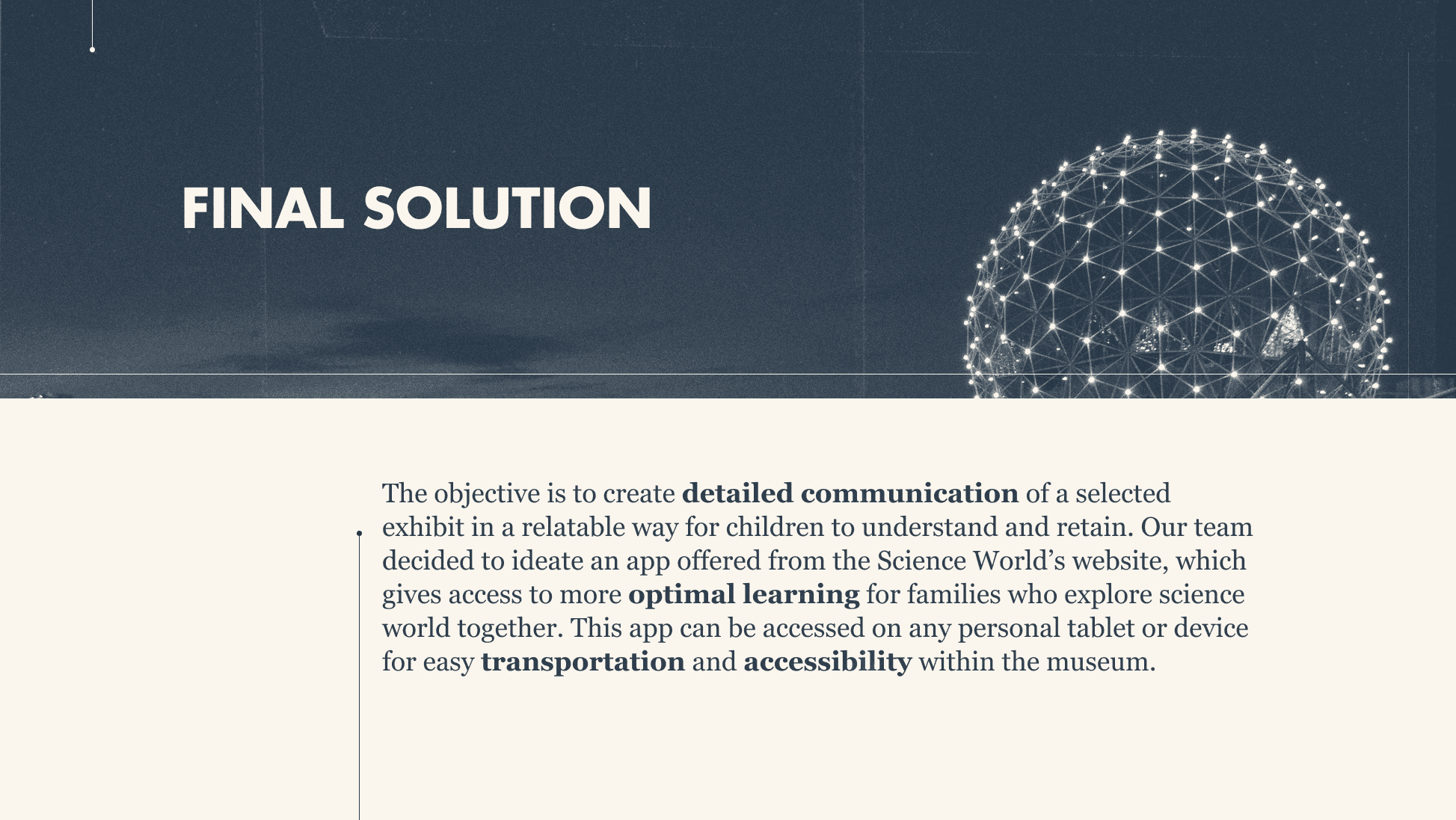
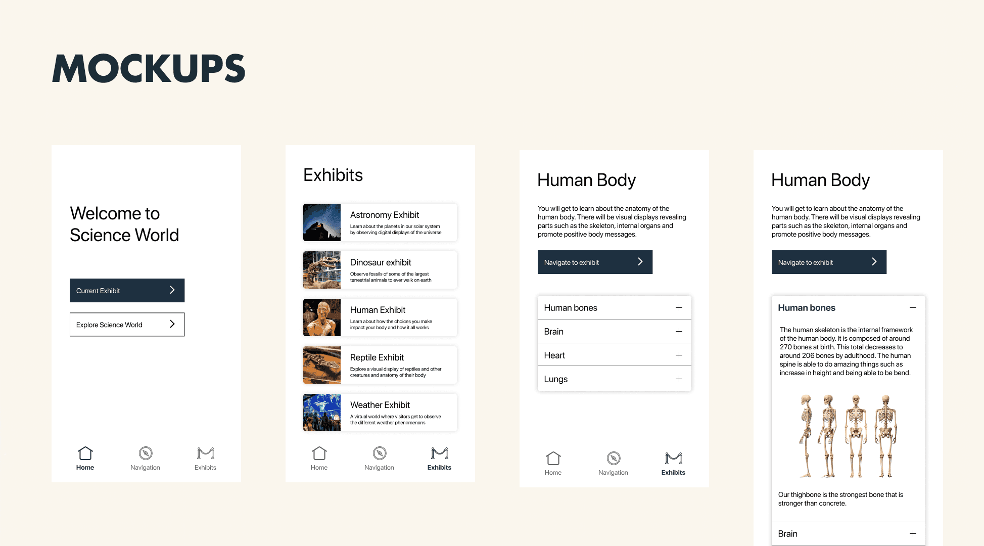
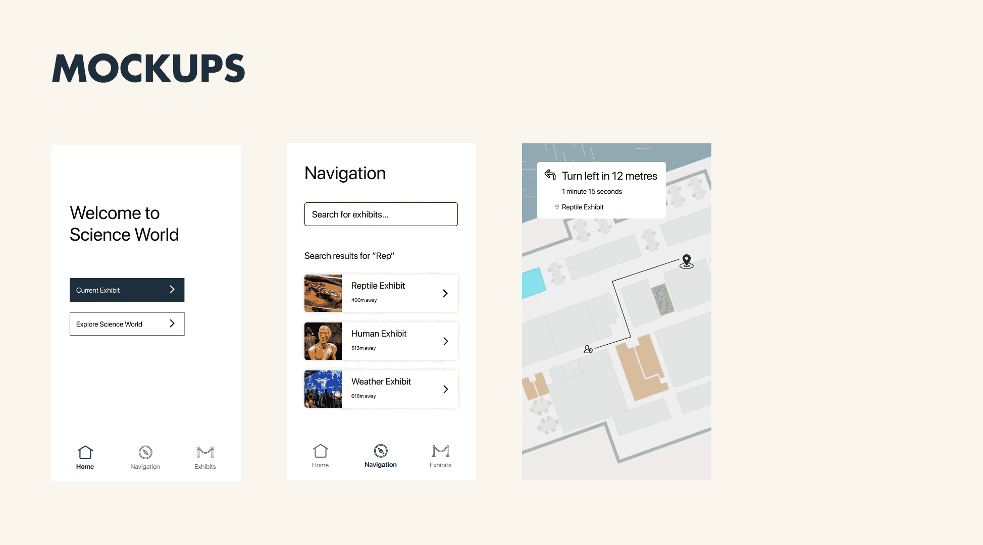
We then converged our ideas into more developed ones and arrived upon a final solution that would be a mobile app to accompany exhibits with rich text and graphical information.
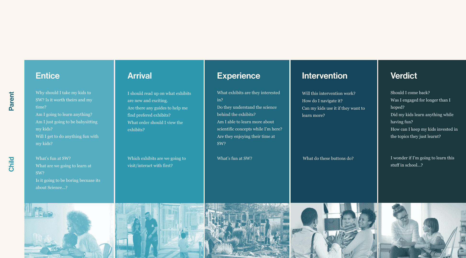
Once our intervention idea was finalized, we created a journey map with the intervention in place in order to understand what kinds of questions and frustrations patrons to Science World might have.
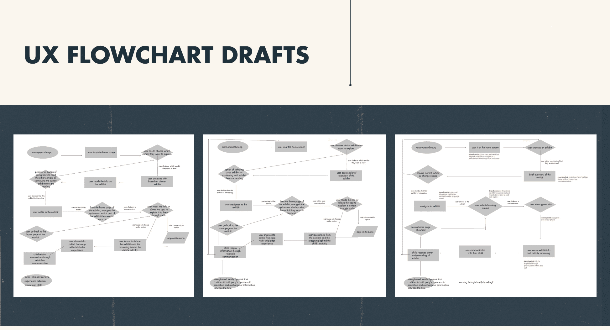
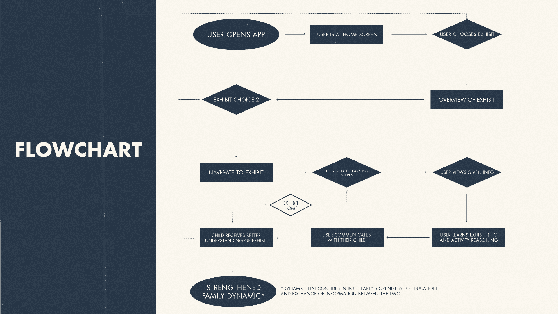
The final step in our research was to create a UX flowchart that depicted how the user moved through their experience at the museum and how our intervention helped them achieve their goals.
Design
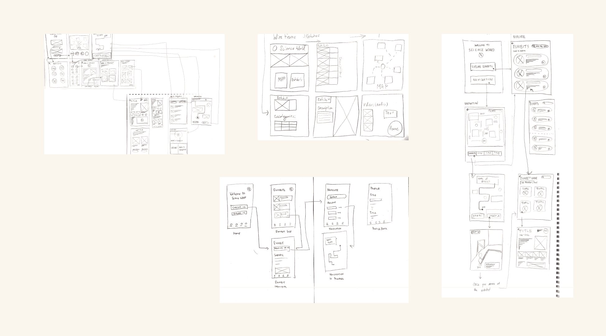
We approached the design stage of this project by sketching out ideas for the mobile application on paper. This allowed for quick exploration and iteration.
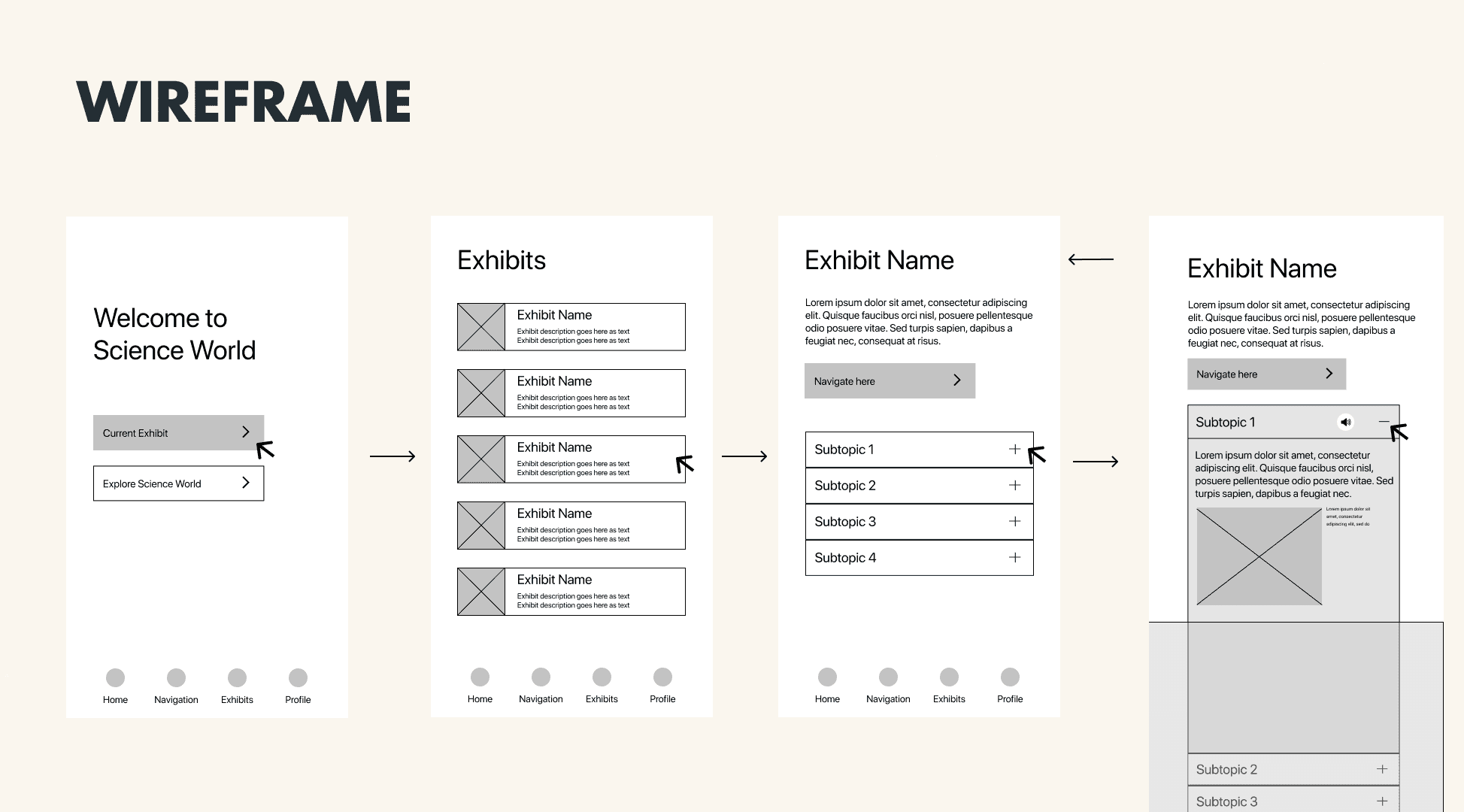
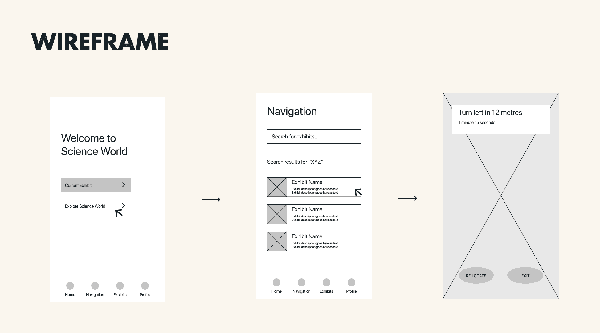
Next, I created medium fidelity wireframes for different flows within the app. This was followed by a quick iteration and conversion to high-fidelity mockups.
This intervention was presented to the museum and received multiple positive reviews from exhibit caretakers. Our team will revisit this project in 2023 as requested of Science World.
Learning
This project was fairly research intensive and was one of my first experiences conducting interviews with randomly recruited participants. Having a structure to ideation with the how-might-we statements and grouping of insights helped me understand the importance of following defined UX practices.